 FA+
FA+
1050
Views
Views
69
Favorites
Favorites
Category
Artwork (Digital) / General Furry Art
Species Vulpine (Other)
Size 817 x 1280
File Size 90.3 kB
Report this content
More from Cecil-Sayataki


 Commission")


I'll go back to working on those $1 sketches now.
I like my new signature.
I like my new signature.
Category Artwork (Digital) / General Furry Art
Species Vulpine (Other)
Size 817 x 1280px
File Size 90.3 kB


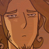
I -love- the body of the subject. The light and the colors and the style all make a very clean, minty and pristine subject matter. I even love it more because it's blended to just the right amount in certain areas that it mimics oil paints when they blend or are broken with a dry brush and am quite partial to that style and stroke myself. The only real thing I feel my eyes are drivel from is the nipple looks a little high on the pectoral and the head and eyes look a little cubic compared to the style of rendering the rest of the picture has.
The shading on the muzzle is done really nicely, so the lighting and the muzzle blends in with the rest of the subject matter, but the forehead is fairly unshaded. I tend to exaggerate shadow and light manipulation a lot, so flat panes sometimes make me go "eh?! o_O, simply because this picture is so bright and heavenly feeling. To me, maybe adding a very light gradient shadow to (his) right side of the forehead would help to define it from both the hair and the eyes. To help the eyes, maybe make the surrounding area just a tad darker on the left eye, and somewhat darker on the right eye so that they don't appear to be connected to the forehead on one solid pane.
The hair is really beautiful. I'm partial to cupid curls. These looks incredibly soft, like the rest of the subject, but slightly undefined, like they're all on one layer or maybe from a different picture. Adding a slightly darker tone of blue, focusing on the right side of the locks, might help define them and also add to the really pristine light source that's offered here. Maybe one more light or glossy brown/gold tone to the left side of the locks where the light is shining as well, since hair tends to have a sheen on it from the protective sebum produced by the scalp.
Incredibly late reply is incredibly late.
The nipple is actually in the correct position. I was referencing a photo while I did this to help with the lighting and anatomy.
I agree with you on the face. I'm still not used to drawing muzzles, especially at angles. I need some more practice.
As for the lighting and shading on the head, the picture I was referencing cut off below the nose so I lost my light reference. I was just winging it.
The hair could definitely use some more sheen. Especially with the light source I picked. Again though, the photo I was referencing showed the hair was rather dull without many highlights. I'll definitely remember what you suggested though.
I appreciate the critique, thank you.
Ive noticed that myself: sometimes while referencing a picture, if you aren't going for straight photorealism, seems off or wonky when paired with your technique. That's why my illustration teacher emphasized to do what "looks and feels right/good" for the rest of the picture, even if the anatomy ends up looking questionable. Afterall, art is the interpretation of not just what we see, but many other aspects as well. That's why I find very long, breathy and strict (if not super harsh) criticism is questionable on matter that is so subjective.
As for the head, I tend to google ref or use my animals in poses as needed to help with muzzle placement. I found a few that might help with your predicament here.
http://www.aspca.org/about-us/image.....looking-up.jpg
http://www.istockphoto.com/file_thu.....looking-up.jpg
http://dreamdogsart.typepad.com/.a/.....f4eb970b-800wi
http://fotosa.ru/stock_photo/Fancy%...../p_2945549.jpg
As you can see, depending on the angle, the extremity of the tilt, the thickness and length of the muzzle and eye placement on certain canids, the eyes may or may not be visible, further centered inwards, or widened outwards. These pics might also help with the ear placement since the tilt of the head dictates how much you will see, as well as the depth inside the ear.

I'm very partial to your blending, however I think you could have done with a wider pallet. Pure white never looks like white skin/fur/anything else unfortunately or realistic for that matter, most artists will use light blues and pinks and greens with just a touch of white for most things that are white. I think you shadows on the orange could have done with a touch of blue, perhaps with yellows in the highlights to make it pop more colourwise.
Anatomy wise, the chest and the back of the shoulder are really well done (though what's the lump in the armpit? if that's the back muscle it's too far forward). But what is the red dot on his collarbone? It's far too high up to be a nipple, but he doesn't seem to have any nipples if it isn't.
I don't like his head, the perspective and anatomy on it are majorly skewed and it really stands out next to the nicely painted shoulder/arm and chest. His eyes probably shouldn't be visible, a muzzle would block them. The nose is at an angle to the rest of his face, it's pointing somewhere over the viewers right shoulder. The neck is ill defined and I have no idea where his adam's apple is, or what that white blotch on the neck is.
His ears? There is no way those ears fit on his head, they're pointing to the right of the image, not to the front. To be honest, they shouldn't even be visible if he's tilting his head up. This also applies to the forehead, we shouldn't see it.
The hair? Sorry but it doesn't look much like hair, it's very heavy and lifeless, and it lacks the details and tones that bring hair to life. It looks more like chocolate swirls rather than hair, I'd suggest getting some reference for it and studying how real hair curls and the highlights/tones in it.
The tail? I don't think we should see the top of it due to the angle of his hips unless it's coming out of his buttcheek. That and with the lack of detail, the sweep of the tail looks like plastic, it doesn't match the painting on the shoulder in terms of realism.
His hips don't match the rest of the torso or the line of sight to be honest. They only off a bit but it makes the two halves look like they aren't actually part of the same figure and with the belly facing a slightly different angle to the rest of them and being slightly feminised, it gives your piece a slightly piecemeal look.
The manties and thigh high boots lack detail, especially the manties which are apparently one solid lump of black. Personally for bondage gear I would have picked a near black blue as the base not straight black, it would have had more pop. Also if his outfit (collar included) is leather, it should have at least some shine on it. The small amount of shine on the boots isn't really enough to make this look like a fabric.
This is a good piece and you certainly know your way around blending but for this to be an amazing piece, it really need more research, more work on the perspective and a varied pallet.
I really need to experiment with a wider pallet, instead of just using my usual one color and it's darker/lighter tones. And I agree that the white would look better with a bit of blue in it. I will be experimenting with yellows in orange highlights next time I do something like this.
I referenced a photo while sketching and coloring this. That lump in the armpit is actually a bit of the shoulder blade I believe. And yes, that red dot is a nipple. The way the arms are raised and stretching the pectoral, place the nipple in that location.
I very much agree with you on the face. I haven't practiced much with muzzles so most of this was just winging it. The white blotch on the neck was actually supposed to be the adam's apple. It looks much too highlighted though.
This was my first time painting curly hair actually. My photo reference showed the hair was rather dull and didn't contain all the shines that hair usually has. I'll definitely be looking up references and making some practice hair doodles.
You're right about the tail. If you follow where the character's spine would be, the tail should be visible much lower. I'm still experimenting with how I draw/paint tails.
I actually don't see what you're talking about with the hips. Since I referenced a photo on this, those hips are correct. Eye level on this piece is actually supposed to be at about the belly button, as that's where the camera was placed when the photo was taken. There is also some contrapposto with most of the figures weight on the left leg.
The "manties" and stockings are supposed to be fabric. Black fabric doesn't gain as many highlights as other colors which is why the panties appear to be a solid black. The stockings though, definitely could use more detail on them, even if it was just some stitches in the fabric. The collar was supposed to be leather, yes. I should have put more shines on it.
You made some very good points in your critique, and I thank you for it.
btw, just because you used a photo doesn't mean the anatomy is necessarily going to be correct. A camera has only one "eye" thus it tends to introduce flaws into an image due to it's lack of perception, and while obviously those flaws are accepted in a photo since we know it's a real object, they will stand out as incorrect in a painting.
Could I perhaps see the reference images you used for this?
Yeah I was actually concerned about that lol.
The torso may be elongated because of that.
Normally, I wouldn't mind sharing my reference image,
But I posed for it and I don't really want to share a photo of myself with someone I don't know.
Hmm. Well, if you really want to compare it, I guess I could send you a note?
The torso may be elongated because of that.
Normally, I wouldn't mind sharing my reference image,
But I posed for it and I don't really want to share a photo of myself with someone I don't know.
Hmm. Well, if you really want to compare it, I guess I could send you a note?
If you don't want to, you don't have to, but perhaps it might be an idea for you to look for other images of similar posing and see if the camera is misleading you.
It's always a good idea to have several pieces of reference to draw from because working exclusively from one can result in camera distortion creeping into the final image and while people accept photos without question, the same doesn't hold true for paintings.
Alright.
I'll definitely look around for some, because I can definitely see some distortion that I didn't notice before.
Yes, yes. I'm glad you pointed this out and I'll be keeping that in mind the next time I reference something.
Having a live model for these kinds of things sure would be nice XD
I'll definitely look around for some, because I can definitely see some distortion that I didn't notice before.
Yes, yes. I'm glad you pointed this out and I'll be keeping that in mind the next time I reference something.
Having a live model for these kinds of things sure would be nice XD
Crank up the lights and darks, do more like this and you'll be a god. This is the lighting of kings Make everything deeper, make everything brighter and darker. You already have an eye for composition, don't be afraid to let the whites of the figure fade into the background, the eye will pick up what it needs.
Comments