 FA+
FA+
Fixed All My Artwork
17 years ago
Hi everyone.
I have now adjusted every piece of work in my gallery according to the correct monitor calibration. Take a look through and let me know what you think.
I have now adjusted my work so that every piece appears as I intended it and as I believed everyone saw it with my dark calibration. The fact is that for the majority of people out there, my work has been appearing too light on your screen, therefore its tonal depth and shading quality has been significantly reduced. Therefore I have done this to allow those people to see what I have been seeing all this time. Some of you may need to refresh pages or empty your browser's cache in order for the differences to take effect.
I dare say this will divide opinion - there will be those out there that dislike the adjustments for probably one of two reasons; either you liked the bright cartoony style of the previous versions (or had gotten used to it and will find these changes a shock), or your monitors are calibrated similarly to how mine was and now the pictures look too dark. Hopefully however, the majority will agree it is an artistic improvement. (Well, I say improvement - in fact it's no bloody different to what it should've been all along!! Lol!)
Comments very much welcome on either side of the divide.
RRRex

Berni
~berni
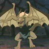
Yes they do look better and richer.Altho i noticed the exveemon in your pics is now a darker blue than it should be(kinda the save for the violet on dragonier)

Farel
~farel
are you sure you edited all arts in your gallery? they look the same to me... which I find good

RipRoarRex
~riproarrex
OP
Depends on whether you're looking at the actual pictures or the thumbnails. The thumbnails haven't changed.
Farel
~farel
oh true, they do look better, guess only the first example you showed sucked, these other ones look good

Crytus
~crytus
you should be hugged. *hugs your toe*

Fuzzypaws
~fuzzypaws
*seconds and does the same!*

ShadowKeeper
~shadowkeeper
the corrected colours do look a lot richer. definite improvement, but it must've taken u a long time to go through each one!
RipRoarRex
~riproarrex
OP
Not really - it only took a few seconds to do the gamma correction on each one. The longer process was trying to edit each submission, but all in all it only took about an hour or so this morning.

FlintXD
~flintxd
hehehe, nice work there pal ^^ mustve taken a while but the results worth it
hunter23
~hunter23
you can see it better