 FA+
FA+
553
Views
Views
24
Favorites
Favorites
Category
All / All
Species Unspecified / Any
Size 1024 x 1024
File Size 1.32 MB
Report this content
More from american_furs


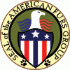
Okay so new logo is completed. I have taken in A LOT of advise and a HUGE help from Rocoro  Newyork for the idea.
Everyone will have their say to what is liked and what is not liked. To prevent craziness, comment below and I will bring the ideas to another outside group for further thought before the logo is finalized. I would like to make final logo by Monday the 16th. 2015.
Edit Feb. 15th: Since the comments poured in with some good and some bad just like I thought, I can see some mods that need to be done. I have removed the feather things from the head and I am working on removing a circle to increase the image for a 100x100 size. The size reduction will also make the image more simple, yet something newer.
 Newyork for the idea.
 Everyone will have their say to what is liked and what is not liked. To prevent craziness, comment below and I will bring the ideas to another outside group for further thought before the logo is finalized. I would like to make final logo by Monday the 16th. 2015.
Edit Feb. 15th: Since the comments poured in with some good and some bad just like I thought, I can see some mods that need to be done. I have removed the feather things from the head and I am working on removing a circle to increase the image for a 100x100 size. The size reduction will also make the image more simple, yet something newer.
Category All / All
Species Unspecified / Any
Size 1024 x 1024px
File Size 1.32 MB

I've been on the sidelines about this, not really speaking my mind, but seeing this? Compared to what you already have?
No...Just no...
This one is overworked, way too complex, and what is personally a big no-no for me: There's lots of text...Text you won't be able to see at 100x100 resolutions anyway...
It's not a seal, it's a crest.
It looks way too 'official' and 'high nosed'. It's not simple and to the point.
Your current icon? The one you're already using? That's straight and to the point, it's well made, high quality, with no question as to what it represents: A paw, covered in stars and stripes. That's it, and it's no more than that, but no less either.
This...What is it? Is that an eagle? It looks like a falcon, or a hawk. That's most certainly 'NOT' an eagle, and CERTAINLY not a bald eagle. Regardless, it doesn't look properly done for what it is. It's silhouette does not resemble a bald eagle, or an eagle at all, as I mentioned before.
The paws are too small, as is the text. People seeing it at its proper resolution won't know what its trying to convey cause all they'll probably see is a vague avian outline, stripes, and some dots in a half circle.
Nope. I still think you should just stick with the icon/logo you're using already, and stop trying to perfect what is already just fine as it is.


I like it. But viewing it at 100x100 is a valid concern. if you still can make everything out that small, go ahead. but make sure to resize it, take a break, and look at it with a fresh point of view. put it out of your mind for a day, then look at it small. if you have to squint, no good. if you have to really stare, no good. the paw and flag is simple, none of that needed, yeah. but if you can improve on it, without needing to zoom in, even better.
if I could recommend, add a paw to the shield. that might make it a little easier.
if I could recommend, add a paw to the shield. that might make it a little easier.


Hey thanks. Sorry that I didn't take into account the 100x100 size of the icon... maybe the seal in the middle be that icon.
http://www.furaffinity.net/view/15757000/
Here is the original that I sent to our founding founders... of the page.
Thanks so much guys :3
http://www.furaffinity.net/view/15757000/
Here is the original that I sent to our founding founders... of the page.
Thanks so much guys :3


My fellow American furries,
We here as American Furries, are taking the great seal of our great furry nation, just a tad too seriously. This great seal of our fair furry nation, is a terrific parody of our own great seal of the united states. Just like old "Weird Al" himself, no offense or dishonor is intended, rather it is a humorous and light hearted tribute to our own presidential seal, a stupendious and wonderful image that bears tribute to the patriotism, valor, honor, faithfulness, and dignity of our great nation.
In all seriousness, I think its a good "official seal" just like our own official seal of the president of the united states. The red white and blue stands for the colors of our own great nation, the stars representing our own states, the paw prints representing the impact that our beloved fandom has on our lives and culture.
I'm not against changes, but I like this one.
Comments