 FA+
FA+


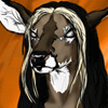
The bunny-unicorn-bird I drew a month ago while bored finally deserves a place online, I decided! As you can tell by the shoddiness of it, this was just a scanned thing on graph paper I colored in photoshop-- pretty raw. I likes it, though. Specially his ribs and tummy-- they turned out great!
The three tails are a little strange, and I'm not sure if that's overkill or not with him... I'd sketched three in, and just didn't know what to do while coloring.
Eek, little nervous since this is my first submitted picture ANYWHERE online, and I'm more of a writer than a doodler.
I'm up for suggestions since I'm so new at this-- if anybody reading this has comments about his design, my anatomy choices, or his coloring, please comment or PM me! I'd loooove to hear from ya~!
Category All / Doodle
Species Horse
Size 1165 x 940px
File Size 344.1 kB

It’s a nice first post!
Suggestion:
If you’re going to color a sketch/doodle digitally you should trace/ink it in a separate layer to allow you to remove/clean up the background.
BTW: most usually list the species for a unicorn as a hoarse – it’s just so that those interested in equine-like forms can find it easier.
Suggestion:
If you’re going to color a sketch/doodle digitally you should trace/ink it in a separate layer to allow you to remove/clean up the background.
BTW: most usually list the species for a unicorn as a hoarse – it’s just so that those interested in equine-like forms can find it easier.
Thank you! I wasn't entirely sure how to go about doing the outline, but next time I'll focus more on that portion of the piece rather than hoping the sketchiness wouldn't be noticed.
And the second bit of advice is really helpful too... I'm still learnin', and every bit of help I can get is a big help!
And the second bit of advice is really helpful too... I'm still learnin', and every bit of help I can get is a big help!

Bambi's way (very detailed and may or may not help):
When I get artwork ready to be scanned and then colored in Photoshop, I usually have it on computer paper (plain white) and inked( .2 to .5mm ink), erasin any pencil. Once in Photoshop (I've been using a 300 dpi black and white; you'll have to change the color mode to RGB afterwards. Do NOT flatten image, ever!), I mod the contrast and brightness to show the lines at their highest quality. Good example is my 'Christmas Piebald'. I make use of layers like crazy. Some of my pieces have 20 layers. I wand the exterior region form the character, then invert the selection. I create a second layer and fill the selection in solid black. It's a siloutte of the outline behind it. I then make it an opacity of about 30-65% and lock it (so I don't mess it up). I go back to the background layer, and highlight portions of one color scheme. Like I highlight all the brown portions of the buck. I create a third layer, and paint bucket it all brown. I repeat this step with every individual color. Each it's own layer. I lock them after so they aren't messed up. Also if you wand a spot and there's a tiny gap causing an area that shouldn't be selected to highlight, unselect, take the pencil tool and find the spot, just fill the gap with black. After, it should be a flat color. I then go to the siloutte layer and wand the black area. I make a new layer atop all of the layers I had just created, and begin to use the airbrush tool to great my shading. I usually have it set at 3-6% between size 21 to 30px. With just the siloutte region highlighted, you can mod all that's inside and not accidently shade your background. I repeat this with highlights. The layer is usually made above the shade layer. At this point it should look like it should. If you know more advance tehnics, shoot for it. Like I use the dodge and burn tool on my deer's eyes. I also use the dodge and burn on metals. I use an airbrush to fade the color into other shades . . . and so forth.
Piebald Examples:
Ink Outline: http://www.furaffinity.net/view/1712920/
Basic Color: http://www.furaffinity.net/view/1713014/
Shaded/Highlighted, etc.: http://www.furaffinity.net/view/1713112/
Oh there' more with the siloutte layer. Once you finish, go back to that layer. Unlock it, and put the opacity to 100%. If any regions changes to solid bacl, you know it hadn't been colored (it helps). Also it cleans up and areas along the outlines a fill in color may not touch.
I always save two copies of a piece. Ont is the PSD so I can always mod later. The other, I flatten the image finally. I resize it to 700px height. It's large enough to see many details on Furaffinity and desktops but small enough to be seen all at once. Plus Furaffinity won't auto shrink (killing it's quality). I save it at it's best in .jpg format.
I always save two copies of a piece. Ont is the PSD so I can always mod later. The other, I flatten the image finally. I resize it to 700px height. It's large enough to see many details on Furaffinity and desktops but small enough to be seen all at once. Plus Furaffinity won't auto shrink (killing it's quality). I save it at it's best in .jpg format.
... wow. Thank you for this. I'm using this advice for my next little scribble. I'm floored: It's incredibly sweet of you to offer all this to me, and I'm using this technique to color the next one. Really, I can't tell you how grateful I am. I love your work-- and I'd love to mimic it, with your permission.


I like the form of the body, as well as the dainty paws. When scanning work into photoshop and colouring it, be sure to play around with the 'levels' and 'brightness/contrast,' to bring out the whites a bit more, a raw scan is usually pretty low contrast, and low key. Also, if you are interested in separated scanned lineart from the white background, so that you can colour underneath the lineart, please reference this link: http://www.polykarbon.com/tutorials.....channels2.html
I used it years ago when I was still in high school, and I have used the same technique ever since!
I used it years ago when I was still in high school, and I have used the same technique ever since!
Comments