 FA+
FA+
1457
Views
Views
20
Favorites
Favorites
Category
All / All
Species Unspecified / Any
Size 132 x 1280
File Size 956.6 kB
Report this content
★
More from Chromamancer
")
")


Stargazing: http://www.furaffinity.net/view/402...../#cid:30124419
I've been asked about how I made that last picture, so I made a rather large process reel from the layers in my image. I didn't save some of the other backgrounds that I attempted, but this may help illustrate the process behind this picture.
I also included a few of my WIPs, where I added color to the picture to see how it looked.
Toward the end, I fixed up the starts using the method in this tutorial: http://www.webdesign.org/photoshop/.....ield.3811.html
I'll do my best to answer any questions. Hopefully, some people will find this helpful. :)
Category All / All
Species Unspecified / Any
Size 132 x 1280px
File Size 956.6 kB


Thank you.
I haven't done any before. I've watched a few of those before. I'll have to think about making one.
It might be rather boring, though. This picture did take me quite a while, so I'd probably have to work on speedpainting quite a bit before doing a livestream.
I'm probably going to give those a shot again soon, for a bit of practice.


If you change the submission file you can upload images which stretch beyond FA's limits.
Change the submission file and just select the large file again and it should be displayed at the real resolution =]
What you did in panel 5 intrigues me though, are those custom brushes or some other method?
Change the submission file and just select the large file again and it should be displayed at the real resolution =]
What you did in panel 5 intrigues me though, are those custom brushes or some other method?
I did not know that. I'll give it a shot. Thank you.
In panel 5, that was one of the standard brushes. It was just a round, hard edged brush.
After I got that simple shading down, I sampled some of those shades with the eyedropper tool, and started painting that texture on with a 5px. round brush. After sampling a shade, that can be used as light, in the darker parts of the picture, or shadow in the lighter parts. Basically, I tried to make an interesting texture, and add a few more details to give a bit more shape to the face and the legs.
I hope that helps explain things a little bit.
Thanks again.
I got a larger version up.
On reading it again, I also realized that my previous comment may have not explained the method behind drawing that texture as well as I hoped.
The idea was to use some rough brush strokes to get rid of the artificial look on those gradients. So, I used a few brush strokes and dots to disrupt the gradients and add texture.
This was only one of my shading layers. I made two other layers above it. One has a few more dots and texture, sampled from the gradients, and the second has those sharp lines that make a few prominent scales stand out.

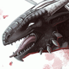
In my opinion the version with the purple color scheme looked better. The green of the dragon's skin looks too saturated considering he's only being illuminated by the moon and the diffuse light of a purple sky. Maybe adding a slight tinge of green to the purple version would've been enough to convey his greenness?. I also like that the purple version looks more nostalgic, it gives me the feeling of longing for a distant memory of the past.
Thank you for sharing your coloring method, I think I know how I'm going to color my own drawings from now and on :}
Thank you for sharing your coloring method, I think I know how I'm going to color my own drawings from now and on :}
That's an interesting point. I added in the green because I wanted a bit more contrast between the main subjects and the sky.
So, I spent a bit more time playing around with my coloring layers, and made a version with much less contrast. I think it still works quite well. It's a large enough change that I probably won't upload it here, but I did upload it to imageshack, if you wanted to take a look at it.
http://img265.imageshack.us/img265/.....targazing3.jpg
I probably should go and start something new rather then keep fiddling with my colors and making alternate versions, but finding ways to improve my coloring is always helpful down the road, too.
Woow!, Yes!, That combination is perfect!. I just downloaded it, thank you very much :) I will consider this a gift
I too have spent very long fiddling with colors, I have about 15 versions of "Starsoul recolored" in my gallery. In a way fiddling with colors is a great way to see what /others/ like more in an image, because I concluded that I could keep fiddling with the colors of my drawing, but fighting with tiny, subtle differences wouldn't do any good: after all, other people may have vastly different screens and the subtleties of the variations I made wouldn't count at all. However, displaying many versions could've helped me pick which one worked better for everyone in average (maybe if the image included a .ICC profile attached... It'd have made sense to fiddle with slight variations in tone).
If you ever want an idea or two for new pictures, knock my door :}
PS: I like that you kept the deep blue eye of the purple version, it gives him a special touch.

There were a few different color layers, but all the detail was all done in black and white.
Basically, I applied colors to the picture at various stages to see what it would look like. That helped me get a feel for how the final version would look, and see where I could improve the lighting or add more detail.
I'm glad you like the line art, too.
Basically, I applied colors to the picture at various stages to see what it would look like. That helped me get a feel for how the final version would look, and see where I could improve the lighting or add more detail.
I'm glad you like the line art, too.

Comments