 FA+
FA+
200
Views
Views
1
Favorites
Favorites
Category
Artwork (Digital) / General Furry Art
Species Wolf
Size 1280 x 977
File Size 70.4 kB
Report this content
More from HelpToImprove


Username: KiyoshiOokami
Link to Larger Version: http://www.furaffinity.net/full/4623354/
Submission Name: Kiyoshi Reference Sheet
Species: Wolf
Type of Media: Digital Art
Rating: General
Type of Response wanted: Constructive criticism
Artist's Comments:
This took three days in study hall to color and complete in photoshop, I now love the program.
Art © kiyoshiookami
All comments/help/criticism/redlines are appreciated!
Link to Larger Version: http://www.furaffinity.net/full/4623354/
Submission Name: Kiyoshi Reference Sheet
Species: Wolf
Type of Media: Digital Art
Rating: General
Type of Response wanted: Constructive criticism
Artist's Comments:
This took three days in study hall to color and complete in photoshop, I now love the program.
Art ©
 kiyoshiookami
All comments/help/criticism/redlines are appreciated!
Category Artwork (Digital) / General Furry Art
Species Wolf
Size 1280 x 977px
File Size 70.4 kB
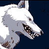
This..burns.
When I finish my reference sheet, I'll give you some pointers and show you what commissioners like to see. For now, all I can say is you'd need a more detailed description, any sort of clothing he'd wear, and for god's sake that blue background is burning my eyes. That shade is too bright on it's own but on a huge image with black and bright red it really, really hurts. Sorry, but most references either have white or soft colors, such as pastel blue, light grey, ect. as the background.
When I finish my reference sheet, I'll give you some pointers and show you what commissioners like to see. For now, all I can say is you'd need a more detailed description, any sort of clothing he'd wear, and for god's sake that blue background is burning my eyes. That shade is too bright on it's own but on a huge image with black and bright red it really, really hurts. Sorry, but most references either have white or soft colors, such as pastel blue, light grey, ect. as the background.
Please refrain from saying personal things, aka: " This..burns " " and for god's sake that blue background is burning my eyes. ", it could be taken as a negative/attack. Try sticking to just critiquing in a polite fashion. A simple " Background is too harsh, always use soft light colors " Consider this a warning. Also, a side note, the character is a she. =)
~ wolvenremorse
~
 wolvenremorse
No problem, just here to make sure no one gets their feelings hurt. ^^ But I agree with you on the background, soft colors work better. =)
~ wolvenremorse
~
wolvenremorse
My apologies to kiyoshiookami for the gender confusion, mistakes have been fixed. =)
kiyoshiookami for the gender confusion, mistakes have been fixed. =) 
Wolvenremorse: Pic says it's a he. xD
In all honesty I don't think "this burns" is accurate. It's actually pretty good aside from a few minor errors.
Indeed the background is pretty harsh. It's typically better to use brighter colors for backgrounds, or give light outlines around objects you want to draw attention to. Given that the character is black, you could go with a darker blue and have a white background for the text and white outline for the character, which can easily be done by adding a layer behind the character and throwing some white on it.
The side view looks pretty good, though the facial expression is kinda off putting, a smile tends to be friendlier x3 It's a personal thought about it, though so that's up to you to change if you wish.
The front on pic has a few places where the two sides aren't proportionately equal, namely the hand on the right is a tad too small, and the right knee is too low.
Final tip: Instead of using straight black for the fur, only use black for lines and use a very dark shade of grey for coloring. It lets you accentuate details a lot easier and IMO looks nicer.
Good luck 8D

As someone who has a black colored character, I would suggest not actually using black, but a dark gray, it isn't so harsh, but still gives you the feeling. =) Also, maybe it would be better to draw the inside lines white, however I'm not sure how you feel by that.
Couple small crits:
*The left arm is larger then the other, especially the hand.
*The chest muscles are too high.
*The legs don't look the same thickness.
*Also, even though darker backgrounds are more comfortable for you, use light colors, or diluted, they are easier on the eyes, and we can see written details better.
Goodluck! =)

Things I would suggest to any artist, new or not:
1) Look up skeletal structure!! If it's for a human, look up human anatomy. If it's for a wolf, look up wolf anatomy.
2) Find a website that allows you to use stock photos as references. It's not stealing to practice from references, it's only stealing if the artist has said not to use it for your own gain. Remember to always link back to any reference you use! (If there is an image you particularly like and are unsure of to use, ASK THE ARTIST!)
3) Use a light source! The best way to do this is to use one strong light source. Draw a little sun, in say, the right hand corner of your image. Now, draw an arrow from the sun hitting the surface. Basic things to keep in mind: things closer to the light source will be lighter. Things farther away will be darker. Here is a good image to help you with that: http://media1.smashingmagazine.com/.....ques/Fig_1.jpg
4) Along with number 3, it's best to do a simply value study before working on the actual image. When you have finalized a drawing, trace it to another paper with the OUTLINE ONLY. Now, set-up your light source! Take a pencil and do a quick study: where is it darkest? Where is it lightest? How will the cast shadow be cast? Remember, shading helps to make your figure look 3-D and make forms turn. :D
Sorry if this is a little much or sounds a bit intense. XD;

Not too bad. Better than a good deal of people. But I have some tips for you.
The body is falling a bit stiff. Studying from life and anatomy can really help to make the body more fluid with greater understanding of muscle placement, as well as consistent proportions which is becoming an issue here, like with the leg and arm. I see you are trying to put the form in perspective but there are improvements to be had. Using reference is also a must! It can really add to the overall piece and keep an artist from making bigger mistakes, like making the character resemble a wolf instead of a generic canine that could really be anything.
Practicing gestures drawings is a great place to start. To do this, you do quick drawing from life, taking no longer than 1-5 minutes on each. you probably want to do a hundred a week if you want to really get cooking.
This is a simple explanation on gesture drawing. The next buttons are a red arrow on the bottom of each page. Hope it helps. http://www.art.net/~rebecca/LifeDrawing1.html

Comments