 FA+
FA+
208
Views
Views
3
Favorites
Favorites
Category
All / All
Species Unspecified / Any
Size 1280 x 1264
File Size 143.7 kB
Report this content
More from Kitt_R_Beesley


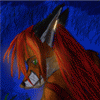
this is the line art for a poster i am currently working on it is included in a 45x52 inch poster that is curently beind drawn out it will be fully colored in photoshop 7
Category All / All
Species Unspecified / Any
Size 1280 x 1264px
File Size 143.7 kB

nicely done! Ok, so, I have a rule. When someone directly asks me to look at a piece, I take that as fair game to offer my honest opinions and critique a little. So don't take offense. What I say is intended to help you out.
The good first: The post is epic. You went the right route there. There is a lot of energy riding on this. I really like the direction you're taking it
Now, with that said, here is the not so good.:
First of all, you say in your discription that you are making this some ungodly size. Don't, trust me, it's not worth the hours of work because you can never print that, and that's assuming you can get it looking good at that size. Most people make that mistake. They think that the character is cool and the = make the drawing biiiiig. NO! LOL. If you want a poster sized image, you want to make it 11x17. That is standard printable poster size. Anything over that is gonna give you some real grief finding someone that can do it in those specs, affording the cost, then trimming it down because that exact size may not be right. And unless you are a master at trimming, you don't wanna try that. that will end in heart ache, trust me LOL
next, the guns. Get a ruler and straighten those suckers out! LOL you were pretty close, but guns are one of those things that everyone recognises and if they're off, even a little, people will notice. Now, you might be like "yeah, but it's a little thing." but it's not, because him firing the gun is the focul point for the whole pic. the back hand holding the other gun needs cleaned up too.
After that, the tail. Do the tail like you did his ponytail! You have all these tick marks in the tail and it lookes bad. At best it's a wirey mess, like steel whoole, at worse, they just look tacked on. The tale should be a fluid shape just the hair is, with the outside shapes and the inside more empty. Then, if you want more detaile you get into worting with color or how you shade. If you do it with lines, then you need to deal with shapes. adding extra tick marks or extra lines is not an effective way to go about it. Take a look maybe at some of my tales and you'll see what I'm talking about XD
Lastly: This is a HUGE PIECE! LOOL even if you size it down! Let's see more!, maybe size him down juuust a little, and put another character crouching and looking in the same direction he is shooting and then another character behind in the back ground but a little foreward of him also leaping back firing a weapon. In other words, give this poor guy some back up LOL. It will help you piece go from "huh, nice character..." to "OH MY GAWD!!! WOW!!!" you don't have to do what I said, but think of something XD. if nit characters, give us some really dynamic back ground stuff.
I know you are probably going "I'm not ready for all that!" but yes, you are! get on google! research the things you want! look at comic books and the way they set up their shots. This is a good piece man! but it could be totally awesome with just a little more work and a few tweaks in the right spots XD
Cheers and good luck! be sure to show me the final XD

Nicely done! I love the pose. The left leg looks a little odd; it's almost as though there's not enough fabric in the pants for him to extend that leg fully. It looks like it would either pull out of his boot or pull his pants down.
Keep it up, man, and this could be HELLA epic.
Keep it up, man, and this could be HELLA epic.
Comments