 FA+
FA+
1841
Views
Views
66
Favorites
Favorites
Category
Artwork (Digital) / Tutorials
Species Unspecified / Any
Size 841 x 818
File Size 335.9 kB
Report this content
More from Kuraianubis


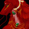
I was chatting with a friend about shading techniques and well..this is mine o.o
So follow the steps with the numbers and letters with my explanation that matches.
1. Flat color, not too bright and saturated. always choose something a little off from the pure color thats usually in the top right. Lets not blind anyone..and you need room for value.
2. Find your light source shown as (a.) then your shadow will be where the light does not touch. Look at an orb, or anything with a similar shape to the object... light wraps around things so try and picture it to place the shadows right. It wont always be a perfect balance of light and dark
3. choose a gradient of colors, dont just blend it together yet. make rings and layers, go ahead and sketch in movement too, it will all blend eventually
4. Blend it up by blur, smudge, or even for texture..use another brush with the opacity down so you blend the shades more
5. lets try fur, another flat color please.. a rich red
6. remember that light source (a.), and now we'll do that gradient thing with various shades, this time instead of smooth strips, lets give it a furry look. I use strokes like (b.) it makes the appearance of shaggyness.
7. dont just blur it..that'll destroy the texture, lets grab a watercolor brush and thin it out with opacity lowering, then smooth down our fur strokes for a blended but textured look
8. Sometimes you need to do something like scales or a patter that actually has raised sections that each need their own shading...soo..flat color please? lets do yellow, one of the hardest colors to shade besides black.
9. light source (a.) and lets use it to plan out where the overall light and shadow is. Yellow looks muddied if black is added, i use orange instead to add shadow, or maybe a nice brown..
10. I've mapped out each scale and shaded where the light doesnt hit as much, and where the light does shine on, because I knew where the light would cover it overall before I can control the amount the scales closer and father get..not each is equally as shiny..because thats still flat looking
11. Lets ad some realism and fun. Shading and light isnt just pure one color, or just black and white. The sun, your bulb, different rooms, different lights ALL have a color to them. Some can be white..yellow..blue..green..red.. whatever. Surrounding objects reflect color. Hold something to a brightly colored shirt..it can cast the color back onto the object. Everything is effected by an array of colors..our world isnt just one plain boring thing.
Using colors as shading and highlights can be a fun thing to play with. I like to use yellows or greens as the highlights, and blues and purples as shades.(c.)
I did it for both the fur and scales...does that not make a difference in look??
Enjoy and mess around with this style ^-^
Category Artwork (Digital) / Tutorials
Species Unspecified / Any
Size 841 x 818px
File Size 335.9 kB


Wow that helping alot thanks mate :) I have just 2 questions :
1- How did you use blue and purple for shading and they looked like deep red ? mine looked blue...
2- When I use blur and smudge to blend colors I don't get smooth colors as you , like in Orb 4 :(
I get almost as 3 with blured edges. is there spefic setting ?
Thanks , I'm new to photoshop , just moved from painter and they have different aspect and tools -_-
1. I made sure the color was very translucent. In PS thats the opacity setting, and this was done in Sai
2. Blur in PS reaallly wont do much, so try and mess with its settings. Also the smudge..mess with its settings too, and try and blend the colors in a circle and then smooth them down
2. Blur in PS reaallly wont do much, so try and mess with its settings. Also the smudge..mess with its settings too, and try and blend the colors in a circle and then smooth them down


Comments