 FA+
FA+
Staff Artist Asking for a Critique on His Coloring Technique
11 years ago
General
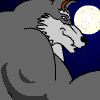
On of the Staff Artists has finished a piece located here . He is striving to do his art better and would like a critique on his coloring.
What he does not want: "lovely," "nice," "looking good," "great fapping material," "I want to bed him," "what a stud-fucker", "*gets on my knees to worship*".
You get the idea.
He would like constructive criticism.
If you dislike it, tell him why.
If you like it, tell him why.
If you just came all over your monitor because of it, please keep that TMI info to yourself!
Got it? If he gets better, you get a better coloring Commission, and that's what we're striving for. n'est-ce pas ?
Please post your commentary on THIS JOURNAL.
We will not comment on your comment. We want to remain neutral.
MuscleWolf
Everything else is beyond fantastic.
Here's my dilemma - people who say they want honest detailed critiques often aren't really prepared for the details.
So let's start with three VERY important things to keep in mind.
1. Your work is good. You have expression and a good sense of pose and physicality.
2. Whenever someone critiques, it's relative to THEIR ideals of 'good' - which may not be YOUR ideals.. so take it with a big grain of salt. In the end, this is you expressing your ideas in a way that works for you. If you like it - you're done. There is literally no other opinion that matters.
3. I'm not going to critique style or subject matter. Those are personal tastes.
With that out of the way, here are ten suggestions:
1. Try to thin down the outlines a bit. One trick is to use the thicker lines in non-repro blue (or any light blue line colour if you're digitial) then go over it again in black using a thinner line.
2. If you can, consider a pressure sensitive tablet for drawing. It lets you vary ink thickness as you draw and gives the drawing a more natural feel.
3. Watch your choices in your colour palate. The brown->tan->white works well, but the yellows are odd. Consider using complementary colours to enhance shading and depth.
4. You have a bit of lighting issues. This is a VERY common problem. In general, I suggest imagining your character in your head as a solid object then imagine where the shadows would be given where you think the lights are. In this case, It looks like it's all ambient light (the background is all kind of uniformly lit), but in fact, the sun will cause shadows to appear all on one side with some backlighting making them not so dark.
5. Look under his right (your left) pec. The colouring there is kind of weird.. I'm not sure what could cause that. :)
6. Be 3D aware. Look at the line of his upper abs on the right (your left)... Try to imagine the cross section of his abdomen there. It seems to me that you'd see some of his obliques or side off the right...
7. I'm not big into the whole 'muscle' thing - so I may be entirely wrong here - but I don't think a person can actually put their legs in that position. Specifically, his right leg is turned out so far that the knee cap is no longer visible. Suggestion - use reference material if you're not doing so already - and consider grabbing a copy of DAZStudio (http://www.daz3d.com/products/daz-s.....-is-daz-studio) which is a free, full featured program similar to Poser. The original idea of Poser was to be an electronic 'mannequin' you can pose and light to get a sense of what it 'should' look like. You can even enhance the musculature to create characters similar to the one you're drawing.
8. Two words: Butt Tail. :) Again, a VERY common thing. The tail is an extension of the spine. Looking at your composition, it would have to be coming out in the middle of the rump to hang like that, or it has a very thin strip that widens out to a full beaver tail.
9. I really like your use of colour shapes to create shadows - and the colour choices are excellent.. but.. consider 'blurring' them out a bit. The sharp edges seem harsh to me.
10. Colour consistency. The carpets don't match the drapes, if you know what I mean. :) Also - the little furry bits on his elbows are yet another colour.
I've taken notice within the MuscleWolfCompany gallery that majority of the pieces have similar body shape as this. I honestly don't know if this is done deliberately by the artist or that it is his style of work. If it is done deliberately, then in that case, to me personally it doesn't please my eyes but for others, they actually do love this kind of art style.
However if it isn't, I'm assuming people have said it before but I'm just going to say it, the anatomy needs work. Even when the artist is trying exaggerate certain body parts which I can understand, but there needs to be a balance. A good example for exaggerated muscles but still maintains that toony look is Johnny Bravo. True the art style is completely different but exaggeration in muscle shape wise and looks there is a balance for that character.
Pose wise is fine but, there is no gesture. It is stiff as a rock. When you look at poses similar to this piece, there is fluidity to that pose. I am personally still learning gesture drawing even though my strongest area is in photomanipulation, gesture drawing is a must and as it is one of the most fundamental basics things to learn in drawing before anything else including learning anatomy. Here is a small video which I am following this guy, Proko he explains it perfectly and why it is important http://www.youtube.com/watch?v=8j39NqwL7s4
Coloring, the artist knows how to add base and knows how to shade perfectly and adds that shine to indicate where light source is coming from. That's a huge plus because a lot of people struggle there and always give a flat look. However, there is just way to many spot shine on the figure. It's as if there are 20 different light spots just hitting this figure and shinning on each muscle area. It is confusing because I don't know which direction the light source is coming from and where are the shadow values. Light is tricky because when it hits an area it bounces off even on human skin it bounces off slightly. The light sources needs to be figured out for this piece because I can't tell. Even in a real oiled up muscle fitness champion, you can clearly see where the light is bouncing off from the gloss on his pecks, abs, legs, etc.
Lastly, the background. If using a real photo to be mixed with a toon figure is done deliberately then I have nothing to say there and my critique ends here. But if it isn't and the artist decided to just add a quick background for the finish... I honestly believe that the artist could have done a lot better job even for something really quick. The artist could have just slapped in a regular grudge paper stock for some good effect.
I hope what I said is helpful, as I am personally learning everyday whenever I create new art pieces. I also do basic starter video tuts for digital drawing and will continue to keep making them but that depends on users feedbacks and what users want on the next video.
Cheers!!
Also I've already shared my criticisms over the phone, so you're already aware there.