 FA+
FA+
Housecleaning: -50 : 780 Submissions Remaining
10 years ago
Things and things and more things :)
- Graphic novel stuff
- Grad school applications
- Teaching still
- Kink parties yay!
- Autumn leaves are happening, happening
1. NEW YORK:
http://www.newyorkcomiccon.com/
I will be at the New York Comicon this weekend, sitting at the table as colorist for the graphic novel FLUTTER, along with the writer and artist, etc.
If any of you are around Manhattan and want to show a donkey a good time this Friday or Saturday, let me know :)
2. BOSTON:
http://www.sgamassart.com/game-design-club/
I will be giving a talk on Modular Character Design at the Massachusetts College of Art this coming October 28 (Monday), 7pm
The talk will be amazing. If you're in/near Boston, drop by!
3. CAMBRIDGE:
http://www.micexpo.org/
I'll be attending MICE (Massachusetts Independent Comics Expo), October 17 (Saturday) in support of FLUTTER and so on.
Admission is FREE this year! Bring your comics. Make your comics. Where are your comics???
4. ARTSTUFF:
I personally just found out about these three artists that each make use of suggestion, fracturing and incompletion along with the clearly defined form. Sharing with you!
I. Antonio Mancini (1852 – 1930) Italian
ART: http://tinyurl.com/obof9d9
This was John Sargent's favorite painter, and the guy that showed him you can loosen the fuck up and it's okay. He was trained in the traditional way according to Renaissance ideals, but was also deeply interested in the hot new Impressionist stuff happening in France. His own approach was to proceed in the traditional manner of building a painting but to then stop at a point that would've been considered crude or unfinished or incomplete.
You can see this in some images that have a faint grid system throughout the piece, like this one - that comes from a technique of placing a large open frame between you and the subject (still life, model, landscape, etc.) and wrapping the frame in string horizontally and vertically to make a visual "grid". This grid you can then sketch onto your working surface and little by little transfer the bits you see more accurately. It's not a new technique, and in the end the final painting would cover all that up as just part of your working process. However, as with many things that start out as artifacts of construction, they become an aesthetic choice and Mancini like the way it looked, to see the means right there still embedded in the image. This draws attention to the surface of the image as a thing, a painting, not an illusion of a subject. The previous ideal was to minimize the surface as much as possible to make it seem like the image was window you could just reach right into. This new way of thinking about stopped you at the canvas, at the marks and smudges. It was a novel approach.
He also pushed this further, and if you see some of his later images, the "grid" from the string starts to be come less square, as he just wrapped the string more randomly, producing odd angles and slivers and triangles and shapes that seem embedded in the image more expressively, ephemerally like faint ley lines or new organizing principles for new forms.
Not only that, in many places his markmaking dissolves into what practically looks like the raw mess of the palette, all the right colors, just yet unworked into meaning, so that scrap of paper or edge of your image where you're testing your colors before you place them, that area is elaborated into the piece. All of this is showing the mechanics of the craft, instead of hiding it, which invites the viewer to step into the "studio" space as artist and feel what that's like. The image becomes much more interactive and a conversation, rather an a one way message of clarity from artist to viewer, you have to do some of the work in your eye and brain to finish and flesh out meaning from the suggestion.
This may not seem so novel to our eyes, used to sketches and roughs and so on. But this would have been a very daring and novel posture for a serious artist to take, to show what would essentially be "half-done" work as sufficient. It then starts to be art about making art as much as it is a portrait. It's a generous posture, as sketchwork tends to be, offering to the viewer a chance to hold the pencil or the brush, mentally.
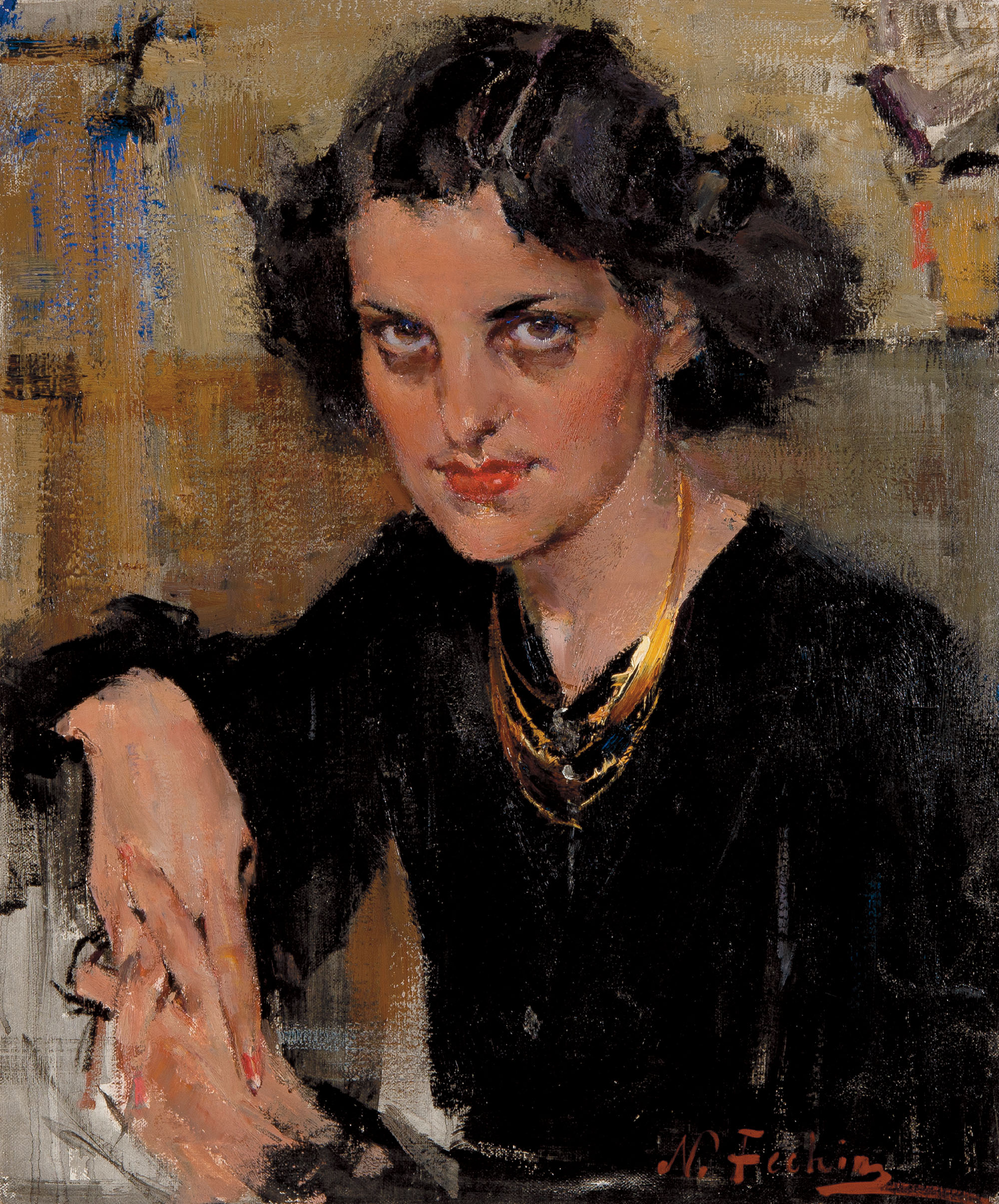
II. Nicolai Fechin (1881 - 1955) Russian
ART: http://tinyurl.com/nvc8ce5
This fellow was later, and straddled the end of the 19th century and the surging rise of the 20th. And you can see it in his art, it looks like good old Impressionist fare, but then you'll see things seem very modern and could have been done last week.
What I love about this guy's work is that roving curious eye of the portrait artist. Even a quick glance through the thumbnails will show an interest in a huuuuge range of types: old, young, male, female, white, brown, black, etc. It comes across as an artist that is curious about the human animal as a subject - it seems like this guy must really and actually like people. Everybody looks handled fairly to me, and he really seems to be aware of the person beyond the academic rendering of shapes.
one
two
three
four
five
six
seven
eight
nine
BONUS: check out his portrait of Boris Karloff <3
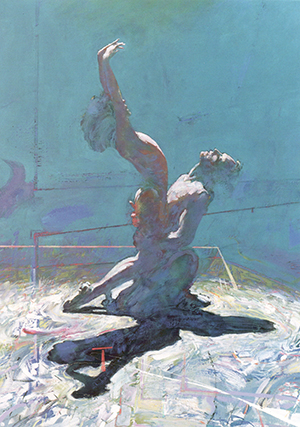
III. Robert Heindel (1938 - 2005) American
ART: http://tinyurl.com/oqeegud
Much more modern, this guy was really prevalent in the 80's and is know for his paintings ballet dancers and broadway imagery. He was working in New York and this all very much part of that time and place. His stuff also has this finished/unfinished quality that looks evocative and dreamy, showing dancers practicing. Perhaps themselves unfinished as they learn the routines or stretching, etc. It all feel very casual and light. Very good, tight, focused drawing underneath, but the painted surface feels distracted and ephemeral, beautiful. Those lines and smudges and marks in some images can seem like pure abstraction, but they are the lines of fresh and old tape on the floor, marking beats and paths and stop points. The scuffing from shoes on grubby dance studio planks becomes the scuffing of paint on the canvas. So it's observed reality, but looks like abstracted painting, and serves as both, really.
Anyway, checked in for more housekeeping here.
Hope you are all doing well. Everyone says "Hi" <3
- Graphic novel stuff
- Grad school applications
- Teaching still
- Kink parties yay!
- Autumn leaves are happening, happening
1. NEW YORK:
http://www.newyorkcomiccon.com/
I will be at the New York Comicon this weekend, sitting at the table as colorist for the graphic novel FLUTTER, along with the writer and artist, etc.
If any of you are around Manhattan and want to show a donkey a good time this Friday or Saturday, let me know :)
2. BOSTON:
http://www.sgamassart.com/game-design-club/
I will be giving a talk on Modular Character Design at the Massachusetts College of Art this coming October 28 (Monday), 7pm
The talk will be amazing. If you're in/near Boston, drop by!
3. CAMBRIDGE:
http://www.micexpo.org/
I'll be attending MICE (Massachusetts Independent Comics Expo), October 17 (Saturday) in support of FLUTTER and so on.
Admission is FREE this year! Bring your comics. Make your comics. Where are your comics???
4. ARTSTUFF:
I personally just found out about these three artists that each make use of suggestion, fracturing and incompletion along with the clearly defined form. Sharing with you!
I. Antonio Mancini (1852 – 1930) Italian
ART: http://tinyurl.com/obof9d9
This was John Sargent's favorite painter, and the guy that showed him you can loosen the fuck up and it's okay. He was trained in the traditional way according to Renaissance ideals, but was also deeply interested in the hot new Impressionist stuff happening in France. His own approach was to proceed in the traditional manner of building a painting but to then stop at a point that would've been considered crude or unfinished or incomplete.
You can see this in some images that have a faint grid system throughout the piece, like this one - that comes from a technique of placing a large open frame between you and the subject (still life, model, landscape, etc.) and wrapping the frame in string horizontally and vertically to make a visual "grid". This grid you can then sketch onto your working surface and little by little transfer the bits you see more accurately. It's not a new technique, and in the end the final painting would cover all that up as just part of your working process. However, as with many things that start out as artifacts of construction, they become an aesthetic choice and Mancini like the way it looked, to see the means right there still embedded in the image. This draws attention to the surface of the image as a thing, a painting, not an illusion of a subject. The previous ideal was to minimize the surface as much as possible to make it seem like the image was window you could just reach right into. This new way of thinking about stopped you at the canvas, at the marks and smudges. It was a novel approach.
He also pushed this further, and if you see some of his later images, the "grid" from the string starts to be come less square, as he just wrapped the string more randomly, producing odd angles and slivers and triangles and shapes that seem embedded in the image more expressively, ephemerally like faint ley lines or new organizing principles for new forms.
Not only that, in many places his markmaking dissolves into what practically looks like the raw mess of the palette, all the right colors, just yet unworked into meaning, so that scrap of paper or edge of your image where you're testing your colors before you place them, that area is elaborated into the piece. All of this is showing the mechanics of the craft, instead of hiding it, which invites the viewer to step into the "studio" space as artist and feel what that's like. The image becomes much more interactive and a conversation, rather an a one way message of clarity from artist to viewer, you have to do some of the work in your eye and brain to finish and flesh out meaning from the suggestion.
This may not seem so novel to our eyes, used to sketches and roughs and so on. But this would have been a very daring and novel posture for a serious artist to take, to show what would essentially be "half-done" work as sufficient. It then starts to be art about making art as much as it is a portrait. It's a generous posture, as sketchwork tends to be, offering to the viewer a chance to hold the pencil or the brush, mentally.
II. Nicolai Fechin (1881 - 1955) Russian
ART: http://tinyurl.com/nvc8ce5
This fellow was later, and straddled the end of the 19th century and the surging rise of the 20th. And you can see it in his art, it looks like good old Impressionist fare, but then you'll see things seem very modern and could have been done last week.
What I love about this guy's work is that roving curious eye of the portrait artist. Even a quick glance through the thumbnails will show an interest in a huuuuge range of types: old, young, male, female, white, brown, black, etc. It comes across as an artist that is curious about the human animal as a subject - it seems like this guy must really and actually like people. Everybody looks handled fairly to me, and he really seems to be aware of the person beyond the academic rendering of shapes.
one
two
three
four
five
six
seven
eight
nine
BONUS: check out his portrait of Boris Karloff <3
III. Robert Heindel (1938 - 2005) American
ART: http://tinyurl.com/oqeegud
Much more modern, this guy was really prevalent in the 80's and is know for his paintings ballet dancers and broadway imagery. He was working in New York and this all very much part of that time and place. His stuff also has this finished/unfinished quality that looks evocative and dreamy, showing dancers practicing. Perhaps themselves unfinished as they learn the routines or stretching, etc. It all feel very casual and light. Very good, tight, focused drawing underneath, but the painted surface feels distracted and ephemeral, beautiful. Those lines and smudges and marks in some images can seem like pure abstraction, but they are the lines of fresh and old tape on the floor, marking beats and paths and stop points. The scuffing from shoes on grubby dance studio planks becomes the scuffing of paint on the canvas. So it's observed reality, but looks like abstracted painting, and serves as both, really.
Anyway, checked in for more housekeeping here.
Hope you are all doing well. Everyone says "Hi" <3
I bet my fiance would maybe like Heindel. He is really into Richard Diebenkorn and a long time ago used to paint a bit like both and its hard to cattle prod him back into doing art (I just have slides of his old art xc)
---
Hm, I can't find the title of #9 from Nicolai Fechin, but it's a great example of drawing the eye in quite hard to the center of focus; long, blocky, messy lines of color keep resolving concentrically to "push" the eye towards the finer, human detail of the face.
(It was originally your art that taught me THAT trick, hmmmmmmm.) :)
---
I'm a big fan of the way Heindel applied that half-finished motif later in his swimmers, like so: https://www.artbrokerage.com/art/he.....el_65168_3.jpg
The way he distorts and plays with the colour hues suggests to the eye a transparency and fluidity of the swimmer that mimics that of the water.
---
*sends many hugs* By the by, if you ever become tremendously unbusy again, I'd love to talk to you about illustrating "Where the Stars Dance". :)
Hugs to you too!
by HELL I mean LOCAL ICE CREAM SHOPPE and
by DEAD I mean DONKEYS
I still want to come by your place with a pile of money and relieve you of some originals.