 FA+
FA+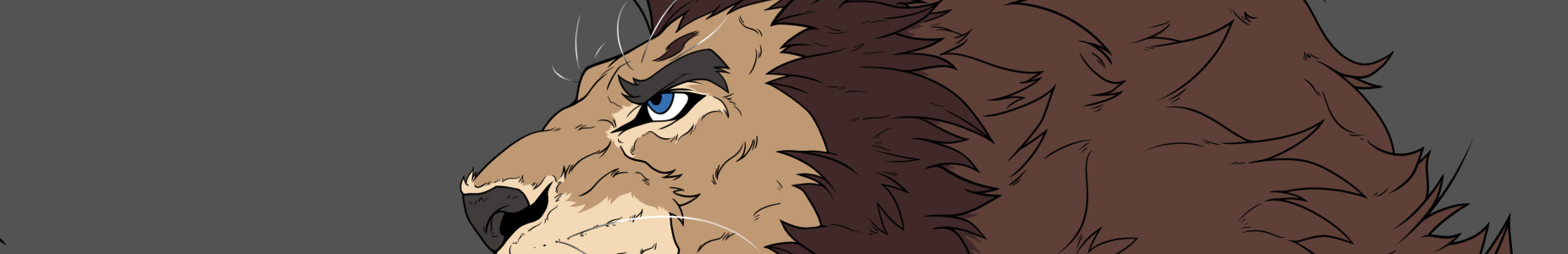
Contrast correction in my last drawings
5 years ago
Hi there! ^^
Thanks to my friend menceybentayga I have noticed an important mistake that I have been making when I scan my drawings, In general, I don't like to modify or edit the drawings that I scan to preserve the fidelity of the traditional drawing, I want the digitization of a handmade drawing to transmit the original strokes and colors of the paper.
That's why when I scan color drawings, linearts or grayscale I only clean the white background of the drawing (the paper texture) and the little impurities in the scan, however my mistake was not taking into account the brightness of the scan, since when the scanner works, it uses light when digitizing and capturing the image, consequently, the image is brighter than it should be.
I had not realized this, and although the images don't look bad, they are so bright that in some cases many strokes and aspects of the drawing cannot be appreciated, this is evident when I compare the original physical drawing with the image, and the colors are much stronger in the physical version.
So from now on, when I scan any of my drawings, I will use a couple of CSP tools to raise the contrast of the colors and thus get closer to the physical version, seeking to counteract the excess light from the scan.
That is why I'm going to republish my last 6 commissions with these changes, I will leave links to the previous scans in each publication so that you can compare the difference.
I will also contact the commission owners to mail them the update files for their drawings, I'm a bit busy this weekend, so I will gradually publish each update.
Without further ado I hope you have a good day! ^^
Thanks to my friend
 menceybentayga I have noticed an important mistake that I have been making when I scan my drawings, In general, I don't like to modify or edit the drawings that I scan to preserve the fidelity of the traditional drawing, I want the digitization of a handmade drawing to transmit the original strokes and colors of the paper.
That's why when I scan color drawings, linearts or grayscale I only clean the white background of the drawing (the paper texture) and the little impurities in the scan, however my mistake was not taking into account the brightness of the scan, since when the scanner works, it uses light when digitizing and capturing the image, consequently, the image is brighter than it should be.
I had not realized this, and although the images don't look bad, they are so bright that in some cases many strokes and aspects of the drawing cannot be appreciated, this is evident when I compare the original physical drawing with the image, and the colors are much stronger in the physical version.
So from now on, when I scan any of my drawings, I will use a couple of CSP tools to raise the contrast of the colors and thus get closer to the physical version, seeking to counteract the excess light from the scan.
That is why I'm going to republish my last 6 commissions with these changes, I will leave links to the previous scans in each publication so that you can compare the difference.
I will also contact the commission owners to mail them the update files for their drawings, I'm a bit busy this weekend, so I will gradually publish each update.
Without further ado I hope you have a good day! ^^

Bentayga
~menceybentayga
¡Me alegro de haber podido ayudar! la verdad es que me traía loco lo claras que se veían las imágenes, me pilló con el PS abierto... pensé que no haría daño comentártelo. La verdad es que el cambio es impresionante, y los resultados finales hacen muchísima mas justicia a tu arte!

Kral921
~kral2012
OP
Gracias man! T^T te debo una!