 FA+
FA+

Found(ry): Ten Dollar Fonts
General | Posted 13 years agoJust got linked to this site from a friend on Facebook and as the name implies, all fonts on their site are only $10 ($15 if you want a commercial license for them).
http://www.tendollarfonts.com/
I'm really feeling these fonts on here!
http://www.tendollarfonts.com/produ.....twood-typeface
http://www.tendollarfonts.com/produ.....ndact-typeface
http://www.tendollarfonts.com/produ...../lomo-typeface
http://www.tendollarfonts.com/produ.....-mono-typeface
http://www.tendollarfonts.com/produ.....ntzen-typeface
Whenever I have some money to spare I'm probably gonna throw some at these guys. There's some great stuff on TDF.
-

Typography Term of the Day and Graphic Design Commissions!
General | Posted 13 years agoHey guys! I know it's been WAY too long (you other mods are just as bad of slackers as I am on this stuff D:)
SO I'm gonna give you a TWOFER this time!
Here are your typography terms of the day:
"EM" and "EN"
What is an em? What is an en?
Ems and ens are relative units of measurement used in typography to define spacing functions. They may also be used as special dashes known as em dashes or en dashes.
So how big is an em and how big is an en? And how long is a standard hyphen compared to em and en dashes?
An em is the size of the given type. For example, if you have a 72 point font, your em for that specific type will be 72 points long. An en is half of one em. So again, if you have a 72 point font, your en will be 36 points long. A standard hyphen mark is 1/3 of an em. So once more, a hyphen for a 72 point font would be 24 points long.
What to em and en dashes look like in comparison to a hyphen?
Em dash: —
En dash: –
Hyphen: -
Are em and en dashes interchangeable with hyphens and if not, when do I use them?
Em and en dashes each have their own very specific function in type as they are distinct and specific pieces of punctuation. En dashes are most typically used to show a range of values (such as May 2–5th or April–May) but are also used in other specific/uncommon grammatical situations. Em dashes are most typically used to indicate long pauses in thought that are meant to have a stronger emphasis than use of parenthesis (similar to an ellipsis). They are also typically used to indicate broken or unfinished sentences in literature. For example
"I really didn't intend for you to feel that way —"
"I still can't believe you said that to me"
"— but I promise I will make it up to you."
ANYWAY Hopefully everyone learned something again! And just to make this account more useful than just typography terms of the day and a cool little icon to share with your friends, allow me to pimp out an offer I have extended here for some quick graphic design (and typography) related services!
Have a good day and remember — times new roman might be cool for term papers but forget it when it comes to good typography!
<3 icee
icee
SO I'm gonna give you a TWOFER this time!
Here are your typography terms of the day:
"EM" and "EN"
What is an em? What is an en?
Ems and ens are relative units of measurement used in typography to define spacing functions. They may also be used as special dashes known as em dashes or en dashes.
So how big is an em and how big is an en? And how long is a standard hyphen compared to em and en dashes?
An em is the size of the given type. For example, if you have a 72 point font, your em for that specific type will be 72 points long. An en is half of one em. So again, if you have a 72 point font, your en will be 36 points long. A standard hyphen mark is 1/3 of an em. So once more, a hyphen for a 72 point font would be 24 points long.
What to em and en dashes look like in comparison to a hyphen?
Em dash: —
En dash: –
Hyphen: -
Are em and en dashes interchangeable with hyphens and if not, when do I use them?
Em and en dashes each have their own very specific function in type as they are distinct and specific pieces of punctuation. En dashes are most typically used to show a range of values (such as May 2–5th or April–May) but are also used in other specific/uncommon grammatical situations. Em dashes are most typically used to indicate long pauses in thought that are meant to have a stronger emphasis than use of parenthesis (similar to an ellipsis). They are also typically used to indicate broken or unfinished sentences in literature. For example
"I really didn't intend for you to feel that way —"
"I still can't believe you said that to me"
"— but I promise I will make it up to you."
ANYWAY Hopefully everyone learned something again! And just to make this account more useful than just typography terms of the day and a cool little icon to share with your friends, allow me to pimp out an offer I have extended here for some quick graphic design (and typography) related services!
Have a good day and remember — times new roman might be cool for term papers but forget it when it comes to good typography!
<3
 icee
iceeTypography Term of the Day: Ligature (and HI!)
General | Posted 13 years agoHey guys!
Icee here! Just wanted to introduce myself as one of your moderators. I have a bachelor of fine arts in graphic design from Iowa State University and love well designed typography so I feel very qualified as a moderator of this page. If you ever have any questions relating to typography or graphic design in general, please don't hesitate to send a message to here or to my personal account!
I thought I'd make things a little more lively here by starting up a typography term of the day thing! (Hopefully the other moderators might enjoy following suit and posting their own terms. :D)
We are going to start off with the term "ligature!"
What is a ligature?
A ligature is when you combine two or more graphemes (letters... or characters in the case of some languages) into one glyph.
Where are ligatures used in every day type?
Ligatures are often used for words that have more than one pronunciation.
Words like "æther," "færie," and "dæmon" all make use of a ligature combining the letters "a" and "e"
Ligatures are also often used when two letters might create awkward spaces when typed separately or might be more easily written when combined into one symbol.
Letters often combined into one ligature are "tt," "ff," "fi" and many more!
When else are ligatures used?
Ligatures are also very commonly used in logos and monograms! They tend to look very classy and can create unique and original shapes that might become a trademark!
Some ligatures you might be very familiar with are found in the CNN logo , the General Electric logo, and the Chili's logo just to name a few.
Anyway hopefully some of you learned a little something today or had your existing knowledge reinforced! Have a wonderful day and remember, every time you use comic sans, a designer loses their wings! (Don't do it!!)
<3 icee
Icee here! Just wanted to introduce myself as one of your moderators. I have a bachelor of fine arts in graphic design from Iowa State University and love well designed typography so I feel very qualified as a moderator of this page. If you ever have any questions relating to typography or graphic design in general, please don't hesitate to send a message to here or to my personal account!
I thought I'd make things a little more lively here by starting up a typography term of the day thing! (Hopefully the other moderators might enjoy following suit and posting their own terms. :D)
We are going to start off with the term "ligature!"
What is a ligature?
A ligature is when you combine two or more graphemes (letters... or characters in the case of some languages) into one glyph.
Where are ligatures used in every day type?
Ligatures are often used for words that have more than one pronunciation.
Words like "æther," "færie," and "dæmon" all make use of a ligature combining the letters "a" and "e"
Ligatures are also often used when two letters might create awkward spaces when typed separately or might be more easily written when combined into one symbol.
Letters often combined into one ligature are "tt," "ff," "fi" and many more!
When else are ligatures used?
Ligatures are also very commonly used in logos and monograms! They tend to look very classy and can create unique and original shapes that might become a trademark!
Some ligatures you might be very familiar with are found in the CNN logo , the General Electric logo, and the Chili's logo just to name a few.
Anyway hopefully some of you learned a little something today or had your existing knowledge reinforced! Have a wonderful day and remember, every time you use comic sans, a designer loses their wings! (Don't do it!!)
<3
iceeHandy Dandy Font Anatomy Reference!
General | Posted 13 years agohttp://www.fontshop.com/glossary/
Slightly more condensed reference.
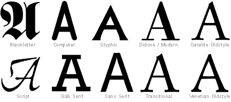
Quick reference of font classifications. To most people Venetian, Transitional, Didone and Oldstyle all translate to pretty much Serif fonts. Your call if you want to split the hairs or not!
Slightly more condensed reference.
Quick reference of font classifications. To most people Venetian, Transitional, Didone and Oldstyle all translate to pretty much Serif fonts. Your call if you want to split the hairs or not!