 FA+
FA+
1371
Views
Views
89
Favorites
Favorites
Category
All / General Furry Art
Species Unspecified / Any
Size 900 x 605
File Size 255.7 kB
Report this content
More from Briarwood


![getting there [WIP]](http://d.furaffinity.net/art/briarwood/1361874084/1361874084.briarwood_falloutsocietywip05.jpg "Click to change the View")

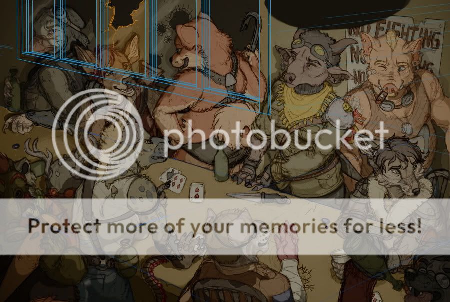
Ok, so I lied about the previous wip post being the last one. THIS is the last one, since all that's left now is a metric fuckton of painting over sketch lines... but all the basic shadows and colors are there.
Part of me doesn't want to post this because I don't want to 'spoil' the finished painting too much... but I would like to make this available for critiques and suggestions, since I have never attempted a scene this ambitious before. Particularly if anyone can help me figure out what's wrong with the window, because it's driving me crazy.
Part of me doesn't want to post this because I don't want to 'spoil' the finished painting too much... but I would like to make this available for critiques and suggestions, since I have never attempted a scene this ambitious before. Particularly if anyone can help me figure out what's wrong with the window, because it's driving me crazy.
Category All / General Furry Art
Species Unspecified / Any
Size 900 x 605px
File Size 255.7 kB

I think the problem with the window is actually from two issues. One being the perspective of the broken glass. It looks as though you're looking at it straight on when the glass is actually at an angle. The other thing is the poster to the right of the window. The perspective doesn't line up correctly. The bottom half of it needs to be skewed to the left I think.
Regardless this looks fantastic so far :D
Regardless this looks fantastic so far :D

It feels like the bottom frame of the window feels off but I'm not sure if I'm right on that. I took a look at it in full size to look at it. I'm also thinking that the flat-ness of the darker colour in the window may be throwing off how... dimensional the rest of the image appears if that helps any.
Honestly, I believe you'd done a -wonderful- job with this image and I'm really looking forward to seeing this finished. Personally I like the "mess" of sketch lines and WIPs -- I guess I find they show a certain level of personality compared to fully polished images.
Honestly, I believe you'd done a -wonderful- job with this image and I'm really looking forward to seeing this finished. Personally I like the "mess" of sketch lines and WIPs -- I guess I find they show a certain level of personality compared to fully polished images.
The windowsill is definitely wonky, I couldn't decide if I wanted a ledge or just a recess into the wall, so I kinda tried to draw both XD I'll try to think of something else to go in the dark areas, but I don't want the background to have too many things going on, either. Hmm.
Thank you! Honestly, I love pieces with sketchy lines too, but I already do plenty of those. I'm trying to push my digital coloring skills by doing more polished things. c:
Thank you! Honestly, I love pieces with sketchy lines too, but I already do plenty of those. I'm trying to push my digital coloring skills by doing more polished things. c:

You mean in relation to the window, like she looks like she's smushed against the wall? Yeah, I can see that, that's what's bugging me so much. I tried to make the window line up with the table, but I have no idea how to make the window look farther away and still be visible in the background. 9_6 what is interior perspective
Thank you, though! :3
Thank you, though! :3


I feel the window is far too bright for where it is in the scene. With as bright as it is it looks far closer than the characters suggest which is a little bit confusing. I think if you darkened up the background the farther from the light it gets it will look better! And the shadows coming off of everyone on the background onto the wall throw off their placement. I think the pig in the back is the only one with the correct shadow cast on the wall because he is the one farthest back, so he sets the precedent for the wall placement. The other four to the left of him shouldn't have their shadows so visible right off them since they are closer to the table.
Hope the makes sense and helps!
This looks great so far though. Look forward to seeing the finished version!
Hope the makes sense and helps!
This looks great so far though. Look forward to seeing the finished version!

Trying to contain my excitement at how cool this is. To me, the window, though it may line up with the bar, looks a bit detailed and "foreground" -ie. My only idea for a possible fix would be to shrink it a bit more toward the left side, since when I look at it it kind of feels like the left side is tilted a bit toward me compared to the rest of the wall? It might just be one of those perception trick things.
Love the NO FIGHTING poster!
Love the NO FIGHTING poster!
I thought I had lined it up correctly, but it might be different because it's an interior shot, I dunno. I can draw a building from the outside in perspective, no problem, but when you throw a bunch of inner walls and furniture and stuff in there it gets so much more confusing. 8C
...actually, come to think of it, this would be three-point perspective since it's an overhead shot, wouldn't it. Somehow they never covered that in my drawing classes, shit. D:
Thank you though!
...actually, come to think of it, this would be three-point perspective since it's an overhead shot, wouldn't it. Somehow they never covered that in my drawing classes, shit. D:
Thank you though!

The 3D placement of the characters feels excellent. Very lively and natural interactions.
The window: we all see windows every day. For a standard window that means the bottom window frame has to perfectly match the perspective-lines (& vanishing point) of the room & table (unless you make the case that they are out-of-line). The quick fix is to imply that the window is a 'french door' going all the way down to the floor. The longer fix is to re-do the bottom window frame at shoulder-height, with the perspective more exact.
The window reflections (the diagonal smears) are not working. That's a visual meme that we accept for more cartoony work, cartoons without a realistic lighting treatment. You can do something sketchy, but the windows may have to be a bit more in painting-style. We expect to see real mirror reflections in smooth glass (even if the reflections are blobs without details or blurry). It will be easier to assume the windows are totally dusty, or painted over. Then you won't have to show the difficult cartoony diagonal washes that hint that the window is perpendicular to the viewer. The painted windows will have a flat-colored surface that may have some regular shadows, and some dark voids where the glass is broken out. Everyone has seen painted-over windows, so that's how they will interpret the visual.
Having the window open on each side feels right, so there is ventilation in this crowded place. We expect that the window panes are going to be exactly the same width (but in perspective), or at least symmetrical -- unless there are clues that those window panes slide behind one another. (The clues are lines showing the edge of the panes.) There are perspective fixes to exactly position the vertical 'mullions' between the panes of glass. Or, the quick fix is to take out the mullions. Big window, with a lot of holes in it.
Even though a window can have irregular broken holes in it, we expect a circular hole to be in perspective on the glass surface. You might have to imagine a grid to make the circular holes have an expected perspective shape.
I just realized in my reply to another person above, I think my problem is that I was working off of two-point perspective, but this would actually be three-point because of the overhead angle, wouldn't it? I never learned three-point perspective properly and I didn't even think about it until just now. D:
Thanks for the feedback on the reflections. I'd definitely like to go for dusty, dirty glass instead of perfectly shiny, but I think for that to be most effective it would have to be backlit by sunlight, and I'd have to change the lighting entirely... at this point I might just scrap the window idea and go for a big industrial fan behind a grate, or something. I just want something in that background space so it's not entirely empty, you know?
Anyway, it's reassuring to hear that the character placement is okay, since they were all pasted together out of four separate pages of sketches with no real guidelines or anything, haha. Thank you!


I d'know if this helps any? I figured that one way to make the window have more depth would be just to flesh out the details a bit more so there's more for the eye to work with to create the illusion of perspective.
This is looking really, really fantastic so far too. <333
This is looking really, really fantastic so far too. <333
That redline looks awesome (how are you so good at perspective and detail on buildings, gosh) but I'm still trying to figure out how I can make the window look less like the characters are smushed right up against it, and I think I'll need to reposition the entire thing somehow. Thank you, though! It'll really help when it comes to putting the details on it. <3


I haven't worked on it in a while, but there is significant progress since this post! Three characters are mostly painted in, a fourth is on the way, and the color contrast has been adjusted. Here- http://i.imgur.com/Kgxvrvl.jpg
Comments