 FA+
FA+
1596
Views
Views
92
Favorites
Favorites
Category
All / All
Species Unspecified / Any
Size 995 x 752
File Size 546 kB
Report this content
More from Beetlecat


Listed in Folders


Go to http://www.beetlecat.artfire.com for more information ^_^
Category All / All
Species Unspecified / Any
Size 995 x 752px
File Size 546 kB
Listed in Folders
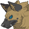


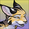
The quick answer is that I did several prototypes and this one stood out the best in the variation of colour - there is more 'omph' and contrast between yellow and orange than there is between light sandy and darker sandy.
That said, I don't have a problem omitting the yellow if you prefer. I can use orange on a lighter airbrush setting for the gradients instead and go over the darker points with a light brown. Just leave me a note with your order to that effect ^_^
That said, I don't have a problem omitting the yellow if you prefer. I can use orange on a lighter airbrush setting for the gradients instead and go over the darker points with a light brown. Just leave me a note with your order to that effect ^_^

thanks for getting back to me. yes, there's definite oompf there. it wouldn't even need to be much different really if you were worried about spoiling the look, just so it leaned a bit more on the side of orange than yellow. but your suggestion sounds nice ^_^. i will definitely have to strongly consider this. hoping to put in an order tomorrow provided my husband doesn't object too much (we're saving up for a couple of things, but since it was my birthday the other day, i might just manage to allow myself something fun).


Comments