 FA+
FA+
667
Views
Views
86
Favorites
Favorites
Category
Artwork (Digital) / Fanart
Species Unspecified / Any
Size 877 x 830
File Size 628.8 kB
Report this content
More from Rings1234


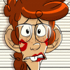
So this is the Mega Man pic i did for Archie's contest, i was upset when i saw that I didn't even make the honorable mentions but looking at the pic now I'm not really that upset any more. I really like the over all look and what not but looking at it now after all this time I can see some places that have lots of room for improvement, mostly his head and face they look really off to me.
Category Artwork (Digital) / Fanart
Species Unspecified / Any
Size 877 x 830px
File Size 628.8 kB


Archie Comics, like a lot of magazines, are notorious for choosing "children's drawings" more than anything by anyone else--and they also look at your age and pretty much throw you out if you're over 20 (or so it seems 99% of the time).
I think this is fabulous and should have been picked!
I think this is fabulous and should have been picked!


I think you did a nice job on the Megaman dood
I'd say what might've thrown it off was the overall composition tho.
For some reason your pixelated background just doesn't seem to integrate well with the cartoon character overlapping it. It've been cooler to see a full cartoon style background instead, even if just with basic colors and whutnot.
Regardless any Megaman contribution you do is awesome Ringsies.
Respect knuckles on those custom 1up sprites btw =)
Comments