 FA+
FA+
358
Views
Views
4
Favorites
Favorites
Category
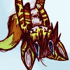
Artwork (Digital) / Pokemon
Species Mouse
Size 555 x 503
File Size 272.1 kB
Report this content
More from K-PUZ


haha, lets start the curriculum, shall we? >wO
(line-arts courtesy of Pichu90)
i made this just learning myself, so is not very professional... ^^;
OK, so now i'm gonna show u some basic simple things about coloring and layer modes... mostly layer modes...
so, what is a layer mode? it affects the behavior and blending of one or more layers in relation to each other or to itself. (not from the help file, i came up with dat myself)
so now i'm gonna show u some examples of what layer modes can do.
in the following, the description comes first, followed by the link, then a little more elaboration if necessary.
example1 - this is a two-layer project. i will be changing layer modes to demonstrate what u can do. "layer 0" is the main layer, and the one i will be changing blending modes on. here, it is shown in normal mode, 100% opacity. note dat i will not be changing the opacity of this layer at any point, it is to remain at 100%. "layer1" is the color layer and is underneath "layer0". i will be modifying "layer1" only once, to demonstrate the difference in opacity vs. layer modes.
http://dos.clawz.com/miscpics/FA/coloring1.png
notice dat the coloring is not visible at all, even tho u can see it is placed underneath the main layer. both layers are in normal mode, 100% opacity.
example2 - i moved the color layer on top of the main layer. now u can see the coloring but not the main layer.
http://dos.clawz.com/miscpics/FA/coloring2.png
in this instance, the color layer is completely obscuring the main layer because it is at 100% opacity, essentially "painting over" the original work.
example3 - in this instance, the color layer is still on top and the opacity of the color has been dropped to 65%.
http://dos.clawz.com/miscpics/FA/coloring3.png
now u can see both the original and the color, but both are faded. part of this is because the color now essentially has "holes" in it, allowing u to see whats underneath but also taking away form the color. and since the color is still partially obscuring the original work, the main layer is also faded.
example4 - this time, the color is back beneath the main layer. from here on out, the color layer will remain at 100% opacity. now we are changing the layer mode for the main layer. so instead of simply having a layered effect now, we are actually blending. the main layer is set to "darken", as can be seen in the layer mode.
http://dos.clawz.com/miscpics/FA/coloring4.png
note how both the original and the color is now more clearly visible, and colors are vivid. however, on darker colors, the color still tends to cover up the original work. i cant say for sure exactly how this mode works, but the darker the color, the more it obscures the main layer. it seems dat the darker colors actually darken over what is there.
example5 - the main layer has been changed to "multiply", and more accurately represents what real marker coloring would look like.
http://dos.clawz.com/miscpics/FA/coloring5.png
notice how the color is not obscuring anything, but blending, as a real marker would do on paper.
example6 - next i have changed the main layer to "color burn", which has the opposite affect of "darken". what is happening here is the lighter colors are obscuring the original, while darker colors are blending better.
http://dos.clawz.com/miscpics/FA/coloring6.png
u might could say the lighter colors are 'burning up' the original because they are 'hotter' colors... (this is just a simple child-like comparative observation, i kno its not accurate, its just to keep things simple)
example7 - this time the main layer is set to "linear burn", which as it indicates, creates extremely linear results. essentially, it is forcing the color straight thru the original work, adding the color of the main layer and color layer together, which also darkens the end result.
http://dos.clawz.com/miscpics/FA/coloring7.png
this probably closer represents what a real marker would do (dat is, normal markers on ordinary paper. i'm sure prisma markers and art paper would yield different results)
now then, here is something for u to try...
this is the color layer. simply left click on the image and "copy", then open the original sketch and make a new layer, and paste it into the new layer. the color layer is the exact same size as the sketch, so it should go right on top of the original. the original is here: http://www.furaffinity.net/view/1025897/
and the color is here: http://dos.clawz.com/miscpics/FA/pu.....ychu2color.png
make sure to have the color layer beneath the original. have the original selected, then go down the list of layer modes to see for yourself how the original changes based on the layer mode.
thanks for reading >wO
did this lesson make useful for u? =3
Category Artwork (Digital) / Pokemon
Species Mouse
Size 555 x 503px
File Size 272.1 kB

You know what? now I understand more about your childlike behavior you mention on your fact #4, I can see you can explain very good with correctly written english words when serious about something. A sharp contrast with the ending sentences.
About your submission, thanks for the lessons, I will try it when I get out of the laziness of coloring my drawings.
About your submission, thanks for the lessons, I will try it when I get out of the laziness of coloring my drawings.


Comments