 FA+
FA+
757
Views
Views
74
Favorites
Favorites
Category
All / All
Species Unspecified / Any
Size 1100 x 780
File Size 147.5 kB
Report this content
More from Capreolus
")
")


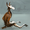
Harder, Better, Faster, Stronger - our work is never over.
Was reading ethology today.
Freewill and construction... Contrast or complement?
(First work of mine that doesn't look horrible when viewed small. yay. but now it looks horrible up-close.)
(Info about this sacrifice series thing here.)
Was reading ethology today.
Freewill and construction... Contrast or complement?
(First work of mine that doesn't look horrible when viewed small. yay. but now it looks horrible up-close.)
(Info about this sacrifice series thing here.)
Category All / All
Species Unspecified / Any
Size 1100 x 780px
File Size 147.5 kB


I wish I had good, profound things to say to match the meaning it looks like you put into your work. Unfortunately I'm just kind of struck dumb. I try not to fave without commenting too often, and you're definitely deserving of good comments. Rambling, agh, I love your work to pieces and your skill is ...::waves hands around in the air::. Basically. Which is a good thing.


I do the same thing. I get tunnel vision really bad about details and things start to get too segmented. Regardless this worked out very nicely =) Kepp up the beautiful work my friend...when I get too specific I sit back and work or take a break...sorry I'm kind of out of it right now ^^;
Agreed. :]
Actually, i've discovered works of Jean Tinguely quite recently. He made the most zoomorphic abstract machine sculptures ever... Especially the movement... it's completely zoomorphic and creepy. His works made quite an impression on me, so it's quite possible this is inspired as a result.
Actually, i've discovered works of Jean Tinguely quite recently. He made the most zoomorphic abstract machine sculptures ever... Especially the movement... it's completely zoomorphic and creepy. His works made quite an impression on me, so it's quite possible this is inspired as a result.


However this was done, it's stretching things even more. You still have that slashed-on painter quality but it's almost as if you were painting with slabs of wood. This looks effortless, though I know it wasn't. There's a slight sense of Degas in the composition; I love how he was able to have figures, even single ones traipse off the canvas and have the composition work.
Some of his stuff was straight forward but here and there, he's got stuff at the horse track in weird comps that work, or some of the dancers drawn from above. Anyone that plays with comp like that is worth studying. This
http://www.malaspina.com/jpg/sargent.jpg
is one of my favorite portrait compositions, not only because of the gloomy shadowy nature of it but because it really flies in the face if convention AND it works just fine. It's an amazing painting I've been lucky enough to see in person many times. Even classical painters sometimes have stuff worth bringing back into the current day.
And you're welcome! :"D
Hell yes, that's one of the most memorable portraits ever. What's even more surprising is that it wasn't a personal work - it was commissioned. I also like J.S.Sargent for how he handled light and paint. His watercolors are amazing, too. Too bad i didn't have a chance to see the original. =/
True. There's quite a lot to be learned from them.
Overall, there's quite alot to be learned from any art... Nowadays i'm fascinated with cave paintings. Animals there are so well observed and concentrated into their essencials, I'm not surprised noone believed they were that old when they were discovered.
For even more eye openers, I suggest "30,000 Years of Art," a REALLY big art book that is exactly what it says; a sampling of art shown in chronological order from all over the world. It's amazing how modern some of the oldest art in it looks. And the oldest piece in there? An anthro lion statue. So there! Yah, Art History as a class never worked well for me, but private study has. There's something to be found of value even in stuff one doesn't like.


Only thing that's bugging me here is the leg going out of frame. You've done an awesome job pushing things in and out of focus! That leg falling out of the frame makes the piece feel unresolved. Not that you can't have limbs leaving the frame, but it's got to be done in such a way that the overall energy of the piece is served. All the energy is spilling out via that leg.
There are a bunch of ways to resolve this:
1. rotate the camera so we're looking down on the critter as opposed to face height. That would maintain the cool freakiness and make the vanishing leg less distracting.
2. rotate the drawing counterclockwise about forty degrees, until he's going uphill, not downhill.
3. Add more air to the left as well as rotate the figure counterclockwise; you might be able to get away with leaving the leg as is if there's more air to the left.
4. consider changing the composition to include the whole of the leg.
As I said, it's the only thing that's getting under my skin. Everything else about the piece pulls me right in.
Comments