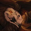
 FA+
FA+
8234
Views
Views
257
Favorites
Favorites
Category
Artwork (Traditional) / General Furry Art
Species Unspecified / Any
Size 750 x 1057
File Size 498.1 kB
Report this content
★
More from Echin


Comic sample page sketch 9: Phonecall
Sample page of Bill/Hill comic, enjoy again.
Bill, as usual, will talk to his foster parents in Texas for at least a few minutes after work. And it totally will not be a problem at all since the restaurant is opened 24 hours a day, 365 days a year.
Bill, as usual, will talk to his foster parents in Texas for at least a few minutes after work. And it totally will not be a problem at all since the restaurant is opened 24 hours a day, 365 days a year.
Category Artwork (Traditional) / General Furry Art
Species Unspecified / Any
Size 750 x 1057px
File Size 498.1 kB


After a while, we can finally see his parents again ^ ^ That´s a cute scene, seriously ^ ^
And as a graphic designer, I can say that I like that letter of the place where they are :D The format and the presentation looks good, few details to take care there, but not bad ^ ^ you have a nice taste for a design heheh.
And as a graphic designer, I can say that I like that letter of the place where they are :D The format and the presentation looks good, few details to take care there, but not bad ^ ^ you have a nice taste for a design heheh.


Heheh XD Well, if you wanna know the critique for a letter like that, I must say that you did a good one:
The format of the letter, in other words, the shape, is a good choice, not the typical rectangle or square that most of the letters looks like, in vertical format makes it more atractive and the location where you put it, on the side of the building, gives a good use for the horizontal format.
The name of the place and the type of letters that you choose makes a good composition along with the graphic, which is a chimeny. I would like to imagine it in color to see how atractive might be look on it heheh.
My only observation here is that the letters are getting out of the margin. In some works, it´s a good strategy of overpassing the margin to make a good impression, but in this case, it´s not necessary. But now that I think about it, is this place an hotel, a coffee or something like that?
But as I say, not bad for someone who´s not a graphic designer ;D you have a good perception for a good letter and logo for a place. ^ ^


:D Read more if you are interested. http://www.furaffinity.net/full/8344767/ :D
Comments