 FA+
FA+
3158
Views
Views
134
Favorites
Favorites
Category
Artwork (Traditional) / Fat Furs
Species Unspecified / Any
Size 632 x 818
File Size 136.7 kB
Report this content
More from Shadow_of_Fig


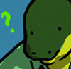
I hated this SO much. I actually went through and did two versions of this...colored completely. This was the better version, and it still didn't quite work as I wanted. What-ev-ah though.
Category Artwork (Traditional) / Fat Furs
Species Unspecified / Any
Size 632 x 818px
File Size 136.7 kB


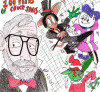
Well, just working from what I know (and keep in mind I can't draw, myself)...
1. The legs are too close together. You've given him "saddlebags", but his legs should be splayed a little wider to support his bulk.
2. Similarly, you've put flab around his biceps, but none is hanging down. Not much is called for, but he's going to have some padding over his triceps (lower arm) as well.
3. The ears are set too low on the sides of his head; move them higher, and narrow the hat accordingly.
4. The feather in his cap should draw to a point at the end; think of it as a feather that could be used to complete an arrow, if you pslit it down the middle.
It's good overall; you could stand some work on your lines and basic shapes, but you're doing pretty well so far.
Yeah it's kind of a shitty pic that I honestly never liked in the first place. I merely posted it for OCD-type completion sake on my part, hah. Nothing to improve on really, it was a disaster to begin with, not exactly a representation of my artwork, just a random bit of work for the time.

Comments