 FA+
FA+
714
Views
Views
62
Favorites
Favorites
Category
Artwork (Digital) / General Furry Art
Species Citra
Size 547 x 618
File Size 101.5 kB
Report this content
More from Firehazard


Listed in Folders


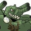
Small creatures should not drink caffeine.
A little citra saw a bottle of a drink labeled "citrus" and thought he'd partake. Bad idea. He'll be wired all night now, poor thing. XD
Fun fact: I did this mostly using the Pen tool, which I have now learned to use thanks to a friend of mine from school. It's great for really broad strokes, but its difficulty to control makes it impractical for regular use.
Citras are the vague intellectual property of Adam Wan aka zaush
zaush
Fun fact: I did this mostly using the Pen tool, which I have now learned to use thanks to a friend of mine from school. It's great for really broad strokes, but its difficulty to control makes it impractical for regular use.
Citras are the vague intellectual property of Adam Wan aka
 zaush
zaush
Category Artwork (Digital) / General Furry Art
Species Citra
Size 547 x 618px
File Size 101.5 kB
Listed in Folders


Cute. :) I don't drink anything with caffeine for the same reason. X_x
I'm just curious; what did you find hard to control about the pen tool? I know it's a little weird at first, but I think it's really nice once you get used to it. Granted, a tablet is probably a lot faster if you're more artistically inclined (unlike myself), but the pen tool is actually surprisingly powerful. Transforming and copying paths is especially useful IMO.
Anyway, I like the colors you used. They're really vibrant. :)
Ahh, yeah, that's true, working with line thickness is a huge pain in the ass. Earlier I was trying to decide if you actually changed the thickness [of the same line] in the line art or not. It looks like you managed by just altering the color of the lineart in some parts, rather than its thickness, is that right?
What I did, whenever I need a line to be thicker on one end than the other, is continue the line past the end point, stroke it, and then erase the excess.
Where the outlines appear to be lighter than usual, is just a side effect of adding the blurred duplicate layer on top.
Where the outlines appear to be lighter than usual, is just a side effect of adding the blurred duplicate layer on top.


Comments