 FA+
FA+
257
Views
Views
8
Favorites
Favorites
Category
Artwork (Digital) / General Furry Art
Species Wolf
Size 437 x 800
File Size 96.4 kB
Report this content
More from sarcasticmarten


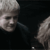
Finally getting around to working on requests again. Great thing about requests vs. commissions, though? Not really a deadline.XD This is for my buddy Ace over on the Feila forums. The thing that bothers me most about this piece is the fact that the gun has no handle...I didn't notice until I was doing the background, though.XD Also, I couldn't remember Ace's eye color when I was doing this and my Internet didn't start working until a few hours ago...So, here's lookin' at you with some baby blues, whether they belong there or not.
Shading was fun to do with this and it's my first foray with Photoshop CS2 that a friend of a friend...let me "borrow".>>
Ace is © xcaezarx
Shading was fun to do with this and it's my first foray with Photoshop CS2 that a friend of a friend...let me "borrow".>>
Ace is ©
 xcaezarx
Category Artwork (Digital) / General Furry Art
Species Wolf
Size 437 x 800px
File Size 96.4 kB

I like the coloring on the gun and Ace's eyes and tail.
I'm not sure if it's just my screen brightness, but like with a lot of your pictures, the colors generally appear too dark. I mention this again here, because what I'm about to say next may be simply because we have different monitor settings, but the coloring of the body other than what I mentioned seems off, almost like none of it really goes together. After placing the image in a program to see what it would look like on brighter settings, the picture does appear to be a little more in harmony, however, the colors still seem to clash.
I know that you've been trying to work on your backgrounds, so a little advice when using gradient would be to aim for a smoother, more gradual fade. At the moment, the background light gradients too harshly.
As I said on your lineart of this piece, the lines are great. I didn't notice the absence of the handle before, and just assumed that it was hidden behind the rest of the gun. I'm sure Ace will be pleased when he sees this.
Thank you for the tips, Todd! I think the real issue here with the colors clashing is that I used very different colors than I usually do when shading. Normally, I'll pick either a darker tone or whatever I'm shading (and a lighter tone for the highlights) or I'll stick to light and dark blue as a standard. In the case of this picture I wanted a feeling of fire so I used yellow for the highlights, and dark orange and red for the shading. Those colors on gray/black fur and blue jeans may not have come off so well as I was hoping. In regard to the darkness...maybe I just have a very bright monitor? I don't know. I'll try to lighten things up next go around to see if that works any better.


Comments