 FA+
FA+
2755
Views
Views
205
Favorites
Favorites
Category
All / General Furry Art
Species Rabbit / Hare
Size 1336 x 1596
File Size 1.01 MB
Report this content
More from lapinbeau


Listed in Folders


I really gotta start charging more for these.
.... Oh well. I'm trying to learn how to color and ink better. But I quite like how this turned out. It's been a while since I drew a proper bunny.

.... Oh well. I'm trying to learn how to color and ink better. But I quite like how this turned out. It's been a while since I drew a proper bunny.

Category All / General Furry Art
Species Rabbit / Hare
Size 1336 x 1596px
File Size 1.01 MB
Listed in Folders
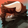


Art Critique:
Anatomy - The heads are rather large in proportion to the torso. In general a torso should be approximately 3 heads long (one from bottom of jaw to nipple line, one from nipple line to naval, and one from naval to crotch). I understand though that with a cartoon like feel heads and faces are emphasized for expression purposes etc.
The right arm of the black furred guy is a tad too short. The elbow should be able to reach just up over the top of the head however with the heads being a bit larger that may not be the best reference. If you check his left arm and compare it to the right you can see it is quite a bit shorter and if the fellow dropped his right arm to his side the elbow would reach just under his pectorals (kinda rib cage area) where it should really be closer to the naval.
For the rabbit the pose he's doing with his left hand is very awkward and kinda painful when I try to mimic it lol. I'm not sure if the viewer would actually be able to see his thumb from that position as the thumb would be obscured by the palm and fingers (if the thumb was either held straight or curled inwards in a more relaxed position). A more natural position would be if his hand was held with the palm upwards towards the light ball and the fingers loosely curled inwards.
The bunny's stance is awkward. To have him weight bearing on the right leg but keeping the leg bent, it'd be difficult to keep balance with the left leg kept behind him. Moving the left leg forward in front of the right would be more natural. An even more stable position would be if his weight bearing right leg was straight and the left knee was in a more forward and outwards turned position (the knee being turned inwards towards the mid-line is very difficult to mimic well).
Colouring - (This is if I'm assuming right in that the magical ball is casting off bright light) The shadows on the head and upper body would benefit from being sharper and darker to emphasize the brightness of the light source. The bunny needs more highlights to show how the ball's light is casting on him (you have them on the black furred guy which makes the bunny seem a bit out of place in the scene). Also the background colours makes me think that there is a light source below the characters so darkening the lower torso area would show that it is the most shadowed part of the body.
Anyway sorry for my ramblings. Hope some of this helps and is what you were looking for :)
Comments