 FA+
FA+
2450
Views
Views
126
Favorites
Favorites
Category
Artwork (Digital) / Fanart
Species Vulpine (Other)
Size 629 x 825
File Size 226.7 kB
Report this content
More from morningstar


")


**PEOPLE WHO READ THE DESCRIPTION GET A COOKIE**
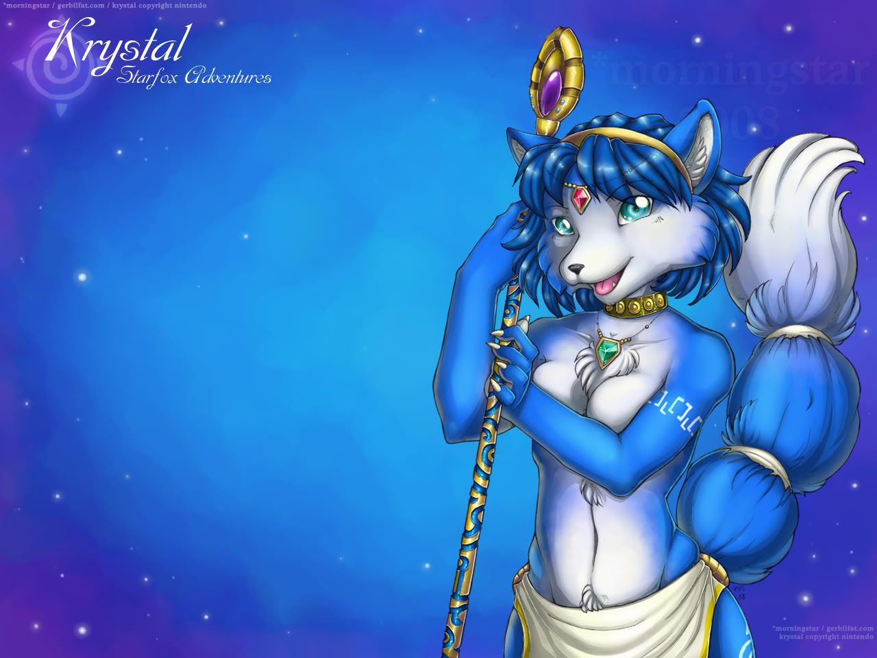
I did this two weeks ago as a thank you for a very nice fellow overseas who ordered a very large (and expensive) number of prints from me, some of which were custom matted. As you can guess, the lion's share of what he ordered was Krystal. I'm posting it now, a couple of weeks later, because I wanted him to get the print with the rest of his order as a surprise. If he saw it online, it would ruin the surprise a little.
I see all of these artists do some really amazing shit with Photoshop, with colors and blending so smooth and creamy. I really want to be able to do that, but I've never really been able to achieve the effect in a satisfactory way with that particular program. I did a lot of playing with this one though, on a technical level, and I think I figured out a solid method to work on that might eventually get me there. I'm pretty happy with the shading and highlighting, although there is always room for improvement. :3
Speaking of improvement, critique is very extremely welcome, but please no whining. Whining is 'omg i dont like her color blu' or 'omg her eyes r a different color' or 'omg u dru her staff wrong lol', all of which I've heard at one point or another during the drawing/coloring process. Please don't be discouraged from commenting, though - I love feedback! I just happen to get a lot of unhelpful gripes on Krystal pictures that can be demotivating.
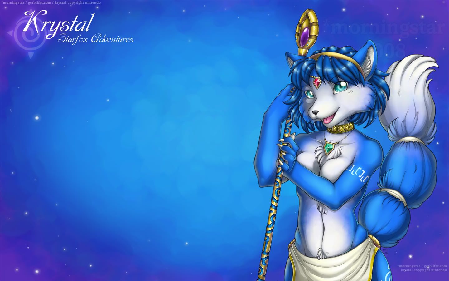
And for those of you who read this, here is your cookie. I've made three desktops - one for 4:3 (standard), 16:9, and 16:10 (both widescreen). Enjoy.
http://img.photobucket.com/albums/v.....standard43.jpg
http://img.photobucket.com/albums/v.....escreen169.jpg
http://img.photobucket.com/albums/v.....screen1610.jpg
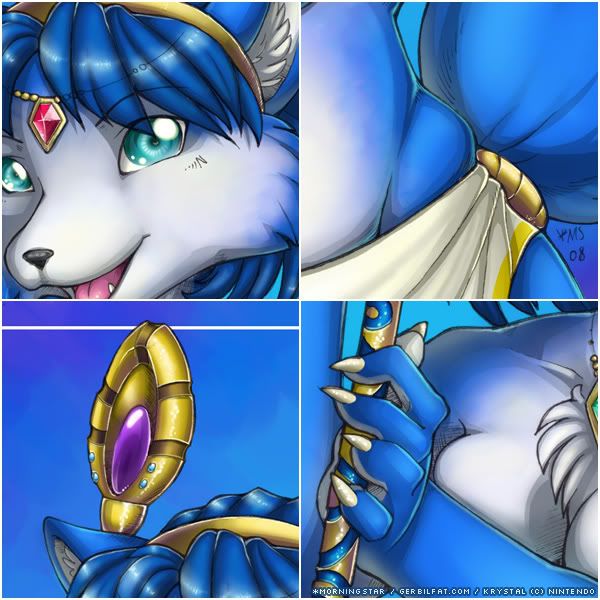
Details: http://img.photobucket.com/albums/v.....taldetails.jpg
Lineart is on 11"x14" bristol, color in Photoshop 7.
I did this two weeks ago as a thank you for a very nice fellow overseas who ordered a very large (and expensive) number of prints from me, some of which were custom matted. As you can guess, the lion's share of what he ordered was Krystal. I'm posting it now, a couple of weeks later, because I wanted him to get the print with the rest of his order as a surprise. If he saw it online, it would ruin the surprise a little.
I see all of these artists do some really amazing shit with Photoshop, with colors and blending so smooth and creamy. I really want to be able to do that, but I've never really been able to achieve the effect in a satisfactory way with that particular program. I did a lot of playing with this one though, on a technical level, and I think I figured out a solid method to work on that might eventually get me there. I'm pretty happy with the shading and highlighting, although there is always room for improvement. :3
Speaking of improvement, critique is very extremely welcome, but please no whining. Whining is 'omg i dont like her color blu' or 'omg her eyes r a different color' or 'omg u dru her staff wrong lol', all of which I've heard at one point or another during the drawing/coloring process. Please don't be discouraged from commenting, though - I love feedback! I just happen to get a lot of unhelpful gripes on Krystal pictures that can be demotivating.
And for those of you who read this, here is your cookie. I've made three desktops - one for 4:3 (standard), 16:9, and 16:10 (both widescreen). Enjoy.
http://img.photobucket.com/albums/v.....standard43.jpg
http://img.photobucket.com/albums/v.....escreen169.jpg
http://img.photobucket.com/albums/v.....screen1610.jpg
Details: http://img.photobucket.com/albums/v.....taldetails.jpg
Lineart is on 11"x14" bristol, color in Photoshop 7.
Category Artwork (Digital) / Fanart
Species Vulpine (Other)
Size 629 x 825px
File Size 226.7 kB


The inlay on her staff makes me squee: the jewelly inlay looks just right. Her right hand is a little confusing though, the way it's turned: some gentle definition of shadows-across-tendons or wristbones might make it a bit more obvious: but hay, that looks like a tricky angle to get right, and I'd be hard-pressed to do better.
Those little tufts of fur are adorable and lead the eye beautifully. Oh my!
Those little tufts of fur are adorable and lead the eye beautifully. Oh my!
That wrist was a tricky spot to do; I wanted her hand grabbing onto her staff a little without gripping it. The pose just kind of happened without a lot of forethought on my part, which may be why that spot looks a little off. Thanks. :3
And oh man I really think I like to punish myself with that jewelry staff crap. @_@
And oh man I really think I like to punish myself with that jewelry staff crap. @_@
Do a search for zhu zhu I believe and he has some really handy brushes and tools for Photoshops as pre-sets.
As far as blending, the trick is to stop using the airbrush so much and use the hard edged brushes, you can change shape dynamics and stuff in the program for the brush settings, but once you get used to hard edge brushes, you'll realize you'll have better control over blending.
One of the other things to do is work in greyscale. Do your shading in greyscale and put flat colors over it. I think you change the greyscale layer to darken. I'm more into painter and have a brush that lets me blend more so I have to go back and see if I have anymore photoshop tutorials.
I actually did the greyscale shading thing on this picture to try out how it works. I'm really happy with it and I plan on using the same method from now on. It's deceptively easy to do.
I'm definitely going to look into getting more Photoshop brushes since I've been using the default ones for so long. The program is so powerful, yet they don't really put good brushes with it to showcase how useful it can be.
My computer was finally overhauled after forever and a half. Painter doesn't make it cry in a corner anymore, which is great because that means I won't have to fight with lag anymore. Actually, the Painter lag is why I stopped working on that one lizard picture.
Having good swapfile space off another drive helps with Painter lag, and decrease the amount of Undos may help too. I mean the max of Undos on Painter is like 32, if you gotta go back that far, you're really fucking up XD
Yeah I also like greyscale shading too, didn't realize that helps a lot more than burn and doge rape.
Here is ZhuZhu btw: http://zhuzhu.deviantart.com/ he has some nice Painter and Photoshop goodies in his deviantart archive.
Yeah I also like greyscale shading too, didn't realize that helps a lot more than burn and doge rape.
Here is ZhuZhu btw: http://zhuzhu.deviantart.com/ he has some nice Painter and Photoshop goodies in his deviantart archive.
Thanks a million, Arshes, you're like this never-ending fountain of helpful Photoshop/Painter information. :3
Dodge and burn shading/highlighting is terrible. Everyone I talk to, I try to wean them off of it. It's such a bad method to use since it does all of the color picking for you. Admittedly the tools do have a place and time, but I cringe every time I see someone using them.
Dodge and burn shading/highlighting is terrible. Everyone I talk to, I try to wean them off of it. It's such a bad method to use since it does all of the color picking for you. Admittedly the tools do have a place and time, but I cringe every time I see someone using them.


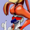

The white/blue transition on the face, tail, and belly took a little time for me to figure out how to do because I didn't want it to be completely smooth, but rather I wanted it textured more like fur would be. The coloring on her belly is pretty weird, which is something I'm all too familiar with since that character sheet fiasco. I'm pretty happy with how it came out, though, although some spots are a little rough. Thanks :3


Wow, this looks about 10x better in full then in preview. So much of the fine detail got lost.
There can never be enough Krystal art. And the fun thing is that all the artists have a slightly different take on her, so we get to see all these "flavors" of Krystal. I especially like the shading on the staff and her arms. And her boobs x.x. Seriously though, breasts are tough: it's hard to get a good sense of volume and shape without screwing up on them somehow. Something about yours still seems the tiniest bit off, but I'd say your 90% there.
Also, personally I like simpler eyes: too many highlights and they get hard to read. But a lot of that's personal taste I guess.
The way *morningstar does eyes is just something that I've gotten used to. It's one of her defining points. :D
There's definitely never gonna be enough Krystal art, but realize that if you change her from her original design or any of her other Nintendo itterations (the first is the best, I say) that she becomes a different character as it is. I love how *mornignstar makes sure to put as much detail into this character as possible. The staff, the fur patterning, etc. It makes the image that much more appreciable. I just wish everyone felt the same about consistancy.
And there's plenty of difference between style and consistancy. Markings being one that fits into the latter, and not the former like I've seen some people think *laughs*


One of the best Krystal artworks I've seen on this site.
And HALLELUAH!! IT ISN'T PORN!
You get extra points for that.
And you haven't drawn her 'wrong' at all, her jewelry, staff and tatoo's are just about right. And you even got the type/build of her body right.
Great work!
And HALLELUAH!! IT ISN'T PORN!
You get extra points for that.
And you haven't drawn her 'wrong' at all, her jewelry, staff and tatoo's are just about right. And you even got the type/build of her body right.
Great work!
Did someone say she got the build right? Hehehe awesome. I remember the character sheet picture that I worked through with her. So many people complained about her figure in that, though it's really just a more realistic figure based on the proportions of height and such. I do like the figure set into this image a tad more though, I won't deny. But my friend, you won't find details much more exact than *morningstar's pictures unless you go replay Adventures itself! :D
Well yes, the details are almost perfect. For one, her breasts are the size they should be, she has a slightly delicate look to her torso, which is countered by the slight thickness of her arms.
And her hips are just the way they should be, about as wide as her shoulders and very feminine.
And her hips are just the way they should be, about as wide as her shoulders and very feminine.


Great job and what a beauty!
Very good proportions anatomically!
The hands are wonderfully done!
Very tasteful! Don't be afraid of moving your shadows further into or on the body or having them very dark. I know when I started to break away from the cell shading style, I was scared of litterally spilling shadows across my figures. It's OK to do so and in some cases it really helps the picture! So contrast is a wonderful thing! I like your blend of semi cell and gradient shading in this! And technicaly that's somewhat how they are anyways.
I like the little fur tufts above her breasts and below her navel, they're cute a and a little provocative, playfully provocative.
and I have to say, I like the size of her breasts, that you didn't super size them and sex her up. Also of personal taste I like smaller breasts, and I can't stand all the gravity defying boobs such as in anime. Very tasteful!
As for getting the character down 100%, I don't really care that much personally. As long as it's in the close enough direction that you tell it's the character intended. I would say, it's similar when people do realistic versions of animated characters, as long as it's the character that they're shooting for I'm cool with it and it's a bonus because it's THEIR style, not a direct emulation of the preexisting character. It's more Original that way. It's how I feel about fan art really, I can't stand that people call it fan art when it's a direct copy of the original works, especially in style. I like when people take an existing character and do it in their style, their pose, and somewhat make it their own by putting thier twist on them.
I love fanart because fans experiment so much with characters, so you get some really unique interpretations of 'stock' characters. Fans do some really great things with characters that make the character fresh and new again.
I'm glad you like my take on her. Krystal fans can be so picky, so it can be really demotivating for me to post a picture and know that no matter what, people are going to complain about aspects of the picture that are just opinion, like my style or what exact shade of blue she is. It's awesome to know that there are people like you out there that have the same appreciation of fanart that I do. Thanks. You left some really great comments on my stuff. That's awesome, and I can't say thanks enough. :3
I'm glad you like my take on her. Krystal fans can be so picky, so it can be really demotivating for me to post a picture and know that no matter what, people are going to complain about aspects of the picture that are just opinion, like my style or what exact shade of blue she is. It's awesome to know that there are people like you out there that have the same appreciation of fanart that I do. Thanks. You left some really great comments on my stuff. That's awesome, and I can't say thanks enough. :3


Comments