 FA+
FA+
 dragon vector art")


213 submissions


Just some experimenting with a new logo.
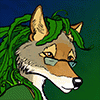
The backgrounds for it was that I was working on the Cheetaan Dragon, body construction, biological characteristics, mechanics of flying etc, as well as doing several sketches of him. To the end I got very pleased with his facial characteristics, he has a very bony looking design all originating from various properties necessary to serve him (ear shape, relative weakness of jaws, large eyes, high angled skull etc). Portrayed in a shade, he would be just perfect for an epic villain. This got me some inspiration, why not try to design a logo along those lines?
Practically all components of the logo serve some purpose, so I had to compromise here and there. My nick, "Jubatian" is at least a rather nice nick for that it is eight characters, can be split in two in a sensible way, although it still gave some headache to maintain symmetry. The character is a cheetah, more precisely a cheetaan, with the characteristics whiskers of them (they looked better until I started cramming my nick there). Young cheetahs, and the cheetaan typically has some mane, this is also portrayed. My real self has a good length of beard, so the logo character.
It was actually rather easy to do apart from figuring out the placement of the letters.
Category Artwork (Digital) / Miscellaneous
Species Cheetah
Size 300 x 300px
File Size 9.7 kB

Üdv! Síma egyszeri mezei Gimp, annyi a trükk, hogy jóval nagyobb méretű az eredeti, hogy így a fontos szögeket könnyen átlássam, kialakítsam. De más, egyelőre titkos logókat Inkscape programmal vektorizáltam is, aztán komolyabb utómunkálatokat végeztem rajtuk. Technikailag a fő feladat az volt, hogy a vázolás után megtaláljam a lényeges geometriai tengelyeket, kapcsolatokat, és annak megfelelően építsem fel az ábrát. A betűkkel a nehéz ügy a súlyozás kiegyenlítése volt, a szimmetrikus hatás elérése, miközben a gepár fej geometriai formái közé is szépen beépüljenek.
Comments