 FA+
FA+
272
Views
Views
1
Favorites
Favorites
Category
All / Animal related (non-anthro)
Species Avian (Other)
Size 855 x 471
File Size 55.6 kB
Report this content
More from cassandrarising


Working on getting the hell out of this art slump I've been in.
I decided to give color a try, and I'm not too sure what to think of it. I think the color flattens the carving a little... I don't know. Its not my best work regardless, but I thought I'd stick it up here and see what people think. If nothing else, it serves as proof that yes in fact I am still alive.
I decided to give color a try, and I'm not too sure what to think of it. I think the color flattens the carving a little... I don't know. Its not my best work regardless, but I thought I'd stick it up here and see what people think. If nothing else, it serves as proof that yes in fact I am still alive.
Category All / Animal related (non-anthro)
Species Avian (Other)
Size 855 x 471px
File Size 55.6 kB
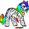
Color is so not my thing... I just kinda got lucky. The colors were way stronger than this, and I didn't like it so I dumped some alcohol (its alcohol based paint) on the whole thing and patted it down. The muted effect was totally accidental, but it looks way better than what it did.
Also, if I'm going to start doing things in color, I need better brushes. The ones I have are all frizzy, even though they're relatively new.
Also, if I'm going to start doing things in color, I need better brushes. The ones I have are all frizzy, even though they're relatively new.

The colours seem to have invert lightness compared to the noncoloured. I.e., the lighter parts of the plain version are turned into darker parts by the colours. That might be because of the alcohol dilution/patting you mention.
In any case, the darkening is probably not what you want, and I think this might be why it looks a little weird. IMHO. I think weak colours would work well if it could be achieved without the high saturation (leading to darker patches) in the areas that should be light.
Just my musings, for what they're worth. Cool bird, anyhow.

Comments