 FA+
FA+
997
Views
Views
84
Favorites
Favorites
Category
Artwork (Digital) / Fantasy
Species Lion
Size 1272 x 1874
File Size 807.5 kB
Report this content
More from Symbolhero


After some time of working on my projects, thesis, and some other business, it was about time to take a little break where I could do something of my own stuff where I coild get happy to see it finished XD
Here you see my four main lions´characters of The Living Heart, also the most important ones:
Top: Gran Maestro Kron, the second deity of Sephiria.
Left: Asaf Light, colonel of the high division of Seliath´s soldiers.
Right: Lord Alastor Mattason, the leader of Seliath.
Bottom: Miranda Light, daughter of Alastor, also Asaf´s wife.
I really like how the shape and composition ended, all clean and in a nice order in my oppinion. I hope you enjoy it : )
Category Artwork (Digital) / Fantasy
Species Lion
Size 1272 x 1874px
File Size 807.5 kB


I REALLY love this a lot!!!!!! ^_____^
The quality of the artwork is quite good but nothing really "splashing new", compared to your recent pieces. Though I have to admit, that whenever it comes to "lions", you really do your best.
:) I can see you really LOVE those characters and so you spend a lot of time on the shading, colouring and the excellent textures, such as different types of hair/fur!
Yes, the lions look very cool - all of them! The mystical, pale, blue lion (evil guy?) and the two heroric lions at the sides... and the soft, content female lion in the lower part of the artwork. They are ALL different and they still seem to belong to each other.
Though I don't really know the story, I can see that there's a strong bond between them! AND THAT IS GREAT!! ^^
BUT... one aspect is even better than the characters themselves... it's the COMPOSITION!
This artwork here reminds me of a crest... or sign. Or... a banner. It could be placed on a shield... or a large tapestry.
The general composition and shape of the characters makes this one unique. The different positions and shapes... and the symmetrical cloaks (left and right)... the arms of the female (forming the shape of a diamond/cube)... I could write 18 pages about the composition here. But I won't overanalyse it here.
^^"
Let me just say... THIS composition blew my f***ing mind!!!!!!!!!!!!!!!
AWESOME!
I want this motive on an iron shield or tapestry.
Yes, and you called it "insignia" yourself... you really did GREAT!
XD
WELL DONE, buddy!
This one really surprised me.
Well, if with lot of time for the shading you mean 3 hours, it was XD The real challenge here was to place the characters in a good balance, well presented and a clean view of the four creating a shape together that could be strong but also organized. And there you go! : D
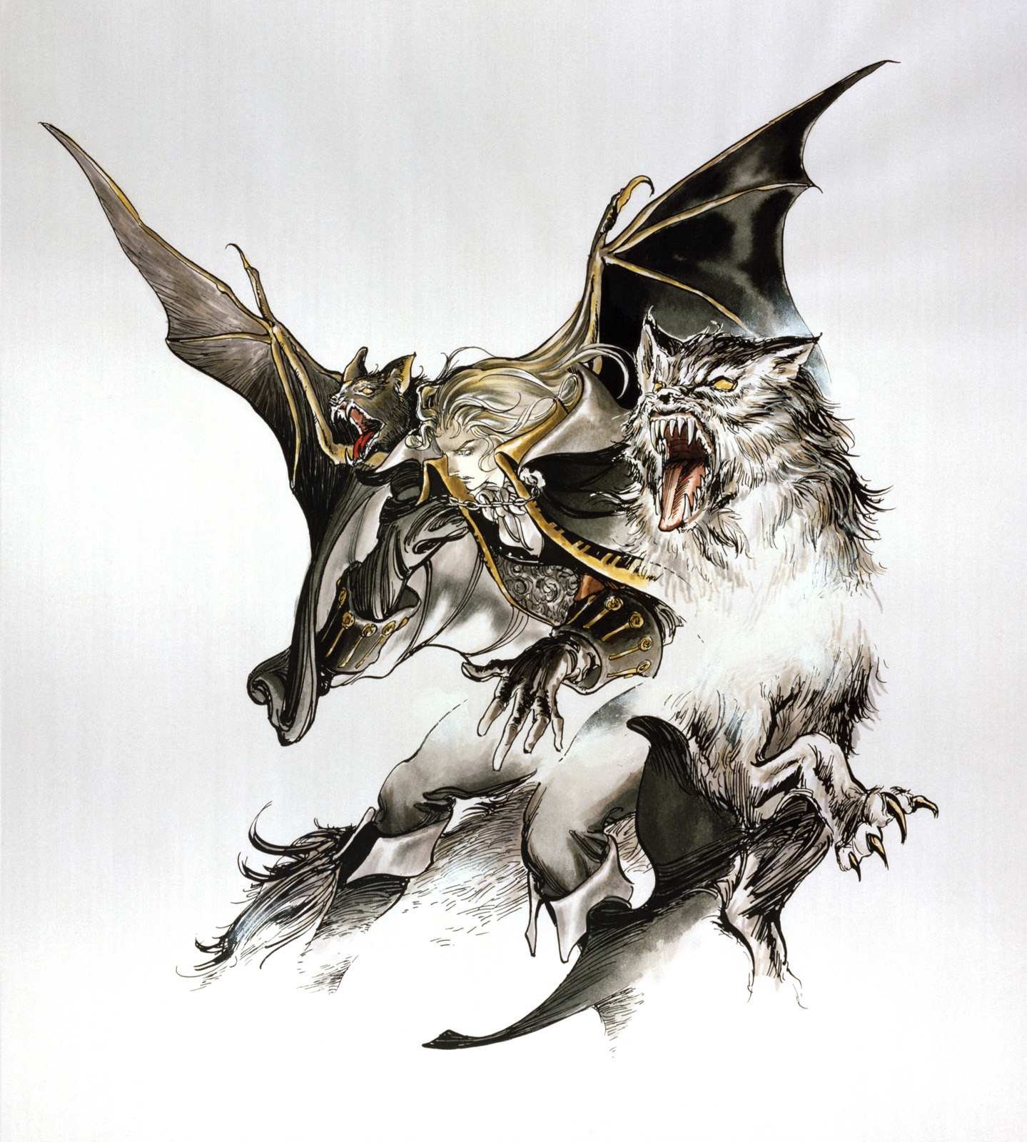
I always wanted to do something clean and organized when I saw this image of castlevania a long time ago http://www.fightersgeneration.com/c.....4/alucard6.jpg
Also, I liked the idea of a image in a white background after watching this work of yours XD http://reptilecynrik.deviantart.com.....Groul-11109292
In the end, I´m reallg glad of the results, not just the character´s design, and my shading style, also for the idea to gather these characters together and showing that they belong of the same world as you mentioned ^ ^
Also I tried something different with my shading style, in some parts I selected certain areas like some parts of a body, clothes, etc and in a shading layer I covered the selected area with a dark color resemble the the right area, and then erased the areas I wanted to give the highlights, leaving the shading alone. I find that out that it´s really effective for some styles of hair, certain type of body on certain light´s tones, and also in some long clothings : ) It was nice trying something different, risky, but worthy hahah XD.
I would´ve love it to see your long comments of 18 pages hahah XD but that´s ok. I´m pleased that you like this comment. To be honest, I wish I could do a t-shirt or at least a poster of 60-90 cm heheh. The cleaned work and composition is what I´m proud of! ^ ^
So one last time, THANKS a bunch for this comment and for pointing your thoughs about certain aspects here. And don´t worry, no need to know the characters to understand the pic here, though it could´ve be a plus heh, but that´s ok XD
Hope this isn´t the last work that I´ll impact you more further XDDD


Comments