 FA+
FA+
1461
Views
Views
113
Favorites
Favorites
Category
Artwork (Digital) / Muscle
Species Lizard
Size 992 x 1323
File Size 707.9 kB
Report this content
More from Symbolhero


A birthday gift for  kevindragon
Wanted to draw his lizard bearded dragon, Krator. He´s been my favourite character of his, and since he drew him a long time ago, I was thinking on making a surprise by bringing him back to life XD
I couldn´t do much more because of my pretty short time of free drawings ^ ^º still have a thesis and few commissions t work on XP
Sorry for the late deliver, Happy Birthday Kevin!
 kevindragon
 Wanted to draw his lizard bearded dragon, Krator. He´s been my favourite character of his, and since he drew him a long time ago, I was thinking on making a surprise by bringing him back to life XD
I couldn´t do much more because of my pretty short time of free drawings ^ ^º still have a thesis and few commissions t work on XP
Sorry for the late deliver, Happy Birthday Kevin!
Category Artwork (Digital) / Muscle
Species Lizard
Size 992 x 1323px
File Size 707.9 kB


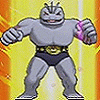


Hmm... sorry, this is one of your weakest artworks.
The shading is solid, but nothing more than average. There isn't a really interesting light source here and the shading is a very "neutral" shading type... just like I'm using in my character sheets, hehehe. ^^
The colouring is simple, but that's accurate because of the character and... this one just has only a limited colour palette.
BUT... dear friend... buddy... the character's right arm is totally WRONG!!!
Look, the biceps is way too low and wrongly shapen!
There also seems to be... some "piece of flesh" between his right biceps and his right chest muscle, which I can't really figure out.
Some good examples of arms:
http://static8.depositphotos.com/10.....ong-biceps.jpg
http://musclemodelblog.com/wp-conte.....41685345_S.jpg
http://thumbs.dreamstime.com/z/body.....n-16109842.jpg
You see... the biceps is never placed THAT low!!!
But it can be possible that we look right AT the biceps. But it's not hanging like in your version.
And his head... looks weird... I mean, the neck. The neck doesn't really look like it IS actually connecting head and chest properly. O..O
Sorry.
Legs, left arm (the one with the weapon) and chest look okay. It's mostly the right arm and neck, that's flawed.
Like I said, not a strong artwork... but it's meant to be a gift. So I guess the gesture counts more! ^____^
And considering your amount of COMMISSIONS... it's sweet that you had some time in-between for a small gift.
Heheh yeah, I knew you might say something like that after watching the one of the lions XD
True, this pic doesn´t gie the same impression as the previews pic for a lot of reasons, not to mention that I made this in a day and the other in a while, like some hours for the sketch, then coloring, then shading, etc. But yeah, I wanted to give him something as a gift, and I knew that if I would stop it to do it next time, there wouldn´t be a next time for me ^ ^º So I made it as quick as possible. And yeah, I did struggle a lot with that right arm ^ ^º If I could made some time, I could´ve made the second checks on the sketch, and also giving a good background where the shading could match nicely. But I haven´t ^ ^º
Regadless, as I always say, the intention always comes first than anything else ^ ^ Though I appreciate the comment and the samples to avoid that kind of mistakes for the next time. But the comment of the coloring, well, I guess is ok, even if the application is pretty simple. True, most of the color is brown, and the red and yellow for the loincloth, the grey for the metal part of the belt and the claws and the collar´s colors. Most of other characters has less of three colors and they wear lots of clothes. With Krator, there´s not much to put with the things he wears, don´t you think?
Don´t worry, I don´t see this comment as a personal thing which I know what is it XP I know you just critique the design and the anatomic aspects, but I appreciate that you understand why I draw it ; )
Thanks again for the comment man ^ ^ Take good care.
Oh... and I hope you understand that this is not a matter of personal taste here... my critique is based upon anatomical and technical issues.
Like I said in the end:
The thought is a nice one. And this has to be recognised and appreciated!!!
^_^
Just... your previous artwork flashed me in such a strong way... this artwork is simply less strong.
Like I said in the end:
The thought is a nice one. And this has to be recognised and appreciated!!!
^_^
Just... your previous artwork flashed me in such a strong way... this artwork is simply less strong.


Comments