 FA+
FA+
8144
Views
Views
339
Favorites
Favorites
Category
All / General Furry Art
Species Unspecified / Any
Size 880 x 300
File Size 204.4 kB
Report this content
★
More from Nek0gami


")


Several people were wanting to see a bigger version of the banner ^_^
Visit RabbitValley.com
Your source for furry and anthropomorphic books, comics, fanzines, and prints!
Use code FENDERMAY08 when checking out to get $5.00 shipping on all orders over $50!
And it'll make Gami's friends happy ^_^
Visit RabbitValley.com
Your source for furry and anthropomorphic books, comics, fanzines, and prints!
Use code FENDERMAY08 when checking out to get $5.00 shipping on all orders over $50!
And it'll make Gami's friends happy ^_^
Category All / General Furry Art
Species Unspecified / Any
Size 880 x 300px
File Size 204.4 kB


*The fox says that we have a partnership with United Publications in the UK and they can be visited at http://www.up1.co.uk/ and they carry our self produced titles including ASB - which can be found directly at http://www.up1.co.uk/Details/A0046, it says he is out of stock, but he can get more from us! *


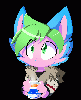


For some reason, in every picture of us, the poor bunny is the one taking the brunt of the abuse. Someday, we bunnies will get our revenge. Bwahahahahaha! Bwahaha, uh, hah, ahem, anyway.
Absolutely incredible work, and I am looking forward to your CD collection too! And, thank you very much.
Absolutely incredible work, and I am looking forward to your CD collection too! And, thank you very much.


It's a fairly good picture, but there are parts that aren't good enough.
First, I wasn't thrilled with how you drew the fox. The hand looks all out of proportion, and the eyes look unbalanced, especially when you look at the ad (it's at the bottom of my screen right now, so that's convenient).
Also, I wasn't thrilled with how off balance the picture is, on its own. The large bag and the rabbit draw attention to that side of the picture, and leave the fox looking even more pathetic than it is.
Next, the eyes on the rabbit have no pupils. This leaves the character looking like a blind man. It also take the soul effectively out of the picture. Also, the logo on the bag is fuzzy, and this become glaringly apparent in the larger version you posted.
Finally, your use of cold colors instead of hot colors makes the characters look more... distant. It may be the commisioner's "fursona," but in an advertisment cool colors, such as the blue that you used, make the picture look more distant and makes the site look slightly less appealing. The rabbit looks much better, because he has warmer colors, such as the nice brown that you used. Also, if you did the text in the advertisment, you should have used a warmer blue, or a black.
Still, I'm just nitpicking, but you really did screw up the elements I described here. You're still an amazing artist, but...
Nice choice of background, great rabbit. It's a species I usually hate, but you draw it quite well.
Your style was pretty good, too. Nice expressions on faces, as well. For an ad, its pretty good.
Just curious, but what do you use to make the pictures? Photoshop or Flash? It looks like Flash, but for all I know you're using a professional art program. If you were using Photoshop, though, then that logo on the bag being fuzzy is absolutely inexcusible.
For you, 3.7/5. Simply not at your normal caliber.


Circles 8 - Dark and moody and kind of spooky. I guess Ken got what he deserved after leaving Paulie and Michael for the bull, but still. Glad that Taye got his chance for his dream acting role, and hope Marty can hold out while he's away. And as usual, Paulie is a rock for helping Ken, as is the rest of the family. I wonder what Mrs. Nussbaum has up her sleeve in dealing with Carter. Excellent issue and kudos to all involved. Hope the next comes soon, At my age, the hill is getting steeper, and the slide is getting faster. Hope I can see the end.

Comments