 FA+
FA+
2412
Views
Views
211
Favorites
Favorites
Category
Artwork (Digital) / Muscle
Species Lizard
Size 827 x 1102
File Size 469.8 kB
Report this content
More from Symbolhero


Before proceeding in some other works I have on my way. I wanted to finish this gift first since it was a birthday gift to  paulgon
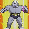
So this a single pose of Brunder showing the results of his work out. All strenght, all builded, all red, and ready to show off XD
Happy Birthday!!! ^ ^
 paulgon
So this a single pose of Brunder showing the results of his work out. All strenght, all builded, all red, and ready to show off XD
Happy Birthday!!! ^ ^
Category Artwork (Digital) / Muscle
Species Lizard
Size 827 x 1102px
File Size 469.8 kB


You know... I've always had my problems with this character. It's "just" a red "dragon like" character... wearing ONLY ONE F***ING black speedo and that's it. XD
Yeah, even a wrestler wears more!! Why can't he wear at least some wristbands... or tattoos?? Why ONLY a small speedo and that's it?
BUT THEN I realized... hey, your friend DJ DARKFOX is not wearing more that a red speedo, either!
AND Reptile??? In many artworks, he used to wear ONLY a loincloth and nothing else... and a loincloth is even less "protective" than a speedo.
So... I had to think about it. And in the end: Brunder isn't much different from many other characters I know! :D
So much for my first thoughts.
BUT why do I have such thoughts, at all?
IF you have a nude character, you cannot (!!!!!) hide anything of the body by using clothing. Yes. And if the characters is almost entirely nude, you REALLY (REALLY) have to do the anatomy well.
And I can say... THIS is by far the best "Bruder" I've seen so far! ^___^
I personally don't really "like" or "dislike" that character. To be plain honest, I'm not interested in him. But that's only a personal opinion. And I just wanted to leave a comment to YOUR (!) drawing here. This comment surely has nothing to do with the character itself.
Like I mentioned above, Bruder is one of the "rather nude" characters, which NEED an artist who knows about anatomy. And I like how you did this one!
Okay... this time, you abandoned your "line art" style once again... BUT in this case, it does NOT matter because
A) there is enough "I need some black parts for my eyes" in the speedo and
B) the shading serves SO WELL that we don't need lines.
^__^
IT is also very daring to draw this kind of head/face from the front... and I like what you've done. Usually, these heads look dull from the front... I never use frontal views so often. But first of all, you DID NOT use a "real" frontal view AND it's the best choice in this pose and composition.
If he would look to the side... no, that would be horrible!! It would look as if his neck had been snapped! XD
So, it's the BEST choice!
Yeah... AND a short comment to the speedo: it reminds me of these typical wrestling pants. It's not too large and not too small. It's not even suggestive and anything naughty... no. THIS is absolutely perfect, correct AND clean - which I like most.
Sure, I also enjoy the "suggestive bulges" and stuff... but this is only "fan service", aye?
In this case, it's really fitting and I like it the way it is!!!!!
Something else... it's highly weird, that he's got a navel but NO mipples... but that's the character's design and not your "fault".
XD
Well... whatever.
My only negative aspect would be the background.
Yes... you have a lot of commissions to do.
Yes... you did (thank god) another version with the magazine background.
BUT... the magazine background is SO superior to THIS one... sorry, Aldo, but I hate (!!) these kind of gradient backgrounds.
I really hate these.
I mean... a plain gradient... a soft one... okay. BUT you even used this stupid "flash like" gradient!!!!!!!!!!!! XD
Sorry, man. This one is horrible.
It's not organic, it's dull and it's just artificial. The character looks SO DARN GREAT and organic... and alive!
The background just sucks here!
Most of all, the background gradient contains a plain white in the middle, which is poison for the eyes and a really bad choice! It's so bright that we get "blinded" by it and is distracts from the character.
Solution/Advise:
Next time, use a rather soft gradient OR do NOT (!!!!!!!!) use the one with plain white in the middle! You can use grey or something contrastive or even complementary.
Yes.
You know what?
I'm sure you take this last negative comment the right way, hehehehehe.... after all, we are friends and you know and UNDERSTAND what I mean when I say "Aldo, this background sucks!"
So, I don't really mind saying it... in a rather blunt way.
^_____^
As you can see, the positive aspects really stand out.
NICE WORK!!!!!!!!!!!!
Hahah XD yeah there´s lineart here. I´m testing by using lines with the same color of the area in a different tone, thanks to that I won´t see that black lines that I deslike to see in a shaded pic like that XP
Don´t get me wrong, I still want to draw illustrations without linearts, but that would be like me last level on ilustration to reach XD
Don´t get me wrong, I still want to draw illustrations without linearts, but that would be like me last level on ilustration to reach XD
Hahahah XD yeah I know, don´t worry about it. At least be glad that I didn´t say that I like the background, then that would be more stupid XD But I like yor suggestion. I´ll try to avoid that kind of gradient, thanks ^ ^
About Brunder´s design. Well there´s a tones of characters that don´t wear a lot than just a undies, or even nothing XD That´s each one´s preference. There´s a lot of characters that I could list you that has the same style but I rather keep it away. Anyway, the objective here was to work on a well defined anatomy. And as I see, it worked and I´m happy with it ^ ^
And yeah, I wanted to keep drawing Brunder´s head in the front views because I can see in his gallery a lot of pics which are just side or in a 45º, So why not showing something different? Besides, as you said, this pose deserved a good frontal view of his head instead of breaking his neck on the side XD.
As for the speedo, well you know me pretty well, I prefer to make it as much as real as possible, and also a descent one since it´s for a cover page of bodybuiliding magazine XD I don´t want to present something else hahah. And sure, I could make few characters with certain bulges (but rarely), but as long is not like the hyper thing, I´m fine with that ^ ^º
Very impressive that you wrote this comment Patrick :D Even if it´s raining now so strongly, you made my day with this complement, thank you!!! ^ ^ *hugs*
And more should will come ; )
PS. You´re right about the commissions I´m taking ^ ^º it´s taking much time as I expected and I really miss drawing my characters. After this list I´ll take a long break in order to show Orion and everyone else ; ) And my next commission shall be not to big. It wouldn´t be fair for those who´s waiting for too long for their turn either ^ ^º Thanks for the advice man.
Cheers and take care : )

I agree with Reptile that this sort of wrestler style looks better with added detail like arm bands. Naturally if he wasn't just a body builder I'd say there should be cool utility straps and warrior gear on him, but obviously that wouldn't work for working out.
Great work though. The magazine version of this is a nice touch.
Great work though. The magazine version of this is a nice touch.


Pues realmente te luciste con este trabajo (nuevamente), me agrada mucho todos los detalles que agergaste a la anatomía, tiene cierto toque de "realismo" que es bastante interesante y si era a lo que estabas apuntando, pues lo hiciste bien .
La anatomía de la cabeza de Brunder tiene muchos detalles, la verdad es que hiciste un gran trabajo en ella, se ve muy bien y nuevamente la expresión de la cara es excelente .
Si bien lo único que encuentro un poco raro son las manos, pero por el tipo de pose, considero que darles la luz adecuada para que se vean bien, estaba complicado, así que ahí pararé el comentario de eso, je! XD
Es de los mejores dibujos de Brunder que he visto hasta ahora.
Heheh muchas gracias por tu comentario ^ ^ Lo aprecio mucho, en especial lo de la cabeza se Brunder, que casi no se ve de frente ; )
En caso de las manos, hay veces que desde esa vista con el puño cerrado o se vea o chico o raro XD no es muy facil hacerlo sin que se vean los dedos, verdad? de seguro es eso heh.
Pero bueno, lo demas lo compenza ; ) que bueno que te gusto ^ ^
En caso de las manos, hay veces que desde esa vista con el puño cerrado o se vea o chico o raro XD no es muy facil hacerlo sin que se vean los dedos, verdad? de seguro es eso heh.
Pero bueno, lo demas lo compenza ; ) que bueno que te gusto ^ ^


Comments