 FA+
FA+
548
Views
Views
17
Favorites
Favorites
Category
Artwork (Digital) / Fanart
Species Lion
Size 1280 x 962
File Size 165.9 kB
Report this content
More from samoht-lion


The mighty king leads his lioness party across the grass land. I never done any images like this before with a landscape and multiple characters. I put about 10 hours into this image. It was fun to do but a challenge none the less. I feel like its missing something.. Besides the other T:L characters of Simba's Pride. Tell me what I can do to improve on images like this.
Category Artwork (Digital) / Fanart
Species Lion
Size 1280 x 962px
File Size 165.9 kB


Yeah, keep it up. In case it is part of what you want to accomplish, you could improve on the typical Disney style, by practicing it. If you want to stick to draw it your way, draw more, do practice and play with angles, and most important of all, try to draw a character over and over from various perspectives but ensure they are recognisable from all of them. That alone will help.

First off, let me say that you have a very good eye for composition :) The poses, expressions, and overall feel of the picture are very nice. You also "color" your outlines instead of making them completely black. That is a very good technique to use, especially with the TLK style.
That being said, here are a few things to improve upon.
1) Anatomy. I'm not saying that it is terrible, but when trying to emulate a style (especially a very popular style like TLK) you should know as much about the characters anatomy as possible. For instance, the lionesses appear too blocky around the midsection. The feline form should curve and flow. Also, Keep in mind that symmetry is very important! Notice that the foreheads on all of the lionesses tend to lean a little to the right. Many up and coming artists have this "leaning" problem... the best way to correct this is to "mirror" the image, or if you're using photoshop, flip it horizontally. Flipping th image can reveal tons of anatomy errors, that would otherwise go unnoticed. Example : The 3rd and 4rth lionesses cheeks don't match up properly. Their right cheeks are very round, while their left cheeks are more concave. Also Simba's ears are not properly aligned with his head. The left ear is not bad, but the right ear looks like it's coming out of the hair and is not actually attached.
Some useful tools for studying proper anatomy --> http://www.amazon.com/Weatherly-Guide-Drawing-Animals/dp/097103141X/ref=sr_1_1?ie=UTF8&s=books&qid=1213706046&sr=8-1 (I love this book!)
http://www.amazon.com/Art-Lion-King.....im_dbs_b_img_4 (my personal favorite... buying new is very expensive, but it's a must have for any TLK fan... it also has some great insight into how the animators/illustrators think)
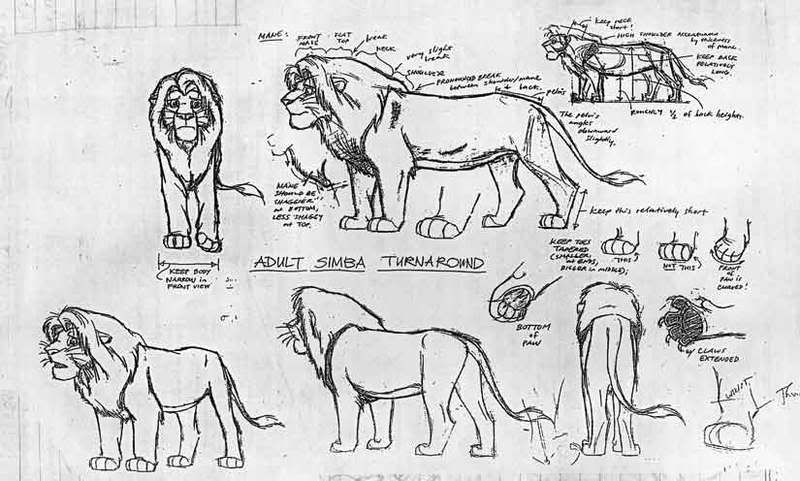
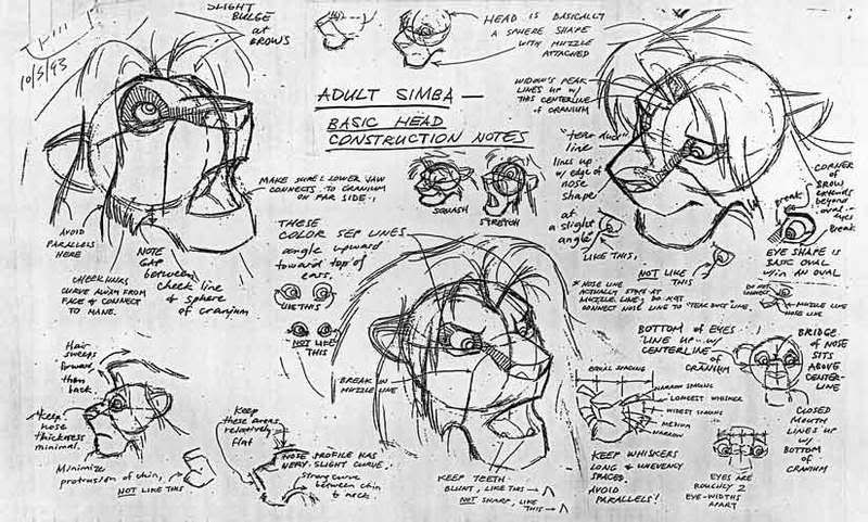
Now what I'm about to share with you, are some very rare, and extremely helpful tools. These are actual model sheets that Disney animators used to construct simba. They really helped me, and I'm sure they'll be an amazing help to you. I can't remember where I got these, so you're better off saving these pics to your computer.
-- Adult simba -> http://i11.photobucket.com/albums/a.....imbaModel2.jpg
-- Adult Simba Expressions -> http://i11.photobucket.com/albums/a.....imbaModel3.jpg
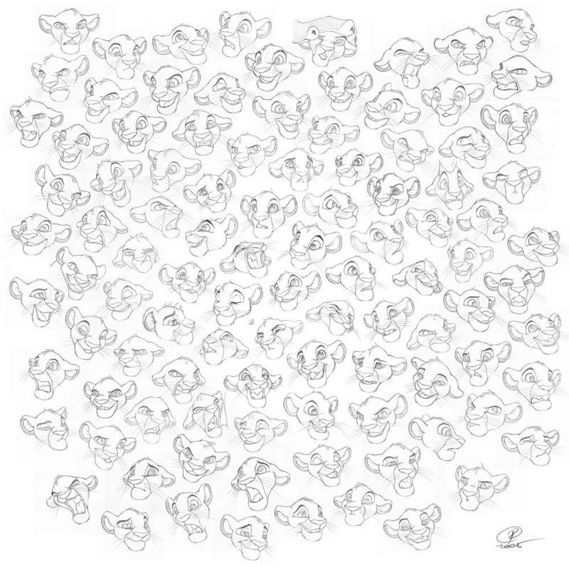
This next picture is a great refference for expressions. This is fanart but damn good stuff, and a very helpful tool.
-- Young Simba Expressions -> http://i11.photobucket.com/albums/a.....ractice101.jpg
_________________________________________
2) Coloring and Shading - Your color choice is pretty good. It's not overly vibrant or glarey, and is overall pleasing to look at. There are however some flaws that can be corrected... mostly with shading. In this pictures, the major light source seems to be coming from the viewers top right. And since it is "mid day" the shadows should be bolder. Especially the shadows being played on the grass.
I would consider myself to be a pretty decent illustrator/colorist, so you may be able to learn a bit from some of my pictures.
--> http://www.furaffinity.net/full/1323028/ (light source from the top right -- notice how I place shadows around muscle groups, to pronouce key features in the face and body like the cheeks, and the shoulders of Hobbes.)
--> http://www.furaffinity.net/view/1230447/ (Very bright light source from top right, and a dim light source on the bottom. Here the brightest light casts the darkest shadows. as well as puts highlights on certain areas. Highlights are important for reflective material like metal and hair because they really accent the area. You made a pretty good attempt at highlights in your picture, but without darker shadows for contrast... it kind of falls flat.
Another thing to note is that the farther back you go into a picture, the lighter things will become. There are some parts of this picture that don't fit that rule, like the mountains in the far back, and the layer of orange grass in between 2 layers of lighter colored grass. When drawing large landscapes, always keep in mind that the picture gets lighter with less contrast in the back, and darker with more contrast in the front.
Overall, just watch The Lion King over and over again, and see how light plays an important role in the composition of certain scenes. The best example of this is in the "Circle of Life intro" where you get to see examples of extremely bright light, dim light, and reflected light.
Now there is one thing that I find unforgivable in this picture, and that's the use of the grass tool. You put so much effort into the composition of this picture, but taking the easy way out but using the grass brush cheapens it. If you're going to spend a lot of time drawing and coloring the foreground, you should spend just as much time on the background too. Don't take this the wrong way though... I'm not trying to be mean, but using the grass tool is a very bad habit that can really cheapen a picture. Now that is not to say that the Grass tool is a bad tool. Actually it can be very helpful! But It's definitely not a good Idea to sprinkle it over and entire area. In my opinion the grass brushes should only be used extremely sparingly and only to accent an area, not to fill space. If you want to use the grass brush, I suggest making multiple kinds of different grass brushes in photoshop (I would say 10 at the least). That way the grass pattern wont look so repetitive.
Here is a great tutorial on how to really make a killer BG --> http://www.drawfurry.com/?p=22
3) References - If all else fails, use any refference you can think of! Even the most amazing artists out there need to use references once in a while, and if they say they don't, then they are lying bastards! Drawing from a refference really makes you notice things that you would never notice before... You'll become much more analytical and detail oriented the more you draw while using a refference. Naturally, our brain interprets images very poorly from memory. Your brain will not remember the details in Simba's mane, or the way a crack branches through a rock... You need to train your brain to think with as much attention to detail as possible. When you draw from a refference, you are basically doing just that - Teaching your brain to notice detail. A good reference is an artists greatest tool.
Pros
- Great Composition
- Decent choice of color
- good expressions
Cons (or just things to work on)
- Needs more contrast in shading
- More practice in anatomy will help as well as flipping the image to catch anatomical flaws
- GRASS TOOL - DO NOT WANT!
- Colors go from dark at the front to lighter in the back.
- Horizon line tilts downward and to the left. It should be kept as straight as possible.
I know this is a very long comment/critique, but I definitely see a lot of promise in your work! You must've put a lot of effort into this, and that alone is commendable! I just hope that my advice will be helpful :)
That being said, here are a few things to improve upon.
1) Anatomy. I'm not saying that it is terrible, but when trying to emulate a style (especially a very popular style like TLK) you should know as much about the characters anatomy as possible. For instance, the lionesses appear too blocky around the midsection. The feline form should curve and flow. Also, Keep in mind that symmetry is very important! Notice that the foreheads on all of the lionesses tend to lean a little to the right. Many up and coming artists have this "leaning" problem... the best way to correct this is to "mirror" the image, or if you're using photoshop, flip it horizontally. Flipping th image can reveal tons of anatomy errors, that would otherwise go unnoticed. Example : The 3rd and 4rth lionesses cheeks don't match up properly. Their right cheeks are very round, while their left cheeks are more concave. Also Simba's ears are not properly aligned with his head. The left ear is not bad, but the right ear looks like it's coming out of the hair and is not actually attached.
Some useful tools for studying proper anatomy --> http://www.amazon.com/Weatherly-Guide-Drawing-Animals/dp/097103141X/ref=sr_1_1?ie=UTF8&s=books&qid=1213706046&sr=8-1 (I love this book!)
http://www.amazon.com/Art-Lion-King.....im_dbs_b_img_4 (my personal favorite... buying new is very expensive, but it's a must have for any TLK fan... it also has some great insight into how the animators/illustrators think)
Now what I'm about to share with you, are some very rare, and extremely helpful tools. These are actual model sheets that Disney animators used to construct simba. They really helped me, and I'm sure they'll be an amazing help to you. I can't remember where I got these, so you're better off saving these pics to your computer.
-- Adult simba -> http://i11.photobucket.com/albums/a.....imbaModel2.jpg
-- Adult Simba Expressions -> http://i11.photobucket.com/albums/a.....imbaModel3.jpg
This next picture is a great refference for expressions. This is fanart but damn good stuff, and a very helpful tool.
-- Young Simba Expressions -> http://i11.photobucket.com/albums/a.....ractice101.jpg
_________________________________________
2) Coloring and Shading - Your color choice is pretty good. It's not overly vibrant or glarey, and is overall pleasing to look at. There are however some flaws that can be corrected... mostly with shading. In this pictures, the major light source seems to be coming from the viewers top right. And since it is "mid day" the shadows should be bolder. Especially the shadows being played on the grass.
I would consider myself to be a pretty decent illustrator/colorist, so you may be able to learn a bit from some of my pictures.
--> http://www.furaffinity.net/full/1323028/ (light source from the top right -- notice how I place shadows around muscle groups, to pronouce key features in the face and body like the cheeks, and the shoulders of Hobbes.)
--> http://www.furaffinity.net/view/1230447/ (Very bright light source from top right, and a dim light source on the bottom. Here the brightest light casts the darkest shadows. as well as puts highlights on certain areas. Highlights are important for reflective material like metal and hair because they really accent the area. You made a pretty good attempt at highlights in your picture, but without darker shadows for contrast... it kind of falls flat.
Another thing to note is that the farther back you go into a picture, the lighter things will become. There are some parts of this picture that don't fit that rule, like the mountains in the far back, and the layer of orange grass in between 2 layers of lighter colored grass. When drawing large landscapes, always keep in mind that the picture gets lighter with less contrast in the back, and darker with more contrast in the front.
Overall, just watch The Lion King over and over again, and see how light plays an important role in the composition of certain scenes. The best example of this is in the "Circle of Life intro" where you get to see examples of extremely bright light, dim light, and reflected light.
Now there is one thing that I find unforgivable in this picture, and that's the use of the grass tool. You put so much effort into the composition of this picture, but taking the easy way out but using the grass brush cheapens it. If you're going to spend a lot of time drawing and coloring the foreground, you should spend just as much time on the background too. Don't take this the wrong way though... I'm not trying to be mean, but using the grass tool is a very bad habit that can really cheapen a picture. Now that is not to say that the Grass tool is a bad tool. Actually it can be very helpful! But It's definitely not a good Idea to sprinkle it over and entire area. In my opinion the grass brushes should only be used extremely sparingly and only to accent an area, not to fill space. If you want to use the grass brush, I suggest making multiple kinds of different grass brushes in photoshop (I would say 10 at the least). That way the grass pattern wont look so repetitive.
Here is a great tutorial on how to really make a killer BG --> http://www.drawfurry.com/?p=22
3) References - If all else fails, use any refference you can think of! Even the most amazing artists out there need to use references once in a while, and if they say they don't, then they are lying bastards! Drawing from a refference really makes you notice things that you would never notice before... You'll become much more analytical and detail oriented the more you draw while using a refference. Naturally, our brain interprets images very poorly from memory. Your brain will not remember the details in Simba's mane, or the way a crack branches through a rock... You need to train your brain to think with as much attention to detail as possible. When you draw from a refference, you are basically doing just that - Teaching your brain to notice detail. A good reference is an artists greatest tool.
Pros
- Great Composition
- Decent choice of color
- good expressions
Cons (or just things to work on)
- Needs more contrast in shading
- More practice in anatomy will help as well as flipping the image to catch anatomical flaws
- GRASS TOOL - DO NOT WANT!
- Colors go from dark at the front to lighter in the back.
- Horizon line tilts downward and to the left. It should be kept as straight as possible.
I know this is a very long comment/critique, but I definitely see a lot of promise in your work! You must've put a lot of effort into this, and that alone is commendable! I just hope that my advice will be helpful :)
Honestly I like to thank you for your feed back. This was my first time in a while doing an image like this. Your critique on this has been very helpful. Thanks again for those links to the Disney Model sheets. Gotta add those to my cd of TLK production art I've created. Regarding making things lighter in the far background or more blurry, How did you apply that blur to Hobbes' back legs? Regarding the grass; I did use two brush tools for the grass, I do anticipate myself doing an image like this again. What other method besides the grass brush tool would you recommend on doing in a image of a field? Once again thanks for your comments and the links.
drawing grass can be accomplished in many different ways, but I prefer to use the pen tool with simulated pressure, and do strokes in several similar colors to get multiple blades of grass. I use that technique for tall grass like in this pic --> http://www.furaffinity.net/view/1296133/
For grassy planes, you can usually get away with less detail. When I color grassy areas in the BG, all I so is fill an area with a base color, and occasionally add highlighted strips across the field. a good example would be in this pic --> http://www.furaffinity.net/full/1200438/
For other pictures, I'll just stroke each individual blade of grass.
Either way, drawing grass is hard and tedious work, and I am certainly no expert on the subject. However its always good practice to stay away from the default grass brushes. I would also encourage creating your own grass brushes. Some artists have done amazing work by creating a plethora of unique grass brushes.
Examples
from --> http://fanart.lionking.org/Artists/Sarafina/
--> http://fanart.lionking.org/Artists/.....yNightmare.jpg
--> http://fanart.lionking.org/Artists/.....enQueenSm4.jpg
--> http://fanart.lionking.org/Artists/.....yLovelySm2.jpg
I'm currently trying to learn how to create brushes like this... it's definitely not as easy as it may seem, but you can already see what a great difference it makes in picture quality
___________________________________
In regards to the bluring effect, I start off using two layers. The first layer is the entire picture as it is without any blurring effect. The second layer is on top of the first and is just a duplicate of the original image. I apply a "radial blur" filter on the top layer, and set the blur setting to "Zoom". That will give a smooth motion blur effect. Doing this will blur the entire image, but keep in mind that the layer underneath the blurred image is the original picture. So, after blurring the top layer, I use a soft brush eraser to erase parts of the blurred layer that I want to appear crisp. Every time I erase a part of the blurred layer, the bottom crisp layer will come into view. This allows me to have very precise and smooth blurring at certain parts, but keep other parts in clear focus.
I'll probably post a couple of tutorials on how I do some of my coloring techniques later.
Anyway, I hope this explanation helps :)

Comments