 FA+
FA+
1394
Views
Views
30
Favorites
Favorites
Category
Artwork (Traditional) / All
Species Lion
Size 1280 x 907
File Size 345 kB
Report this content
★
More from Rahir


Listed in Folders


Pinned you! – Commission for Byakko110
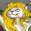
This is another commission I did for my good pal  and it’s a follow-up to http://www.furaffinity.net/view/14024520/
After having gotten over the initial shock of becoming hot anthro-lions (which can’t be that bad of a shock), they are now in the process of getting each other to know better. And what better way is there for that than rolling on the ground in a playful manner and ending up in a position like this?
 and it’s a follow-up to http://www.furaffinity.net/view/14024520/
After having gotten over the initial shock of becoming hot anthro-lions (which can’t be that bad of a shock), they are now in the process of getting each other to know better. And what better way is there for that than rolling on the ground in a playful manner and ending up in a position like this?
Category Artwork (Traditional) / All
Species Lion
Size 1280 x 907px
File Size 345 kB
Listed in Folders


Thanks
I admit, I applied my stocking technique It gives the surface of their bodies some nice depth, and considering that these lions in animation have only solid colors made it seem less appropriate to go for a more detailed fur texture. But I do like how his mane is flowing, kinda like Fabio's mane
Bringing also some depth into my backgrounds is the next challenge for me. I would say it worked somewhat on my previous picture with the layers that continued into the distance, but with this pic there was only little space for any background at all, and to work with that kind of composition is something I still have to figure out. Any advice on that would be very much appreciated
You truly are of your generation... I had a crush on Fabrice Morvan at one point.
The biggest tip I ever got about backgrounds with limited space, is to act as if the border of the paper doesn't affect the background. As a rule of thumb, if you're focused on the character, the camera angle will be on the character. The camera doesn't care about the backgrounds, but when the backgrounds adhere to the camera, it looks fake.
So here, the top palm tree, with the leaf and the tree parallel or almost parallel with the picture border, looks like the frame was chosen for the trees. So one key to having depth is to have subjects pierce or shy away from the edge of the paper of their own volition, almost as if the edge doesn't exist. But if the elements in the picture hover around the edge, as if the edge is real, then that breathes doubt into the mind.
Things also generally get hazier, duller, and less detailed as you go further into the distance. So that will help, if it's hazier and duller and simpler than the foreground, if you only have a thin strip to show the background in. This is tricky!
Ah, Milli Vanilli...when that reveal happened back then, I just thought "who cares who really sang?" It didn't stop people from liking Karaoke XD
Thanks for the advice! It sounds so obvious, and yet it's good you told me. Not sure if I would've ever figured that out on my own without instruction. I did indeed think too much about the edges of the picture, like you said. I will put that definitely to use in my following pics, and especially in my comic. Having to work with individual panels of varying size only deepens the need for a good composition, it seems to me.
Thanks for the advice! It sounds so obvious, and yet it's good you told me. Not sure if I would've ever figured that out on my own without instruction. I did indeed think too much about the edges of the picture, like you said. I will put that definitely to use in my following pics, and especially in my comic. Having to work with individual panels of varying size only deepens the need for a good composition, it seems to me.
Nobody likes karaoke, though X3 We like to fulfill our illusions of singing and laugh at our friends and play challenge games with them, but still...
It's like tangents. The same way tangents make things look like they're on a flat plane, edge-hugging makes things look like the border exists in the universe.
It's like tangents. The same way tangents make things look like they're on a flat plane, edge-hugging makes things look like the border exists in the universe.
Comments