 FA+
FA+
355
Views
Views
14
Favorites
Favorites
Category
Artwork (Digital) / My Little Pony / Brony
Species Unspecified / Any
Size 1024 x 768
File Size 103.3 kB
Report this content
More from zidders


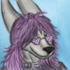
Over two months in the making. This is for  Sierraracs
 Silverrat, SierraRacs, and myself hanging out. We're into playing the latest MyLittleBrony:Fanship is Fappics card game. Sierra's just there for fun conversation.
FA slaughtered the detail with its crappy compression. Lovely.
 Sierraracs
  Silverrat, SierraRacs, and myself hanging out. We're into playing the latest MyLittleBrony:Fanship is Fappics card game. Sierra's just there for fun conversation.
 FA slaughtered the detail with its crappy compression. Lovely.
Category Artwork (Digital) / My Little Pony / Brony
Species Unspecified / Any
Size 1024 x 768px
File Size 103.3 kB


I have the awesome 13mb .pgn file (muhahahahaha)!
Zid, you have really pushed yourself in this commission. You really set a high bar for yourself and in my opinion you hit it out of the park. :)
I really hope that you are as proud of your work as I am in you for your commitment and dedication. You are an awesome friend and I am very happy you agreed to take on my request.
You are the best!


To be brutally honest, I always thought the airbrushed fur looked odd. I like the amount of detail you're putting there, but I honestly think that particular style would look better in Traditional, with a pencil.
I really like the way the orange guy is drawn and colored, his linework is very smooth (save for his right leg, which looks a little longer than the other) and the pose feels natural.
The background and props, they're kinda flat-looking to me.
Again, all this is just my opinion, and I believe you're making good progress.
100% agree with you. I don't really have the skills to make fur look good. Check out 'Morning Coffee'-Zid looks way better when he's toonier. Silver's pose IS really weird, and yeah I had a lot of trouble with the legs plus everything does look flat.
I learned a lot from this but at the same time I made a lot of mistakes. Hopefully my next piece will benefit from it. Thank you very much for the critique I really appreciate it.
I learned a lot from this but at the same time I made a lot of mistakes. Hopefully my next piece will benefit from it. Thank you very much for the critique I really appreciate it.

My goodness, how could i have missed this in my submission!?
The fur detail is fantastic for both you and the racoon(?) on the right!:)
You also did exeptionally well on your feet and the racoon(?)'s face, those angles are difficult!
2months? What was the most difficult part?:)
The fur detail is fantastic for both you and the racoon(?) on the right!:)
You also did exeptionally well on your feet and the racoon(?)'s face, those angles are difficult!
2months? What was the most difficult part?:)
Yeah I didn't add shadows because by the time I got to coloring everything I'd already sunk a ton of time into it. As far as what he's leaning against..I was going to add a wall but just wanted to get this done. I didn't do as good a job on Silver as I did with Zid & Sierra.
The most difficult part was the table and chairs. I drew them last. Instead of drawing the perspective stuff first I started with the figures. It made everything more difficult than it needed to be. From now on I'll be using my avatar & building skills in Second Life to set up scenes like this.


I really love the hands. There are a bunch of nice little details here, such as the clock, the lampshade, as well as the aforementioned hands. (Also, I wish I had a purple jacket like Zid's!) And I especially like Silver's pose, but I can't tell if there's a back to his chair so it makes him seem off balance.
When you draw tables and chairs, do you draw the characters first or the props first? I was always taught to draw these sorts of props before drawing characters, and if you're not doing that already (at least as an underlying sketch) that may help you. I also feel like more could have been done with the lighting, especially since what is in shadow is so dark.
I think this kind of picture could benefit from a different composition or perspective. It's nice to see full-bodied characters, but I think something like this would work even better if it were a bit more intimate and we, as the audience, were invited a little closer. I'm imagining a perspective where maybe we're looking over Silver's shoulder and everyone is just a little closer together. As it is now, everyone just seems so distant. Of course, this is all just stuff to keep in mind for future compositions.
All this sounds way more critical than I intended, but I really am impressed by how you do continue to improve.
This means a LOT. I agree with needing it to be more intimate. I should have studied the 'Dogs playing poker' pictures that led to this because most of them are like that-close. Very intimate. I think looking over Silvers shoulder would have worked better, and would have helped perspective-wise.
As far as perspective-I made a mistake. I realized too late that I should have gone into Second Life and used my avatar as a reference. There are plenty of areas in it where I could have had my partners and I sit our avatars around a table in similar poses. I could have then used the screenshots as a reference. Live and learn.
The biggest issue is lighting-I was going for something waaaay too advanced. Lighting is something many professional artists struggle with though so at least there's that. Thank you so much for your critique!
By the way, have you ever looked into the works of Andrew Loomis? I believe most of his books have been out of print for many, many years, but you may be able to find at least parts of his books online. His figure drawings are probably what he's most well known for, but the books Figure Drawing For All It's Worth Creative illustration has some really interesting ideas for compositions and perspective. It can all seem really advanced and overwhelming, but it can be a great source of inspiration.
My grandmother has all of his books. I grew up reding them. I'm actually not as good now as I used to be due to not drawing for 20 years. I'm gradually catching up to where I used to be. Back in high school I had a lot more motivation to draw because I had no friends. I think my biggest issue is how much more easily distracted I am. I need to see if I can find some of his stuff on pdf.
Oh, hey! Coolness. Thanks for reminding me of these.
http://illustrationage.com/2013/04/.....ion-downloads/
http://illustrationage.com/2013/04/.....ion-downloads/

Comments