 FA+
FA+
17037
Views
Views
388
Favorites
Favorites
Category
Artwork (Digital) / Comics
Species Vulpine (Other)
Size 1600 x 712
File Size 551.1 kB
Report this content
More from Zaush


Listed in Folders


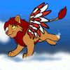
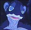
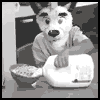
Here's the first three pages of about a 6-7 page short comic project for a class I'm taking online called Drawing For Comics. It's a wordless comic, and the pages are in the rough sketch phase for this portion of the project. I should have the followup pages up in a few days.
Category Artwork (Digital) / Comics
Species Vulpine (Other)
Size 1600 x 712px
File Size 551.1 kB
Listed in Folders


After an event last night with some extroverted idiots... "idea of treat others the way you want to be treated " I don't think this'll ever bloody happen. "Stop speaking to me like a PoS", sorry, but if I wanted to speak to you like that lady, I'd be fucking screaming at you so loud the entire campus can hear. Expecting manners when you rung everyones bell because you're too stupid to bring your OWN keys with you, and then playing music too f-ing loud... *slams head on door*
As for how we got so far... ask any old person what their community was like. Then the govn't got too involved in parenting, and parents also stopped giving two shits. *lesigh* I don't want to live on earth any more D:
As for how we got so far... ask any old person what their community was like. Then the govn't got too involved in parenting, and parents also stopped giving two shits. *lesigh* I don't want to live on earth any more D:


the golden rule is 6 panels per page. The first page should probably be split up. The other ones work well enough.
Also, a panel's width generally represents 'shot time'. You have some fast looking horizontal ones, and some slow looking tall ones. I dunno. Not bad, but you could do better.
Also, a panel's width generally represents 'shot time'. You have some fast looking horizontal ones, and some slow looking tall ones. I dunno. Not bad, but you could do better.
I find the look really interesting, since Euro comics in general came from the necessity to pack in more information in each page (two plot points on average) due to constraints on page count. At the same time, euro comics and graphic novels are also larger format A4 (or sometimes bigger) for print. When I went into this workshop I was already pretty interested in the euro look, and the person who is instructing draws for the french market which seems to follow its own set of standards. Here's an example of his work: http://www.timmcburnie.com/pinocchio-2014/


I think it's hard to instantly get that she fell through ice, but one reason for that is the trees. They look fluffy and full of leaves. If it were winter, shouldn't they be bare? And if they're pine, then that just means the shape of the trees are wrong. Changing these points would help with setting the scene, in my opinion. I'm only pointing this out because if the is for a grade in your class they might point that out. But this is over all very well done!


Comments