 FA+
FA+
6034
Views
Views
227
Favorites
Favorites
Category
Artwork (Digital) / Transformation
Species Western Dragon
Size 1200 x 900
File Size 315.4 kB
Report this content
More from Blueballs


This loathsome criminal just robbed a bank. After throwing the money over his bed and rolling around, he fell asleep. Since each banknote is technically an IOU for some amount of gold...
It's really just tempting fate to fall asleep on stolen gold.
Full view please? I spent ages drawing scale details.
The last, and best, of my transfur attempt 3 images.
I didn't get in (sadface).
Some errors fixed. Guys! From now on, if I try to get away with really bad tricks (like crappy photoshop texture) you totally have to call me out on it. I'll never learn, otherwise.
Category Artwork (Digital) / Transformation
Species Western Dragon
Size 1200 x 900px
File Size 315.4 kB
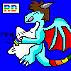
This is what happens when you touch yourself at night.
Errr...
Anyhow... I'm not a big fan of dragons to be honest. But this feels like a nice thought out piece, and I wouldn't mind seeing where it goes. So I think I'll watch yah for a bit.
It's laid out nicely, the colours are good. But the scales look a little off. The mix between human and scaley is balanced nicely here. =P The hands look a little weird though... and the face looks a little cartoony and not enough shocked or scared; I mean, the text looks like he's yelling.


This is quite a good piece. But I say that about pretty much everything you draw. And I think a lot of people, myself included, feel reluctant to criticize art that we like, for fear of driving the artist off. But I do think that there's some flaws in this piece that don't show up in your other pieces. So let me concentrate on the parts I didn't like so much.
I'll respectfully disagree that the face doesn't look shocked/scared enough; it's half-reptilian, and a reptilian snout isn't particularly expressive. It seems like if you tried to increase the "shockedness" of these facial features, you'd also wind up increasing the "cartooniness", and that wouldn't improve the piece.
The wings do seem perched perilously high on the shoulder blades -- maybe that's what's giving it a bit of a cartoony look.
I don't know if the text makes it look like he's yelling. But it does make it look like he's speaking perfectly distinctly, and that seems pretty darn unlikely if he's just sprouted a snout and especially a tongue like that.
The shape and positioning of the spike right at the tip of the tail looks odd; it's hard to see how that would even stay in place. It seems like if you're going to have something like that on your tailtip, it would probably look more like the claws on the feet.
The spikelets on the wings look a little like Hershey's Kisses. :)
Does the final form have three fingers or four fingers per hand (plus the thumb)? From the look of the left foot, I'd expect it to be three; and his left hand looks consistent with that, though it's hard to tell from this angle. But the right hand looks fairly far along, and there's no sign of the pinky shrinking or merging with the ring finger or otherwise going anywhere. (Or is it his thumb that's disappearing? That seems anatomically unlikely.)
Oddly enough, the one part of this piece that I really get hung up on when I look at it is the whole issue of socks. The left one has apparently gotten thrown completely out-of-frame, which I suppose could happen. But what's up with the right one? Unless it got torn completely in half somehow (which seems really implausible), his foot would have had to at least double, maybe even triple in size in order to make the sock look that small in comparison. And his foot doesn't seem nearly that far out of proportion with his leg. So the sock mystery cannot be resolved. And the texturing you've applied to the sock just winds up looking really wrong -- it has a very visible and perfectly horizontal-and-vertical grain pattern, with no sign of any changes in direction in the places where the sock would obviously bend or be distorted (at the ankle, around the folds and creases you've drawn, etc.).
The curtain in the background doesn't draw any attention to itself, which is a good thing, because when I do look at it, I notice that you've applied that same texture from the sock, which makes it look like a giant gauze bandage. :) And again, the pattern is perfectly horizontal and vertical, despite the fact that the edges of the curtain clearly aren't. If you're going to use textures with visible grains on cloth, then you're going to have to work out some technique of distorting the texture at the places where the cloth would bend or fold.


Nice work. Good detail too. :)
Oh, and by the way, don't worry about not getting into transfur...for the following reasons:
1 - Transfur is very overrated as a site and is slowly colapsing down around itself...
2 - you're more likely to get more attention on places like DA and FA these days...
3 - the guy who runs Transfur is an asshole. he thinks of the site as his own person art site where he rules over it all. He even tells people what he considers to be art and not, by controlling thier accounts. For example (and this genuingly happened), an artist who used to have an account there posted a picture into the Completed Images (CI) section of her gallery. The next day she showed up to check things and found that it had somehow ended up in the Sketches and Scraps (S&S) section, a section that most people don't visit. So, thinking it was a mistake, she moved it back to CI. Once again, it was moved back to S&S. She contacted the owner of the site, asking about it, and found out that it was him who had moved it. (Yes, he thinks he can control everyones artwork.) After asking him why, he reason was 'The eyes don't look quite right.'. So, she closed her account. I don't blame her really...
So, if you like the thought of having your artwork ruled over by someone (who i'm fairly certain can't draw himself), then keep trying. If not, then stick with DA and FA.
But I can certainly understand why an artist would love to be on TransFur. There's such a small pool of artists and art submissions that a piece can easily stay on Page 1 of the browsing interface for two weeks. On FurAffinity, any given submission scrolls off of Page 1 in a matter of minutes. Really good stuff can get lost in the shuffle.


Comments