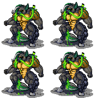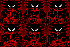
On this test pic Keith wanted me to try do alot of deffint line style to see what I can pull off. he said that I dont keep my own kind of art style he said that I can almost do all kind he said that in art styling Im all over unlike others that keep doing the same over and over like say Fred Perry or Dong Winger theres are very fine and you know who done it but my is a mess I think, but hsaid no its not a mess I can do WB, Disney to Marvel, Anime if I choose to.
Anyway here style from A to E on three kind of guys plus Keanu as references for size.
Anyway here style from A to E on three kind of guys plus Keanu as references for size.
Category Artwork (Digital) / Muscle
Species Unspecified / Any
Size 1920 x 3600px
File Size 1.85 MB
Listed in Folders
I think E is the best one, but also like D. The problem with everything else except D and E (for the most part) though IMO is that they the overall line thickness stays static. You could vary the thickness of your line strokes more, depending on how important the lines are (like in E with the silhouette & other important lines, but just more). Moreover, try starting&ending your lines less "abruptly". A bit hard to explain, but try making the ends of individual strokes "sharper". For example the horizontal lines on those guys pecs or the lines separating the two individual muscles in the biceps would start out at their most thickest at the base of the muscle and gradually get thinner and thinner and eventually thin to nothing as they approach the center. Currently they just stop right before the middle, which quite frankly looks a bit cruddy IMO, even if the lineart is otherwise good.
I agree with Matelija on everything. Line work on everything but D and E is too static and makes the picture too flat and just isn't smooth. Try to play around with line thickness. Make the lines gradually get thicker and thinner in different parts of the body. The silhouette or the line that the light source is not hitting are generally the ones that you would want thicker.

 FA+
FA+


Comments