 FA+
FA+
4675
Views
Views
392
Favorites
Favorites
Category
Artwork (Digital) / Fanart
Species Unspecified / Any
Size 1083 x 851
File Size 301.6 kB
Report this content
More from greenendorf


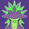
More MeatyKnight for your viewing pleasure; his design is largely based around Death Adder from the Golden Axe series.
Had a lot of fun playing around with lighting and darker palettes here.
Had a lot of fun playing around with lighting and darker palettes here.
Category Artwork (Digital) / Fanart
Species Unspecified / Any
Size 1083 x 851px
File Size 301.6 kB


Your use of highlights is always impressive, and sharp, much like  Digitslayer's work.
I wonder how you would do with a vectorized medium. I think your style would fit nicely with it, and the added benefit of being able to change the resolution is always a plus.
This fills me with such a strong, conflicting sensation. The complimentary contrast sort of straddles the whole evil forces bit, while still feeling warm and inviting with that supple glow. And I say this knowing nothing of the series, so forgive me if he's not a bad guy. :p
I really like this. Obviously. :]
 Digitslayer's work.
I wonder how you would do with a vectorized medium. I think your style would fit nicely with it, and the added benefit of being able to change the resolution is always a plus.
This fills me with such a strong, conflicting sensation. The complimentary contrast sort of straddles the whole evil forces bit, while still feeling warm and inviting with that supple glow. And I say this knowing nothing of the series, so forgive me if he's not a bad guy. :p
I really like this. Obviously. :]
Thanks, Chark. That's the exact atmosphere I was going for - ominous, but with a slight warmth. Meta Knight sort of hops between being a villain and an ally (or somewhere in the middle) depending on the game, so it's open to interpretation.
True vector art is something I've only experimented with briefly - most of my work uses cel-shading and hard lines which merely resemble vectors. I do like the vector style, but prefer making paint-like stokes with the tablet.
Ideally, I should have added more colour steps to simulate the effect of soft shading, but I kinda messed up by putting some of the wrong colours and effects on the wrong layers, which made that a little awkward. So I resorted to blending the areas together to soften them up. I'll chalk that one up to experience. :V


Comments