 FA+
FA+
1840
Views
Views
80
Favorites
Favorites
Category
All / Comics
Species Unspecified / Any
Size 1280 x 810
File Size 703.2 kB
Report this content
★
More from UnregisteredCat


Listed in Folders


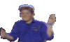
Superheroes? pg.1 (F5)
Done for  's birthday!
Includes me, unregisteredcanine,
  jackson77,
  chioro and
  bigtacodragon
What amazing things will we all get ourseves into next?! Stay tuned.
 's birthday!
Includes me,
 unregisteredcanine,
  jackson77,
  chioro and
  bigtacodragon
What amazing things will we all get ourseves into next?! Stay tuned.
Category All / Comics
Species Unspecified / Any
Size 1280 x 810px
File Size 703.2 kB
Listed in Folders


I suppose most of my exposure to comic format is limited to traditional print, or scans of them. I haven't really dug into webcomicsi so much.
I'm actually curious. Generally the length of a panel indicates how long the 'shot' is. A tall narrow panel is perceived as 'fast' because of how fast the eye reads across it to the next one. In a comic where the page is wider than it is tall, what does that do to the pacing of the pages?
I guess another thing to mention is that it's really weird to have the speech balloons completely outside of the panel, with just really thin colored tracer tails connecting them to the speaker. From panel one, your eye goes directly right to the head of the character who spoke in the previous panel. Then we see a line going up to speech, so we follow it and read it. Then we see there's a balloon higher up, meaning that we should have read that one first? But who said that one? Well, from the wrong balloon, our eyes then go up, to the right, and then finally to the character who was supposed to speak first on the page.
This could be entirely remedied by just taking the blue character's speech balloon and putting it on the bottom of the panel. That way when we first get to the panel, we see that the same character isn't speaking first, read the balloon, and then see the character. This still isn't ideal, but it's much less confusing. From there the reader would follow the characters to the right to see all of them, and then hook down to the bottom of the panel to read the blue character's reply.
Still, it's interesting to see people do things different ways.
Oh yes, I like seeing how others do art too. But I don't like to take any kind of scientific approach to comics, I'm a bit more experimental and messy until I find my way.
The reason I placed the balloons that close to each other is because I wanted to show how quickly she spoke and how quickly he retorted. If I had moved the blue bubble farther, to me it would have felt like a "pause" in responding.
Honestly I'm not a fan of the empty white space i added outside of the borders. I may change the file to have a transparent background. Hmm....
Anyway! I appreciate your in depth response! However, I feel like some things should be fun, and not necessarily perfectly measured and orchestrated all the time. I understand if it was something more commercial, but you can't over-think things that give you pleasure !
That's a perfectly reasonable reply. There's no harm in trying to do things a new way without a model in place. And you're right; moving the speech balloon down to the bottom of the panel would make it seem like there's a bit of a pause in the reply which won't work if the intent was to have them really close.
Well, looking forward to the following pages~
and yeah, maybe get rid of that white border if you're going to use black gutters.
Well, looking forward to the following pages~
and yeah, maybe get rid of that white border if you're going to use black gutters.


Comments