Category Artwork (Traditional) / General Furry Art
Species Unspecified / Any
Size 530 x 700px
File Size 161.6 kB
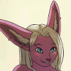
Just a lil bit of error, the AA whiteness around the .gif is hard to smite, leeast in my experiance, dosent look so bad shrunken down, but would have been alot easier above 25k I damn well know that much. A ferw more frames are needed to make it looks smother, but again the file size wont permit. I like it tho :3
-Z
-Z
Thanks =) Honestly, it's like my second animation practice, first one only being that Mentok icon >.> How do I take out all the white fuzzies? I shrank down the mask and cut the background even more so it chopped into the image itself, though any further and it would have been cutting the image majorly =/
~N~
~N~
I may be wrong, but ive learned that getting rid of the white is to ether begin in a non-AA envronment, with vector in illistrator, then exporting to phohoshop, and you adjusted the brightness of the layer thats red for the diffrent grames id guess, which will still work. Or, make the layer set to multiply with the transparent background. i like your mentok one better heh
-Z
-Z
First of all, I do have to say this look less Mentokastic than the last one.
Seriously, though, this is pretty awesome. I do think you're getting better with the Photoshop animation. First of all, the red pulsing was done well, I'm glad you had it just fade in and out rather than making it disappear completely. Where I really think the improvement shows through, though, is the flickering tongue. In the full view it moves very smoothly, and because it flows so well you really can't pick out the individual frames so it really completes the illusion of motion.
Finally, I really think this shines as a icon. It's simple enough to understand from a quick glance, and it really does look awesome beside your name. In the icon version you can barely make out the tongue, though, so if I didn't already know it was there I might not have even noticed it.
It's another one of your icons that are going to given me nightmares, though.
Thanks a lot for sharing your work, NachT! ^^ I think if you do want to keep doing animation you are good at using Photoshop to do it, but you might be even better using a program designed for it. Whatever you decide to do, I hope you keep us up to date because it is great to see what you can do!
Actually, I took the tongue out of the icon. Couldn't really see it, and it made more space for the upside-down cross for infront of himself. Just utilized the space better I think by swapping tiny tongue for the cruicifix =)
Thanks =) I'll still toy around with it before doing anything really serious though, it's all just to get out of this art-funk I'm in atm anyways x.x
~N~
Thanks =) I'll still toy around with it before doing anything really serious though, it's all just to get out of this art-funk I'm in atm anyways x.x
~N~

 FA+
FA+


Comments