 FA+
FA+
1946
Views
Views
149
Favorites
Favorites
Category
Artwork (Digital) / Pokemon
Species Pokemon
Size 1150 x 889
File Size 598 kB
Report this content
More from sarki


")
")

Listed in Folders
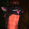
![[exp] Fear the Sarkichu](http://d.furaffinity.net/art/sarki/1419295307/1419295307.sarki_sarkichu-scythe.png "Click to change the View")

-= Experimental Flag =-
After the last batch of commissions I've been trying a new approach to painting thingies.
So I came across this really weird method in which you paint/render everything in black and white first then color it digitally. It is super fun to work with but I don't think I have quite the grasp of making colors look good on it yet. ^_^;
Guinea Pig #1 was Sarkichu, with a chu-scythe... which is in no way making up for his inability to produce lightning.
Category Artwork (Digital) / Pokemon
Species Pokemon
Size 1150 x 889px
File Size 598 kB


I paint black and white, then add colour. it really helps, I can't imagine going back >__< Then when I have done the full greyscale painting, I lighten up that layer if I need to, then add a multiply layer over the top with the colours on it. I play around with that for a bit, then merge em together and work on it from there.
It helps me because it's hard to shade over top of the colours nicely, you need to constantly be changing your brush colour so you don't mess up the coat markings or whatever. Doing it this way means I can focus purely on the lighting and anatomy etc, then worry about the markings and stuff afterwards. u__u
If the colours look too muddy then I'll add an overlay or multiply layer between the grayscale and the colour layer of a creamy brown or a light purple or something, depending on the subject, so that the shadows fade back to a nice colour, not just blacky grey, because that looks gross.
This is a really nice picture =D I hope you play around more with this method ^3^ It's used by a lot of really big artists in the industry and stuff so it can't be too far wrong =D
Thank you for the input dear. :)
I've picked a lot of this up from watching Ctrl Paint videos. He showed this weird method and I had to give it a spin.
It is incredibly fun to work with, but as soon as the colors come into play it gets a lot trickier than the more standard Ink -> Flats ->Shading.
Overlay layers help a ton, but this one right here was only at a presentable state after a lot of spot fixing with hard painted colored strokes on top ^_^;
Gotta admit it really helps defining shape and form by working like this, I love it.


Comments