 FA+
FA+
1393
Views
Views
33
Favorites
Favorites
Category
Artwork (Digital) / All
Species Unspecified / Any
Size 1750 x 870
File Size 587.8 kB
Report this content
More from sarki


")

")
Listed in Folders
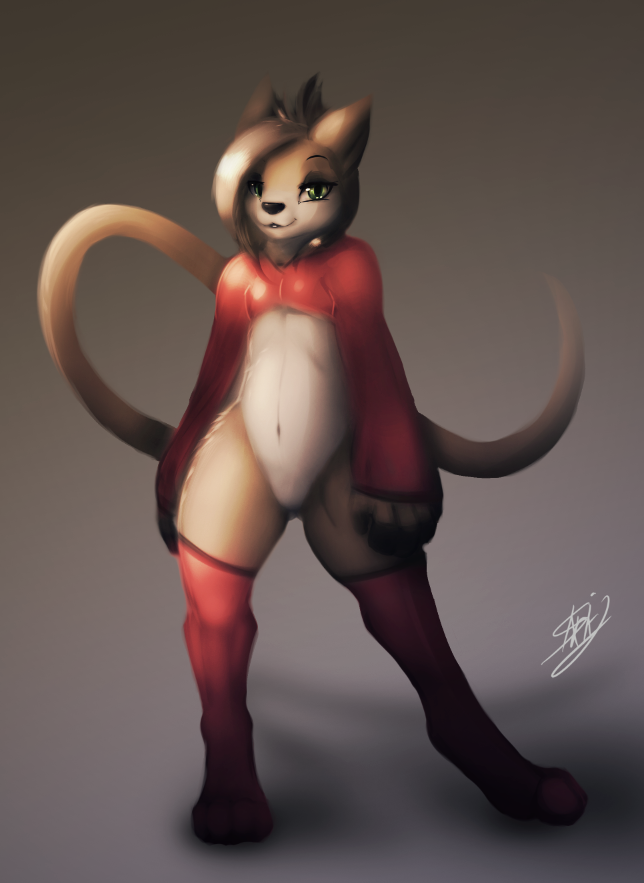
![[exp] Coloring is hard.](http://d.furaffinity.net/art/sarki/1419431024/1419430975.sarki_cat-painting-red.png "Click to change the View")

*Still hasn't figured out how to properly color these things*
I feel like the shading looks fine (it's probably one of the most fun shading styles I've found so far). But something doesn't quite work out right when putting color through it.
Back to the drawing board~ |3
I feel like the shading looks fine (it's probably one of the most fun shading styles I've found so far). But something doesn't quite work out right when putting color through it.
Back to the drawing board~ |3
Category Artwork (Digital) / All
Species Unspecified / Any
Size 1750 x 870px
File Size 587.8 kB
Listed in Folders


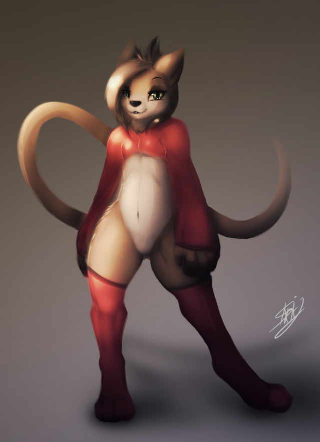
It may be because you're starting with a greyscale shading map before adding hues to it that it looks off. It means your shading comes off as looking dull due to it being originaly black and white. When you go to colour over it after, you should try changing the hues in the darker areas from the lighter ones. Eg. On your browns, make the darker areas more orange-red. Just kinda move the hue slider towards blue for your darker areas and see how you like it.
*nod nods*
That was something I hadn't considered. I always shaded with dark blue or reds in the old style. Not sure why I was attempting to go straight black and white here.
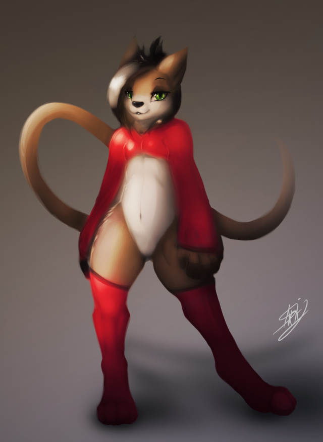
After some tweaks here is how that turned out:
http://i.gyazo.com/310fb5ba50ddf2ca.....71206d7cc8.png
A bit more saturated:
http://i.gyazo.com/dd0405937307a5be.....165f57e968.png
This was just from playing with the layers a little bit, I might just have to try it again in a another drawing |3
It's a learning process ~
That was something I hadn't considered. I always shaded with dark blue or reds in the old style. Not sure why I was attempting to go straight black and white here.
After some tweaks here is how that turned out:
http://i.gyazo.com/310fb5ba50ddf2ca.....71206d7cc8.png
A bit more saturated:
http://i.gyazo.com/dd0405937307a5be.....165f57e968.png
This was just from playing with the layers a little bit, I might just have to try it again in a another drawing |3
It's a learning process ~

Hmmmm~ Maybe.
I think it might be the colors actually taking away too much detail from the shading, it looks dull ^_^;
This is what happens when I pull up the colors: http://i.gyazo.com/cdce2e9d8852932f.....bf892ee097.png
I think it might be the colors actually taking away too much detail from the shading, it looks dull ^_^;
This is what happens when I pull up the colors: http://i.gyazo.com/cdce2e9d8852932f.....bf892ee097.png


Believe it or not, I think that it is actually more inherently a shading issue. It was something that Sycra on YouTube actually said once that usually when someone thinks that there's a coloring problem it's usually actually a shading problem and he's much better than I am at this point but I've come to see what he means even when looking at some of my own work in the past, too.
It looks as if to me that you have an idea of where the light source is coming from but less of how it hits the planes of the body parts as three-dimensional ones. Also, as long as your not in space, there's probably going to be reflected light somewhere which can help to make an object seem more three-dimensional.
It's also a good idea to pay attention to the contrast of certain areas, seeing if they blur together too much if you get further away at the edge could indicate a problem.
Another good thing to keep in mind is that when a light source hits an object is that the core shadow will occur perpendicular to the direction of the light source.
Practicing from photographs to with single light sources as opposed to ambient ones can help to understand the form of how the light hits it.
For something that probably explains it a bit better than I can and with audio-visual elements to, I'd take a look at this as I feel that it's helped me and other people in the past a lot. For the record, the guy teaching this aside of being a wonderful artist does in fact have a MFA and is an art professor at a college: https://www.youtube.com/watch?v=V3WmrWUEIJo
Thank you dear, that was incredibly helpful.
There are a few mistakes in the lighting, using this style of rendering I get a lot less room for error, since it's going for detail.
It's a problem that has plagued me for a bit, but it was a lot less obvious when doing "cartoony" style paintings.
The difference now is that when applying the color A LOT changes, which is something I wasn't prepared for.
Shading and the coloring are not exclusive to the full composition, so I guess by getting better at one it will greatly help the other. ^w^
I think that it's less of a compositional issue and more of a form issue in a way. Not that your proportions or anything are so off but, what I mean more is that it helps to define particular planes of your object to simplify for yourself how the light hits it as opposed to thinking light side-dark side on a 2D object. Making something more polygonal to begin with can even really help to let yourself draw the line between the light and dark.
I think that if you know what you're looking for that you can see that it's still present even in the grayscale, but when you apply color, if you didn't notice it before things may become a lot more obvious.
Generally problems with colors that occur are more about the balance between the main color of a picture and its saturation vs the opposite colors, using cool colors to make backgrounds and certain things recede, using colors in shading such as warm highlights and cool shadows depending on the situation, and potentially an overall balance between warm and cool colors.
I'm glad that you've found any of this helpful as I find that opposed to the use of particular programs, brushes, techniques of application, or mediums, that the overall fundamentals of what make the image itself (flow, rhythm, value, form, composition, hue, and saturation as examples) are really what makes an image good in the end. ^-^

Honestly though i was thinking about it when you mentioned it ghe other day and i think its about contrast and maybe the color of the shading?
Some of the parts kind of run together like the shoulders or the top of the belly.
Then again maybe its the hardness of the shadows?
*is such an expert in the field* .w.
Some of the parts kind of run together like the shoulders or the top of the belly.
Then again maybe its the hardness of the shadows?
*is such an expert in the field* .w.
Comments