 FA+
FA+
520
Views
Views
4
Favorites
Favorites
Category
Artwork (Digital) / Comics
Species Human
Size 956 x 1280
File Size 361.9 kB
Report this content
More from LiimLsan

 (\"Car Car Motherfucker\")")

")
")


<<< PREV | FIRST | NEXT >>>
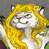
For all your cursed totem needs... "Hey, I saw this cursed totem, and I know you like Supernatural and Ospreys, but I wouldn't put it on, it shrieks. Happy Birthday! -Liam Anne"
Such good friends you have...
It's very hard to draw people you know but haven't met in person, since I don't think I've ever seen a picture of her without her muscles partially tensed. I don't know how she does it, I'm paranoid about sharing even a selfie online... until I step up my makeup game a LOT and probably start hormones. Dat is het leven.
I'm still trying out my digital lettering skills, but I'm erasing 90% of my lines to make them smoother and choppier and more appealing... like, I know I should be going for the interesting flicks of the wrist, like her style, but I love the free-flowing, smooth stroke calligraphy stuff too much. <3
This picture for some reason saved at a much lower resolution than normal... it's a pain in the tuchus for it.
It doesn't take me much effort to color everything as opposed to sepia-ing everything, but it takes so much more time wasted on me planning out the color like the invasion of Normandy. Did you see the first page, where I somehow had to render a multi-toned black car, black asphalt, and the shadow of the black car on the black asphalt with different shades? It only reads because every one of those blacks is tinted ever so slightly to purple, yellow and ultramarine, respectively - and because it's black, tinting them is the difference of only one or two RGB settings, or the value of the image is thrown off. Can you see how I get engrossed in all of these? I had an elaborate beige-avocado-mahogany scheme here, but it looked so much like the Jungle Room at Graceland that I threw it out. Too much woodcarving. Of course, my great-uncle Pete, who was not only at Normandy but carved Eisenhower's toilet seat for it, would slap me if he knew I wrote this paragraph, much less drew furry comics on the internet.
Category Artwork (Digital) / Comics
Species Human
Size 956 x 1280px
File Size 361.9 kB

I wish I could appreciate your Normandy-invasion-level planning of the color scheme, but as I said, I'm functionally color blind. The tonedeaf Technicolor-onslaught of my comic pages must feel pretty harsh to you, I imagine. Your ability of doing calligraphy like that commands my utmost respect, though, being someone who's handwriting is flat-out terrible. I thought that drawing practice would improve on that skill as well, but it hasn't happend so far for me. I guess it IS an entire discipline of it's own.
And that's an interesting story about your uncle, although I guess pretty much everyone from the 40s would slap us for anything we do on the internet here XD Thank dog those times are long gone by (for the most part).
And that's an interesting story about your uncle, although I guess pretty much everyone from the 40s would slap us for anything we do on the internet here XD Thank dog those times are long gone by (for the most part).
Nah, it's your digital stuff that hurts my eyes, your colored pencils aren't that bad. I'm alone in this generation for not succumbing to the thrall of magenta and cyan - Here's a classmate of mine, for reference.
And no, it's an entirely separate difference. With a picture, you're trying to make a whole picture look good, and the details reflect your imagination, full of giant overdramatic melismas. With calligraphy, in contrast, you're aiming at a completely different target - clarity, legibility, neoclassical appeal, harmony of abstract proportions. The letters have to feel beautiful in sequence. Your hand needs to be stiff, steady and assured - the exact opposite of a painter's hand. Some people can switch between them, some can't - but the whole "discipline" and "perfect" aspects are much more easily appreciated by the layman than appeal, beauty or imagination - since the former is applicable to both sides of your brain, not just the right - so there are a lot more people with good handwriting in the world than good artists (of course, since typing became more prevalent, fewer people are bothering, and now calligraphy is like bodybuilding - people used to have to do it to perform their jobs, now that we can sit at a chair and type all day, it's become worshipped as an abstract art instead of tolerated as an applied art).
Typography is more like visual engineering than anything else - you're trying to engineer every letter so that the text is legible and beautiful and invisible. Same thing with colors - I'm trying to make my pages look luscious to the eye, like ripe fruit.
It's a totally different discipline.
I'm very glad those times are gone. I just came back from the dentist to have a pair of side cavities cleaned and filled, and it occurs to me - I had anaesthetic in my jaw, he had micro-drills with smooth operation, ultraviolet light, various space-age compounds, and it barely hurt at all. In the forties, I'd probably lose a tooth or two from this. Or in China, with their foot-powered dentist drills... fuck fuck fuck. My father was a very cavity prone child, and a decade ago he had to get his entire mouth basically redone because the silver fillings they used back then eventually corroded and made it worse after a couple of decades, root canals, the like...
They'd slap us, you're right.

Comments