 FA+
FA+
877
Views
Views
67
Favorites
Favorites
Category
Artwork (Traditional) / General Furry Art
Species Unspecified / Any
Size 785 x 610
File Size 466.5 kB
Report this content
★
More from NaughtySong


I: http://www.furaffinity.net/view/1353994/
II: http://www.furaffinity.net/view/1465526/
For moonykins
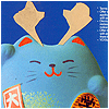
materials used: brush pen, technical pen, Copic and Prismacolor markers, white marker and white gel pen on parchment paper
II: http://www.furaffinity.net/view/1465526/
For
 moonykins
materials used: brush pen, technical pen, Copic and Prismacolor markers, white marker and white gel pen on parchment paper
Category Artwork (Traditional) / General Furry Art
Species Unspecified / Any
Size 785 x 610px
File Size 466.5 kB


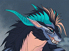


WHY ARE YOUR SHADINGS AND HIGHLIGHTS SO SEXY
WHY
Anyway! I love this one so much! The square-ish fillers in the stripes add a lot of really eye-pleasing detail to the picture and that red horn is just.... Amazing. It looks like i should be able to reach out and touch it!
WHY
Anyway! I love this one so much! The square-ish fillers in the stripes add a lot of really eye-pleasing detail to the picture and that red horn is just.... Amazing. It looks like i should be able to reach out and touch it!


Just thought I'd give you a quick heads up...I will send you that ref for my commish as soon as I can. But I'm stuck without computer for the moment. :c
All that aside, this is fantastic. I love the expression and the pose and the horn is awesome. A huge thumbs up on this. Yes.
All that aside, this is fantastic. I love the expression and the pose and the horn is awesome. A huge thumbs up on this. Yes.
Thank you so much, Darzi!! : D I really appreciate it. :}
And yes, the reffie will be very helpful! Don't worry, seriously. I mean, being stuck without a computer BLOWS badly. IMO anyway. :[ *clings*
I can't wait to get started on yours!! Wee 'lil ferret eeee ;__;
And I am veryvery happy that you like this. ^__^ *squeeze*
And yes, the reffie will be very helpful! Don't worry, seriously. I mean, being stuck without a computer BLOWS badly. IMO anyway. :[ *clings*
I can't wait to get started on yours!! Wee 'lil ferret eeee ;__;
And I am veryvery happy that you like this. ^__^ *squeeze*

Thank you! I'm glad you like it. :}
As far as the horns are concerned, I'm going to have to respectfully disagree with you. I very carefully planned out the coloring for the entire picture, and made every single decision entirely on my own after careful consideration, down to the very color and texture of the paper itself.
But of course you are entitled to your own opinion on the matter. No worries. :3 If you want to go into more detail about why you think it 'loses unity', please feel free to do so. It is just that, at the current time, I am not convinced that I made an ill decision for the horns.
note that this is entirely a matter of personal taste, I may be the only person on earth feeling that way ^^
by unity I meant the more different color scheme used, the more one creature feels "patchworked", as in "putting together various elements that werent originally meant to be together".
you chose to put in evidence the unicorn by selecting a different color scheme. fine with me.
but you also did some different color scheme between the main curved horns and the other horns/spikes, they are darker and brownish and have the redish texturing.
It certainly make them less "blank"/"flat" but I feel like you went too far and made them too different from the other horns/spikes as if they were taken from another animal.
maybe if you hadnt added the redish texturing, or if the grey coloration had been the same, I may not have reacted.
adding details/variations is nice and add a lot to the interest and effect to an art piece, but adding too much can have the opposite effect.
Here the effect I feel is very faint, just some uneasiness, hence my comment about "unity"
I really like your artwork and I hope I didnt make too much of a fool of myself here ^^
Thank you so much for going into detail about this, THIS REALLY, REALLY helps me out so much!! THANK YOU! : D
I see what you mean now. Yes, this all makes sense. I am going to keep your information in mind. In fact, I am working on another (well.. a few others, actually ^^) at this very moment, and will do my best to take into consideration all the information you've given me here.
You didn't make a fool of yourself at all. On the contrary, this is extremely helpful and insightful. Again: Thank you so very much! ^__^

Oh man. I keep going to this to leave a comment, and each time I can't even begin to know where to start! Or to put into words how awesome this looks! The horns, the, uh, spike on his forehead, the spines on his tail, the claws, the teeth, the fur pattern... I just wanna go up there and give him a big ol' hug! But that snarl like he looks like he's going to seriously tear me to shreds if I even get close to the little guy!
And yep, there it goes. The awesomeness of this (coupled by a desperate need to sleep unfortunately) has broken my brain :P
And yep, there it goes. The awesomeness of this (coupled by a desperate need to sleep unfortunately) has broken my brain :P


The coloring on all the horns are beautiful. I love the flow and steadiness of the lines on the side horns and all the colors you used in them (and the claws, too). The red horn is just gorgeous. The squares are really cool.. good ol' geometry actually useful for something. :P The way you colored that horn makes it look semi translucent which is a very very coll effect. The colors in general are amazing and the way you shade is gorgeous. I love these kinds of pictures - the way you wield the white gel pen is like aahhh! :D
Comments