 FA+
FA+


176 submissions

")


Fantastic Mr. Fox is truly a fantastic movie. Every time I watch it I love it a little more. If you have not seen it yet, please do yourself a tremendous favor and watch it!
This will soon be available as a print through my etsy shop, keep an eye out!
Gouache on Watercolor Paper
This will soon be available as a print through my etsy shop, keep an eye out!
Gouache on Watercolor Paper
Category Artwork (Traditional) / All
Species Vulpine (Other)
Size 1280 x 1097px
File Size 568 kB


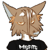
Oh, fucking awesome. I love their faces, love their attitudes, love the colors. This movie doesn't get enough love.
Not just because it's furry, but because it's awesome. I listened to "Let Her Dance" on repeat tonight and thought of this movie for no damn reason....
Did you ever see Oswald Iten's stuff on this?
Not just because it's furry, but because it's awesome. I listened to "Let Her Dance" on repeat tonight and thought of this movie for no damn reason....
Did you ever see Oswald Iten's stuff on this?
Film analysis is a valuable tool for an illustrator, since film you can't linger on an image. They're usually models of clarity and structure! This film alone - cold colors are reserved. Green and purple are present only in small chunks every five minutes to balance out the overwhelming orange. Red is used to denote props, like the bone or crate. No orange or brown is presented at the climactic showdown - only yellow and gray and red and such. And blue is reserved for character's eyes, for maximum contrast, for Kristofferson so he looks alone and un-fitting-in, and a saturated ultramarine night sky that looks not only infinite, but makes everything else look more orange. It's wonderfully meticulous!
There's a lot of great ways you can use this technique. "101 Dalmatians" established green as Roger's color and Blue as Anita's color early on - and the house is constructed accordingly, with blue kitchen and green music room. The only red in the entire film is on costumes and during the Hell Hall confrontation, interestingly! Pongo gets a red collar to draw our attention to him, Nanny has a red button to connect her color-wise to the dogs, and Cruella is Cruella. But whenever the movie wants to connect us with one of the humans, it uses their colors.
Interestingly, you ever see "Sleeping Beauty?" Marc Davis (the guy who designed and drew Cruella, Maleficent, and most of Disney's girls of that period) was very bitter about the color choices. Eyvind Earle, the film's production designer, had a very bizarre, cold color palette with lots of grayed purple, blue, green and gray - a lot of yellowish-green, but the color palette really is bizarre, I can't decipher or copy it - and to make Maleficent look ideally contrasty with that yellow-green, they gave her purple-blue robes, the complement of yellow-green, and a baby blue face to harmonize with it.
However, Marc Davis' original design - quite striking! - had a face as gray as a corpse, cadmium yellow eyes and bright scarlet linings in her robe, and she really does look like a Satanic allegory. "Her robe was scalloped to look like flames!" he said. "It should have been the same color as flame! Next villain I get, I insist that her coat lining be eye-searingly red. Just to see how it looks." Ah, well, of all sad words of book and pen!
This stuff about color - simplicity, tagging it to characters - this is all stuff that you can USE. Overthink things, play with them! Keep it as simple as you can and it'll look nice. Good luck - and look for some books on golden age production designers! They're wonderful resources.
I just got the "Art Of" book, and it's fucking incredible. Highly recommended. It isn't crowded with art (it wasn't really a film full of concept art) but it feels like you're trapped on the sets with the animators looking at the props and memos. It's an exhilarating experience.
I think we don't draw enough fanart sometimes, because I keep finding subjects that I just realize I've never drawn. I just did an "Oliver and Company" pic and realized it's the first time I've tried to draw any of them... The problem is that the only people who draw fanart are the ones with novice drawing skills and strange fetishes and obsession with kid's stuff. I searched for Redwall fanart once, here, out of curiosity, and the first thing that came up was a piece of inflation art - and lots of Cluny Yaoi - I promptly closed out of the tab. I understand a lot of the purpose of religion now...
In general, I'd leave it to Cyberfox. I've gotten requests from him that I'd rather never do ever in my life.
Thank you for your insight!
That's really helpful to think about. I am a very straight-forward, highly visual thinker, so analytics are sometimes hard for me. I've been getting more in to film and story structure lately, which has always been something I would just gloss over. I used to just watch movies and read books for the "overall feeling" and I wouldn't pay much attention to detail. But now that I know which movies and stories are my favorites, I'm finding the joy of re-reading and re-watching them and picking up story elements that are very special and that I didn't notice before.
I totally agree, I wish fan art was more tasteful. I've seen a lot of really great fan art though, a great place to see it is at cons. Sure, they're saturated with superhero art, but I usually manage to find a few diamonds in the rough, artists who use their unique style to portray beautiful characters.


Comments