(Art Trade) Rook part 1 of 2 "larger view"
another work as part of a trade with  canis-ferox
http://www.furaffinity.net/user/canis-ferox
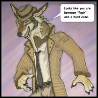
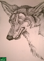
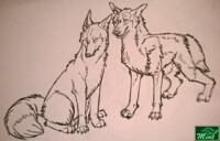
here is a larger version of both, i was going to upload this both separately but to help keep my gallery uncluttered i combined them to show what the ink looks like (in my sketch book). Also how the quick background layer color taken from a camera phone photo. i tend to be better with ink than i am using a digital pencil but now i have a new cintiq. once is start using it i think you will notice an improvement.
once again, as explained in the prior upload, these were only done in five hours. Thus the anatomy and line work is deeply flawed, yet passable. It still looks better smaller but need to study clothing more as i am bad at it. i only used Canis-ferox's own reference for a style guide to what rook wears. No real photos studied so i could not pick up on fine details.
essentially it is easier to draw from life because there is abundance of detail, in which you must learn to narrow. drawing from an art reference means the artists has already done that already, so you must interpret their edit choices in how they first drew it. i wanted to make sure i got him fairly accurate to the character sheet. i can draw floofies any day but clothing is tricky and i still haven't got the hang of how it hangs and folks. more study needed.
anywho... so this is part one of two images i am making as an art trade for canis-ferox. the other will be a more savage werewolf rook drawn in a slightly more fluid style.
 canis-ferox
http://www.furaffinity.net/user/canis-ferox
here is a larger version of both, i was going to upload this both separately but to help keep my gallery uncluttered i combined them to show what the ink looks like (in my sketch book). Also how the quick background layer color taken from a camera phone photo. i tend to be better with ink than i am using a digital pencil but now i have a new cintiq. once is start using it i think you will notice an improvement.
once again, as explained in the prior upload, these were only done in five hours. Thus the anatomy and line work is deeply flawed, yet passable. It still looks better smaller but need to study clothing more as i am bad at it. i only used Canis-ferox's own reference for a style guide to what rook wears. No real photos studied so i could not pick up on fine details.
essentially it is easier to draw from life because there is abundance of detail, in which you must learn to narrow. drawing from an art reference means the artists has already done that already, so you must interpret their edit choices in how they first drew it. i wanted to make sure i got him fairly accurate to the character sheet. i can draw floofies any day but clothing is tricky and i still haven't got the hang of how it hangs and folks. more study needed.
anywho... so this is part one of two images i am making as an art trade for canis-ferox. the other will be a more savage werewolf rook drawn in a slightly more fluid style.
Category Artwork (Traditional) / All
Species Wolf
Size 884 x 800px
File Size 737.9 kB
Ah I love this! :D Once again really nice looking pen work, and it looks really great with the coloring! It kind of has a soft sort of look to it even while having sharp edges. And clothing is indeed tricky haha, it took me a ton of studies and I still need to do more. Good work with it here, especially for not using any other references other than my scribbles. The feet/hindpaws and the fur on the tail looks particularly nice! Thank you! :)
oh ha ha that softness.. i blame the fact ( most likely?) on my cheap method of transfer to pc. i dont own a scanner anymore so i simply used my camera phone. granted its great for photos and representing color, and not as bloody cumbersome as using my SLR camera which is also great but more for scenery and animals not artwork.
since i know i am going transparent ( which turns black lines into colored lines when done right...( thus again.. a way i can "cheat" around something to save time in what would otherwise take hours to achieve). essentially since i know the quality does not need to be perfect in the photo since i plan to underlay it with color. the imperfections simply add some texture and character to the work. any time Ive tried to make the BG solid white it looks horrible.
Black lines can be hit or miss but it all depends on how good line quality is and i achieve better line quality with a ink pen than digital. yet i have a bit of a shakey hand regardless but that is probably why i mean better with ink than digital. also any ink line shading i do actually compliments very well with color shading providing i do not go overboard with both. . i started on the jacket but ran out of time... you can see how it stands out a bad badly... but if i had made more lines or cross hatched a bit it would have looked much better.

 FA+
FA+


Comments