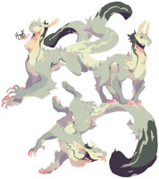
Monster Anthology vol.2 Demon Edition pdfs are available!
---
You can get the sfw or nsfw editions or both for a lowered price! They both have completely original content. They are not censored/uncensored versions of each other~
---
I'm featured in both of them and this is the cover I made for the nsfw version! Thought I should post it here for those who don't follow me on Tumblr or Deviantart!
---
You can buy it here!
---
You can get the sfw or nsfw editions or both for a lowered price! They both have completely original content. They are not censored/uncensored versions of each other~
---
I'm featured in both of them and this is the cover I made for the nsfw version! Thought I should post it here for those who don't follow me on Tumblr or Deviantart!
---
You can buy it here!
Category Artwork (Digital) / Fantasy
Species Unspecified / Any
Size 591 x 900px
File Size 609.5 kB
Hey, I like the work, it's really beautiful and the color choice and composition is pretty spot on, but if you would like a critique, here's what I have:
The text would be better with more space in between each letter, or if you really wanted them to flow from one to the other, then it would have been better that they were widened, stretched to the side so to speak. I'm suggesting this because even with the priming from the title and clicking the link, I had to struggle to read what your cover said. The only word I could read was demon, and that was only on full view. Just by spacing it out you would continue the lines you've formed, still keep the image of a frame around your centerpiece, while making it more legible. Seeing as it is the title, It would be important for the text to be easily legible, it's the calling card of it being a cover, after all.
I hope this has been helpful for future covers. The Anthology looks delightful.

 FA+
FA+


Comments