 FA+
FA+
1467
Views
Views
122
Favorites
Favorites
Category
All / All
Species Unspecified / Any
Size 600 x 893
File Size 278.6 kB
Report this content
More from Anjila


 speciesxchange - Join the fun! Next round is on the 15th
So, this is supposed to be my birdie as a nautilus! Somehow, when I looked at the submitted species, I had a feeling I'd get this one. :B
As much as I LOVE and appreciate when you guys compliment my use of color, this time I'd like to know what you think of the design. :>
In my opinion, I'm such a cop-out. Rofl, she looks more like a lizard wearing a nautilus hat than an actual nautilus anthro. EPIC FAIL. D:<
Category All / All
Species Unspecified / Any
Size 600 x 893px
File Size 278.6 kB


I have to totally agree with blitz on this one, that was a VERY clever idea with the shell!
And I think the design is awesome. The little things coming off the elbows make me think aquatic, and the whole design is very believable for a nautilus! Great job! <3
Oh an. *obligatory color comments <3*
And I think the design is awesome. The little things coming off the elbows make me think aquatic, and the whole design is very believable for a nautilus! Great job! <3
Oh an. *obligatory color comments <3*


Well, you have to admit that it's be rather difficult to make a nautilus into an anthro form. I mean... I'm sure it CAN be done, but I'm not entirely sure as to how. Squids and octopi are pretty tricky as it already stands!
Still, I like the design, and the tendrils for hair do look really nice! Even on the arms, they look really great! And yes, very colorful too! I'd rally like to learn your method. >.<
Still, I like the design, and the tendrils for hair do look really nice! Even on the arms, they look really great! And yes, very colorful too! I'd rally like to learn your method. >.<


the type was the first thing that i saw. Good typography that is just the right amount of kern for that font with how much room you left between each word.
but the problem is that the eye trails off the page almost immediately as you finish reading, what keeps you from staring up and down that line of text is the fact that all the brightest color is on one side of the page.
What the composition is missing is the path that the viewer follows. solutions could be to tighten some of the angles in the frame,i.e. bend the right leg more and lean over farther

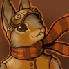


I personally think the design is quite unique for such a species. It may not be perfectly appearing like a nautilus, but nothing is perfect. The hair really got my attention, probably because of the green highlight. That outfit really suits her body very well. I also love how that hat looks. Really a great touch of style!


I think if her head was turned more towards the front, or another view was provided so the crazy @V@ face could be seen, that the nautilus would come across more. I was about to say, "yes sorta does look like leezard in shell hat with dreads" but then I noticed the glasses. Maybe the colors should have been more rusts/reds and white, to give the skin that more peppermint sorta spotty look Nauti's have? I like the morph between yer birdie and the mollusk though.


Comments