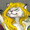
For this year's egyptian CesFur a badge for  rokoji - another happy returning commissioner ^^
I took inspiration from work of an artist from dA http://xviisideris.deviantart.com/ who share the same love for rich colours and shiny stuff as me. I've been watching her account for a while and eversince I loved to dive into her universe.
If you are interested in ordering a badge like this whether for CesFur or at all, here is a journal with information, slots are open: http://www.furaffinity.net/journal/6688919/
 rokoji - another happy returning commissioner ^^
I took inspiration from work of an artist from dA http://xviisideris.deviantart.com/ who share the same love for rich colours and shiny stuff as me. I've been watching her account for a while and eversince I loved to dive into her universe.
If you are interested in ordering a badge like this whether for CesFur or at all, here is a journal with information, slots are open: http://www.furaffinity.net/journal/6688919/
Category Artwork (Digital) / All
Species Lynx
Size 800 x 843px
File Size 1.21 MB
Listed in Folders
Thank you c: here is the journal with details if you're still interested -> http://www.furaffinity.net/journal/6688919/
They're certainly wonderful people if they have enough good taste to watch you <3
The changes to FA. I'm probably the only person who really likes this website design - it's one of the simplest website designs around, precisely because they haven't changed it.
The pages from this site can load in milliseconds. There's nothing especially charming or standout about the website itself, which puts all the focus on the work. The neutral colors of the background set off the art particularly wonderfully (Blue, green, purple and brown are the only colors that work at neutral levels that don't compete with the artwork - and only blue and green have no overtone at all, so the charcoal teal of fA is probably the best it could have).
There's nothing on the site aside from the comments box that's pure black or white, so it's super pleasing to the eyes.
And if you know anything about HTML code, you can handcraft whatever you want.
Imagine how awful this site would be to use if they included a box of option buttons to your text - it'd be atrocious.
Literally, all they need is a folder option and the really useful "edit comment" feature and they'd have nothing wrong.
I'm the only person on the website who likes the fact that it's mediocre and not especially pretty - because this website is a display website, not a show website.
*wink wink* ;3
Hm, well, you could say that it's very old-school X3. But along with it comes technical and safety issues. It doesn't just look old, it IS old.
Yep, browsing art is pretty neat, I have to agree here(I don't like it on Weasyl), but I dislike the note system here.
I miss HTML on dA. Now it's only CSS or hell, I don't know, I knew only HTML : P
But don't we have the option box already? In the journal section. Yees, folders are a must. And you can already edit comments.
Aside from the layout, with the ownership change lately, all the fuss about IMVU owning now the content of the site or something. For me it is worrying. Maybe not so much for now but in 3, 5 years when I will have artwork that can really generate money - I will be muuuch more careful where I post it.

 FA+
FA+


Comments