 FA+
FA+
150
Views
Views
1
Favorites
Favorites
Category
Artwork (Digital) / Doodle
Species Unspecified / Any
Size 844 x 475
File Size 26.7 kB
Report this content
More from XIII-Varro


A little logo that a pal on twitter made for me, I recommend you check out her DA!
http://darknesswolffire.deviantart.com/
http://darknesswolffire.deviantart.com/
Category Artwork (Digital) / Doodle
Species Unspecified / Any
Size 844 x 475px
File Size 26.7 kB

OK, well, I've written down everything I can recommend, and I hope you don't see this as saying it's completely rubbish because of how much I recommend because I do like the handwriting and I think the design has a logo feel, but it needs more work. A better brand makes for a better company, so take a read and see what you think
- The general rule of colours is that more is less, and very rarely do logos with more than 3 colours work. I'd suggest taking the red, white and blue and sticking to them throughout. I think I counted 7 colours here, and it's rather too much. Also, red, white and blue instantly remind me of patriotism (British or American), so that's something to consider as to whether or not that's something you want to be associated with.
- Gradients and fades are getting dated. They were neat when we invented the technology for them from the 60s to 90s, but nowadays, they're kind of an easy way out (and the same goes for swooshes). You're better off with crisp shapes with block colours as they don't age nearly as quickly. If you would like shading however, you're better off using cell-shading techniques (the logo for the Rolling Stones, with how the light is kept as block shapes overlaying the tongue and lips, is a great example of cell shading.)
- Also, I can't help but feel that the shapes in the background aren't that relevant to your art style. Your style has a somewhat stained glass effect, where this looks like it's more of a digital painting. Ask them if they can make the background more relevant to your own style.
- I find your name gets a little lost in the background and becomes illegible. Either make the text weight thicker or separate the background and the text completely (usually, the illustration above the text is perfectly adequate)
- I also find the text below Varro to be confusing. I can't tell if it's meant to be GC, CTC or C7C. Perhaps make this clearer too.
- One thing often overlooked by non-designers is the typography, specifically tracking. This is when the designer increases or decreases the space between all letters in a line/paragraph, and when it comes to logos, we usually track the letters to have smaller space between each letter so it doesn't look all spaced out when printed in a large format, so I would highly re comment bringing the letters closer together for Varro
- Another common mistake non-designers make is is that they think logos are created from in an instant doodle, when in fact, we do something called thumbnail sketching. This is when we draw out first idea as a small. rough sketch, then another idea, then another idea, and so forth until we find the logo that best fits and plan how to make it. If they train themselves for this, their logos can be more accurate for their clients.
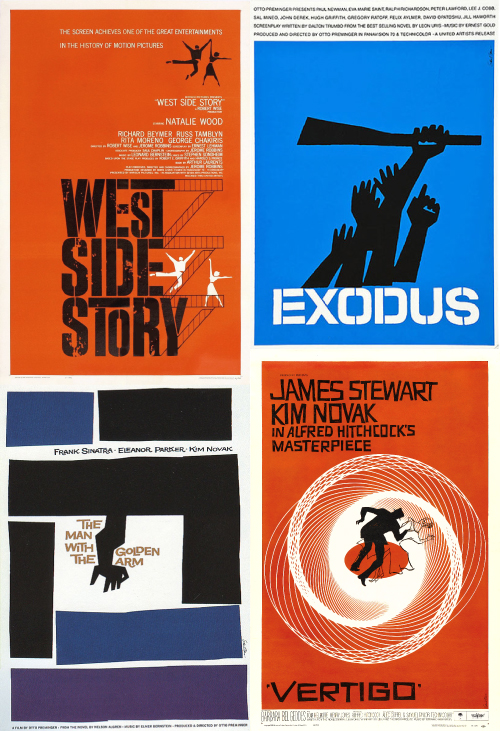
- As a recommendation, I would look at the designs of Saul Bass, especially for his movie posters. His angular, cup paper style reminds me a lot of yours, so you can look at his work for integrating your style with your brand.
Hope this is all OK for you *hugs*
- The general rule of colours is that more is less, and very rarely do logos with more than 3 colours work. I'd suggest taking the red, white and blue and sticking to them throughout. I think I counted 7 colours here, and it's rather too much. Also, red, white and blue instantly remind me of patriotism (British or American), so that's something to consider as to whether or not that's something you want to be associated with.
- Gradients and fades are getting dated. They were neat when we invented the technology for them from the 60s to 90s, but nowadays, they're kind of an easy way out (and the same goes for swooshes). You're better off with crisp shapes with block colours as they don't age nearly as quickly. If you would like shading however, you're better off using cell-shading techniques (the logo for the Rolling Stones, with how the light is kept as block shapes overlaying the tongue and lips, is a great example of cell shading.)
- Also, I can't help but feel that the shapes in the background aren't that relevant to your art style. Your style has a somewhat stained glass effect, where this looks like it's more of a digital painting. Ask them if they can make the background more relevant to your own style.
- I find your name gets a little lost in the background and becomes illegible. Either make the text weight thicker or separate the background and the text completely (usually, the illustration above the text is perfectly adequate)
- I also find the text below Varro to be confusing. I can't tell if it's meant to be GC, CTC or C7C. Perhaps make this clearer too.
- One thing often overlooked by non-designers is the typography, specifically tracking. This is when the designer increases or decreases the space between all letters in a line/paragraph, and when it comes to logos, we usually track the letters to have smaller space between each letter so it doesn't look all spaced out when printed in a large format, so I would highly re comment bringing the letters closer together for Varro
- Another common mistake non-designers make is is that they think logos are created from in an instant doodle, when in fact, we do something called thumbnail sketching. This is when we draw out first idea as a small. rough sketch, then another idea, then another idea, and so forth until we find the logo that best fits and plan how to make it. If they train themselves for this, their logos can be more accurate for their clients.
- As a recommendation, I would look at the designs of Saul Bass, especially for his movie posters. His angular, cup paper style reminds me a lot of yours, so you can look at his work for integrating your style with your brand.
Hope this is all OK for you *hugs*
Comments