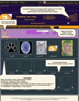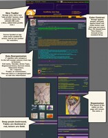
Awesome! It is done! This is a screen shot of a Furaffinity project I coded to improve the message system. You know when you log in, and see the numbers in the top bar about comments, faves, new watches etc...?
Well instead of seeing a list of who commented on what, this brings you directly to a combined list of comments from your shout box, submission comments, and journal replies.
I am not done writing the program to be able to show the user where each comment was from, right now it just shows you all the comments (here every they came from). It is difficult integrating their origin, cus every comment is redirected to this page. I think I can still do it, without having to change too much that the comments will still work.
The design:
I am still using the"dragoneer colors" purple, and orange, and this makes the the tab links look really cool! I also changed the table outline to lime green. I got a lot of complaints about how hard it was to "see things", but the links have been made easier . I hope you think this looks better.
This is still a PROTOTYPE, but I plan to improve upon this shortly.
Feel free to leave your comments :)
Category Artwork (Digital) / Miscellaneous
Species Unspecified / Any
Size 1046 x 1280px
File Size 259 kB
Listed in Folders
That is pretty dang awesome. o.o
Will it be a separate option/tab(Or will it be toggleable)?
Also, for long comments. Will it shrink down to a certain amount and you can basically click a "Read more" to go to the place where its commented, or will it stretch all the way down to accommodate?
Will you also implement a "Reply" button, to where you can reply to a comment from this box/area instead of having to go to the submission/journal?
Woah!!!some very good ideas I like the idea of a reply button. Lol,
this would be like a "master reply area" instead of having to find the comment on the journal or submission.
As for the size, the table will expand depending on how big he comment is, other than that, each comment box here is 60 PX in height, but it is not limited to that size.
I developed a lot of cool stuff for FA recently lol, you should check out the user profile page in my gallery
I personally think its a good idea. :p FA already implemented something like it, it happens randomly though, which is weird.
Yeh, Master reply area. xD
Understandable! :3
Awesome! Do you think these would be implemented by staff or are these just addons that may be given away freely? Or?
Yeh, Master reply area. xD
Understandable! :3
Awesome! Do you think these would be implemented by staff or are these just addons that may be given away freely? Or?
Awwww. Well, sometimes change can be a worrysome thing for some people. Like the sidebar that FA implemented last month, which I hated btw(as most did). That was a stupid change, what you have is an interesting one. Hopefully toggleable though!
Yeh, I bet. c:
It'd be fun to collaborate, I'd love to help <3
Yeh, I bet. c:
It'd be fun to collaborate, I'd love to help <3
Thank you! Note me whenever if you'd like to. c:
Yeh! Cause some people may not like the feature. Making it toggleable would help, making it optional. c:
Well yeh, but some people don't like that note system atm, yet they can't turn it off.
I personally became attached to the new note system xD
Yeh! Cause some people may not like the feature. Making it toggleable would help, making it optional. c:
Well yeh, but some people don't like that note system atm, yet they can't turn it off.
I personally became attached to the new note system xD
Idk what u mean, this like in the top messages. Like comments received on submissions,journals and shouts. So when you click messages, it shows you this. If you click on the message It brings you to the journal, or submission where it was posted so you can reply and stuff.
But nelizar (abouve us) had a good idea to have the reply button here, so you can reply to comments from this page instead of having to click back forth between pages. :)
Not a fan of the trippy border colors, but each to their own. :P
I remember back in 2006 when DeviantArt also just showed a list of links to comments, instead of the actual comment in the messages page.
Maybe the new revamped FA will bring this in as standard? Until then, I guess a user script is a cool idea. You said you have difficulty integrating their origin? But the name of the page/submission is right there in the original message, which is presumably what you're parsing. Perhaps I can take a look at your script and help you out?
Never heard of it before, but I've heard of Ferrox Art Inc which was the old company that used to own FA.
According to WikiFur https://en.wikifur.com/wiki/Ferrox_(software) Ferrox is really old, and hasn't been touched since 2009. I assume it's not related to the current FA updates. Also, it's server-side.
My proposal to use JS to create a userscript for Greasemonkey/Tampermonkey means you don't need access to the server side - anyone can use it. Of course, it'll need to fetch extra data and parse it in order to grab message contents, etc.
https://www.youtube.com/watch?v=w6ccBwnc5KU
This is why art sites use muted colors instead of over-saturated ones. If you stare at them long enough, the color receptors in your eye get stuck in a particular state and it affects other things on the page.
50% grey is ideal but boring, so most sites use some actual theme color, it's just purposefully under-saturated.
Pick one or two hues for a theme and stick with them. Having half a dozen placed randomly looks like something you'd see in mid-90's web design, a style which thankfully died off with myspace.
Opinion starts here -
Having dragoneer-themed colors is probably a bad idea. He is, to put it kindly, extremely controversial, he doesn't even technically own the site, and he's also not the mascot... that would be Fender.
Purple and orange probably ain't gonna work for most people. Colors that are 180 degrees apart on the color wheel are hard to use together in an aesthetically pleasing way, and look especially tacky if they're not toned down a bit.
/opinion
Now, on the coding and layout aspects... I'm not the one to give you detailed advice here, since I lost most interest in codemonkey stuff when I got out of highschool. Avoid javascript when possible, at least for essential site functionality. Honestly I block all scripts by default these days, unless they're absolutely critical for getting the page to work.
I will say that most of the problems the site currently has are backend and database problems, this is common knowledge at this point. Fully implementing a new gui is probably not going to be as simple as you would think, until that gets sorted.
If you do manage to get a fully functioning prototype done, then good work, you have more motivation than most of the site staff. But it may be a moot point until the bigger problems get fixed... as of now, that's on imvu.

 FA+
FA+


Comments