 FA+
FA+
648
Views
Views
14
Favorites
Favorites
Category
Artwork (Traditional) / Comics
Species Unspecified / Any
Size 628 x 960
File Size 163.6 kB
Report this content
More from helmeetelgato


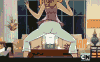
A few may remember an attemp I did before to start a comic here; I had to retire the pages because I was aiming to an editorial that requested so, but as it resulted in a dead end, I cgo again with this, remasterized and stuff.
I will do next updates in my soon to be reborn website
http://www.helmeetelgato.com.ar
Most precisely, in
http://www.helmeetelgato.com.ar/Comics/
Take a look and tell me what you think, would ya?
I'll be working in this project from now on, I have a great story have been working on for years and it's time for it to be revealed, he.
Don't hesitate and tell me what you think!
<<< PREV | FIRST | NEXT >>>
Category Artwork (Traditional) / Comics
Species Unspecified / Any
Size 628 x 960px
File Size 163.6 kB

nice start, but of course it's hard to tell from the initial splash page. ^^
the second paragraph of the narrator should read, "Myths and fairy tales are written in blood" or "...with bloody ink"; but then again I am no native speaker myself, and there might be a more suitable phrase. :)
layout and panels look good, although I think the light is a bit too wide for the spot it throws onto the ground. like the main panel was cut in half.
I guess you know Scott McCloud's "Understanding Comics"? if not, try to find it; it might give you good ideas for further pages. :)
Thanks you A LOT for the supportive criticism =D
Teah, the effect of the light was supposed to be kind of a degradee or something, I dunno, but I suppose oit didn't result like it should... I'll see to fix it later
Special thanks for the grammar correction, I'll need a lot of that =)
I'll get that reference you suggest and find what I can learn.
Teah, the effect of the light was supposed to be kind of a degradee or something, I dunno, but I suppose oit didn't result like it should... I'll see to fix it later
Special thanks for the grammar correction, I'll need a lot of that =)
I'll get that reference you suggest and find what I can learn.
Comments